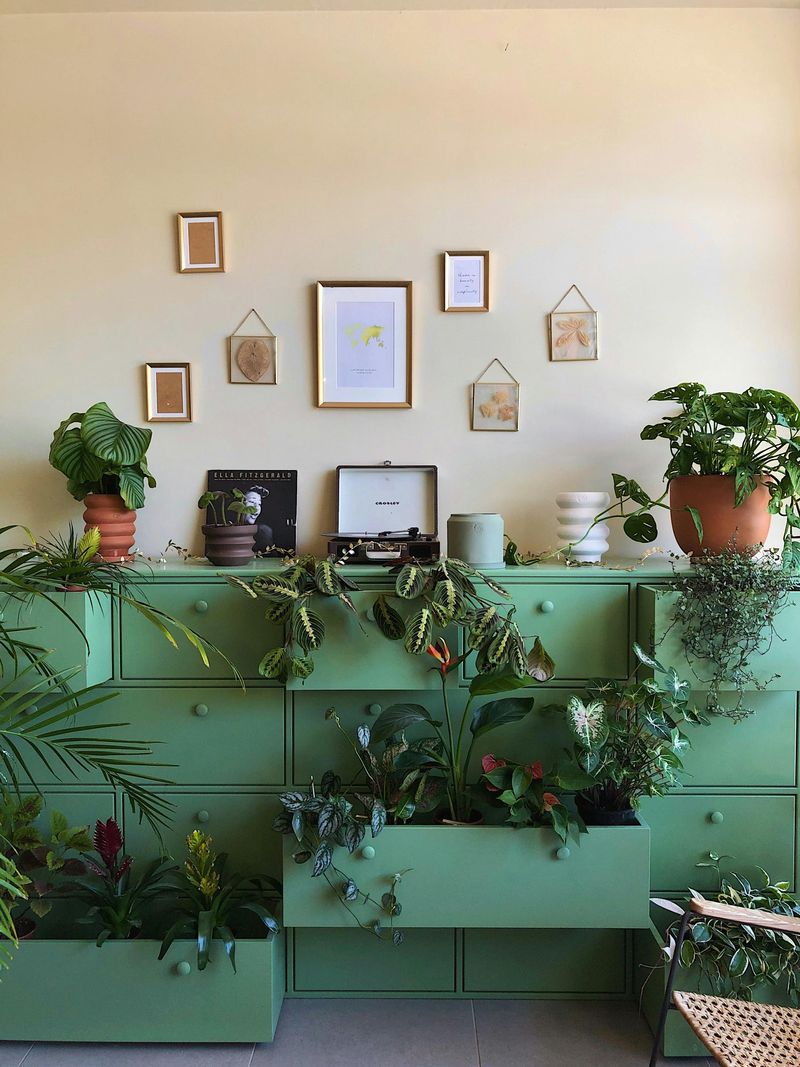
Ever felt like your living room needs a fresh new look without breaking the bank? Color changes are the fastest way to breathe new life into tired spaces. From bold accent walls to subtle accessory updates, these ten color transformations can turn your living room from drab to fab in no time.
1. Bold Accent Wall Magic
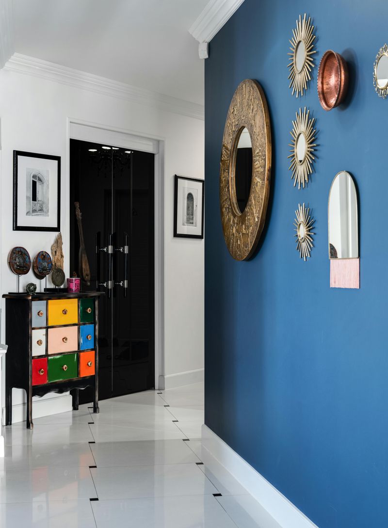
A single wall painted in a vibrant color creates instant drama without overwhelming your space. Navy blue, emerald green, or even a rich burgundy can anchor your room and provide a stunning backdrop for artwork or furniture.
The key is selecting the right wall – typically the one behind your main sofa or the fireplace wall works best. This focal point draws the eye immediately when someone enters the room.
Best of all, this project requires minimal paint and can be completed in a single afternoon, making it perfect for weekend warriors looking for big impact with minimal effort.
2. Ceiling Color Revolution
The ceiling is your room’s fifth wall but often gets ignored. Painting it a soft color like pale blue, blush pink, or light sage green creates unexpected visual interest and can make low ceilings feel higher or large rooms feel cozier.
For a truly dramatic effect, try a deeper shade that contrasts with your walls. This unexpected pop of color draws the eye upward and makes the entire space feel more intentionally designed.
Remember to use flat paint for ceilings to minimize the appearance of any imperfections and create a smooth, flawless finish that enhances your overall color scheme.
3. Sunshine Yellow Accents
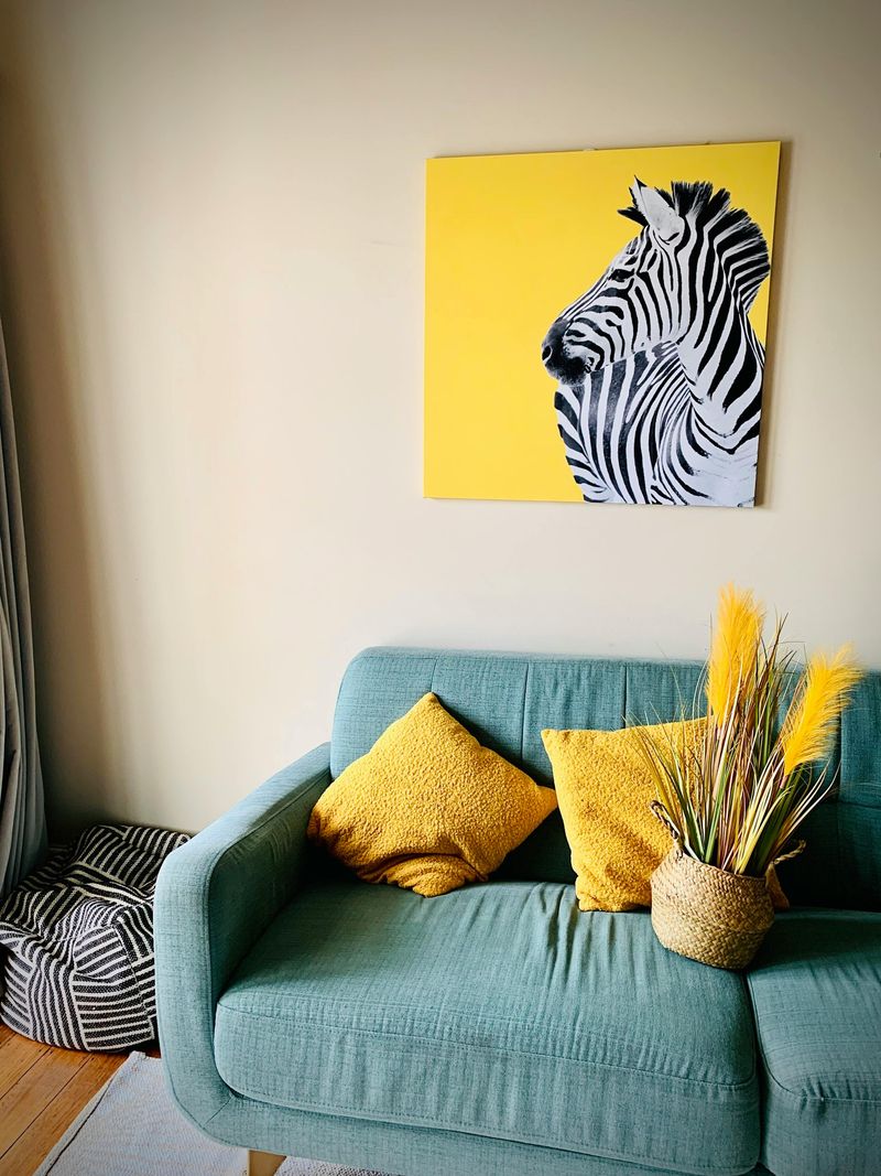
Yellow brings instant cheerfulness to any space! Adding pops of this sunny hue through throw pillows, vases, artwork, or even a bright area rug creates an immediate mood lift without committing to a major color overhaul.
The trick is choosing the right shade – buttery yellows work in traditional spaces, while mustard tones complement mid-century modern decor. Lemon yellow pairs beautifully with gray or navy blue for a contemporary look that feels fresh and energizing.
Start small with just one or two yellow accessories and gradually add more if you love the effect. This color works especially well in rooms with limited natural light.
4. Monochromatic Makeover
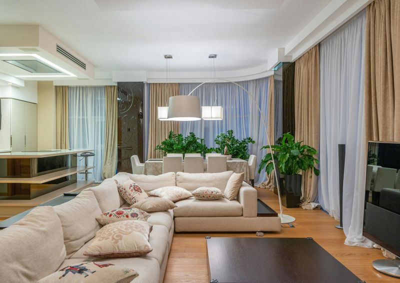
Picking one color and using various shades of it creates a sophisticated, cohesive look that feels both modern and timeless. A gray palette ranging from charcoal to silver or a green scheme from forest to sage makes decorating foolproof.
The secret to pulling this off is texture variation. Mix velvet, linen, wool, and other materials in your chosen color family to add depth and visual interest. Include at least three different tones within your color for dimension.
This approach works especially well in smaller living rooms where too many colors might feel chaotic. The unified palette makes the space feel larger, more organized, and incredibly stylish with minimal effort.
5. Coral Pop Treatment
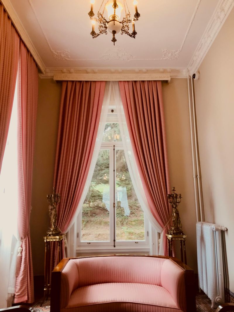
Coral is the perfect balance between pink and orange, adding warmth and energy without feeling too feminine or childish. This vibrant hue pairs surprisingly well with neutrals, blues, and even greens for an unexpected color combination that feels fresh and modern.
Start small with coral throw pillows or a statement lamp, or go bold with a coral sofa against neutral walls. For a tropical vibe, combine coral with turquoise and touches of gold for a look that feels like a permanent vacation.
This color works particularly well in rooms with lots of natural light, as sunlight enhances its warm undertones and creates a gorgeous glow throughout your space.
6. Two-Tone Wall Statement
Split your walls horizontally with two complementary colors for a designer look that adds architectural interest to plain rooms. The lower portion can be a darker shade with the lighter tone above, creating balance while making ceilings appear higher.
A chair rail or thin wooden molding between colors adds a polished finish. Popular combinations include navy and white, charcoal and pale gray, or forest green and beige for timeless appeal that works in both traditional and modern settings.
This technique is particularly effective in rooms with high ceilings or long walls that need visual breaking points. The color division naturally creates zones within your space without needing physical dividers.
7. Jewel-Tone Furniture Revival
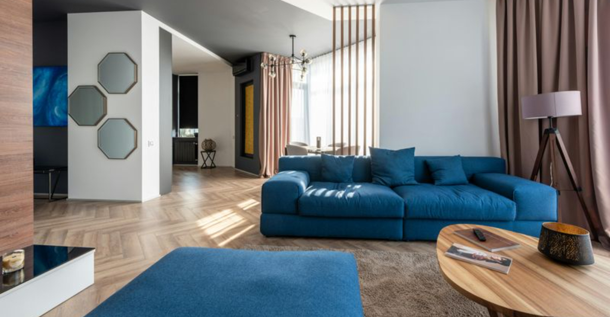
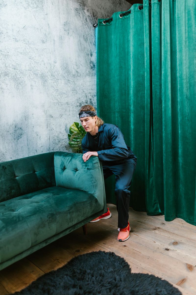
Reupholstering or slipcovers in rich jewel tones like emerald, sapphire, amethyst, or ruby instantly elevate neutral living rooms. Even updating just your main sofa creates a dramatic focal point that anchors the entire space.
These saturated colors feel luxurious and timeless while providing incredible versatility. They pair beautifully with metallics, woods, and most other colors in your existing decor. The richness of jewel tones also hides minor stains better than lighter fabrics.
For a budget-friendly alternative to full reupholstery, try a quality slipcover or even a vibrant throw blanket strategically draped over your furniture. The color impact remains substantial without the higher cost.
8. Painted Trim Transformation
White trim has dominated homes for decades, but painting your moldings, door frames, and window casings in a bold color creates instant character. Black trim looks sophisticated against white walls, while navy or dark green trim adds unexpected elegance to neutral rooms.
For the brave, try matching your trim to a colorful wall for a cocooning effect that feels incredibly cozy and intentional. This technique works especially well in older homes with original woodwork that deserves to be highlighted rather than blending into the background.
The contrast between walls and trim naturally draws attention to architectural details you might have been overlooking, effectively highlighting your home’s unique character.
9. Gradient Color Scheme
Create visual flow by arranging accessories in a color gradient throughout your room. Start with darker shades on one side, gradually transitioning to lighter versions across the space through carefully placed items like books, vases, and artwork.
This subtle technique creates movement that draws the eye through your living room in a natural progression. Try a blue gradient from navy to sky blue, or a sunset-inspired scheme from deep orange to soft peach for a cohesive look that feels intentionally designed.
The gradient approach works particularly well in open-concept spaces where you want to create distinct zones while maintaining a harmonious overall feel between different functional areas.
10. Nature-Inspired Green Revival
Bringing in various shades of green mimics the outdoors and instantly makes rooms feel fresh and alive. From sage to emerald to olive, green connects us to nature while providing a surprisingly neutral backdrop that works with most existing furniture.
Green walls pair beautifully with natural materials like wood, rattan, and stone. The color promotes relaxation and has been shown to reduce stress – perfect for creating a calming living space after hectic days.
For maximum impact, choose a green with similar undertones to your existing wood tones. Rooms with good natural light can handle deeper greens, while spaces with limited windows benefit from lighter, brighter shades that reflect available light.
