Walk into a room and something just feels off. Maybe the furniture looks awkward, or the colors clash in ways you can’t quite explain.
Professional interior designers spend years mastering the subtle art of making spaces look effortless and polished, and when those touches are missing, it shows in ways you might not even realize.
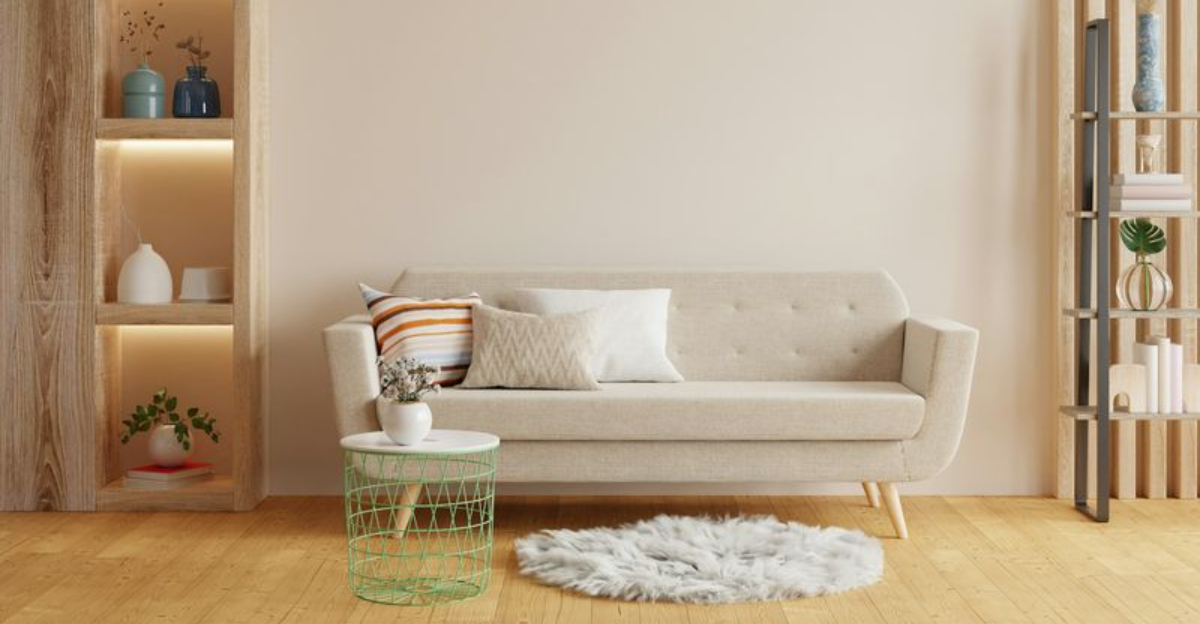
1. The Rug is Way Too Small for the Space
Picture this: a beautiful sofa floating in the middle of a room, and beneath it sits a tiny rug that looks like it wandered in from a dollhouse.
One of the most common mistakes people make is choosing a rug that’s far too small for their space.
Designers know that rugs should anchor furniture, not hide timidly beneath a coffee table.
The front legs of your sofa and chairs should rest on the rug, creating a cohesive seating area.
When the rug is too small, everything feels disconnected and awkward.
A properly sized rug pulls the room together visually and makes the space feel intentional rather than haphazard.
2. All the Furniture is Pushed Against the Walls
Remember playing musical chairs as a kid, with all those seats lined up around the room’s perimeter?
That’s exactly what many living rooms look like, and it’s a dead giveaway that no designer was involved.
Pulling furniture away from walls creates intimate conversation areas and makes rooms feel more inviting.
Designers understand that floating furniture in a space, even just a few inches from the wall, adds depth and sophistication.
It might seem counterintuitive, but this approach actually makes rooms feel larger.
The empty center becomes a design flaw rather than a feature, leaving your space feeling like a waiting room instead of a home.
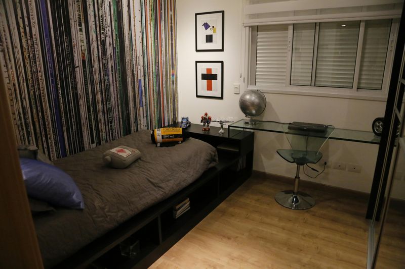
3. There’s Only One Light Source (Usually Overhead)

Flick on that single overhead light and watch your room transform into an interrogation chamber.
Relying solely on ceiling fixtures is perhaps the fastest way to drain warmth and ambiance from any space.
Professional designers always layer lighting with table lamps, floor lamps, and accent lights at different heights.
This creates depth, highlights architectural features, and allows you to adjust the mood throughout the day.
Each light source serves a purpose, whether for reading, ambiance, or highlighting artwork.
Without this layering, rooms feel flat and uninviting, no matter how nice your furniture might be.
Good lighting design transforms ordinary spaces into extraordinary ones.
4. The Sofa, Coffee Table, and TV are All the Wrong Scale
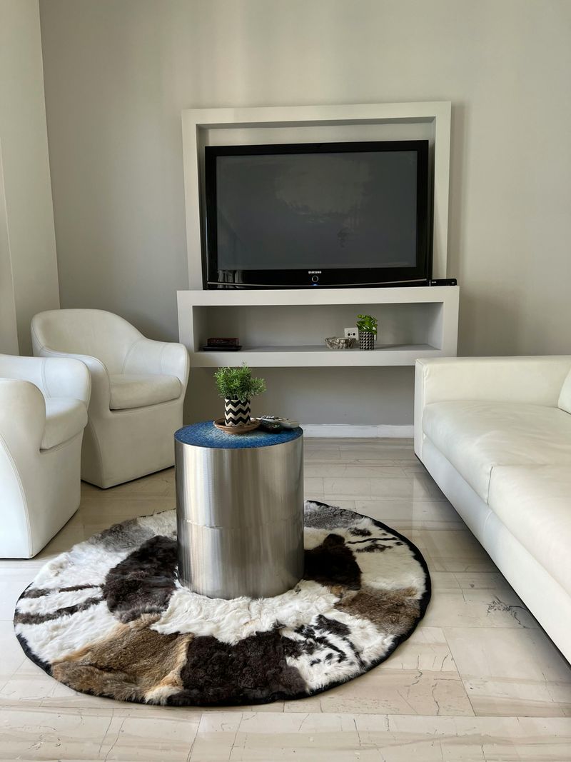
Ever seen a massive sectional paired with a coffee table that looks like it belongs in a child’s playroom?
Scale is one of those invisible elements that designers obsess over, and when it’s wrong, everything feels uncomfortable.
Your coffee table should be about two-thirds the length of your sofa and sit at a similar height to the seat cushions.
The TV should be proportional to both the viewing distance and the wall it occupies.
When these relationships are off, the room feels either cramped or empty.
Designers use mathematical ratios and years of experience to get these proportions right, creating harmony that untrained eyes might miss but definitely feel.
5. Art is Hung Too High or Centered at Ceiling Height
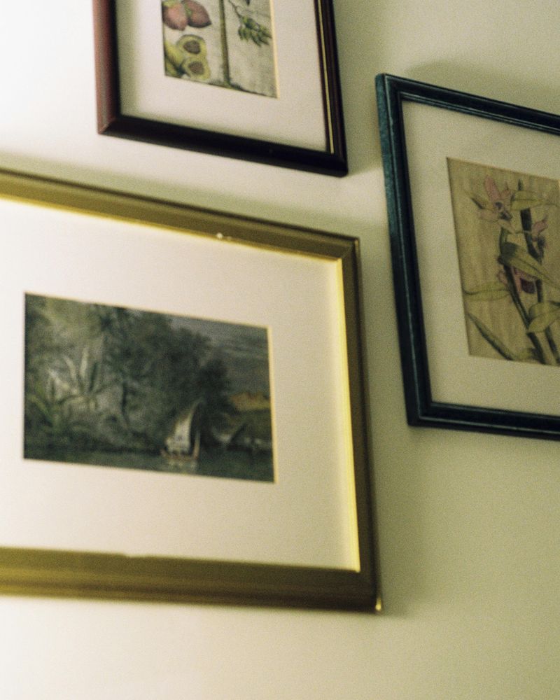
Crane your neck upward and you’ll spot artwork floating somewhere near the ceiling, as if it’s trying to escape the room entirely.
This is one of the most universal mistakes homeowners make without professional guidance.
The magic number designers use is 57 inches from the floor to the center of the artwork, which aligns with average eye level in galleries.
When art hangs too high, it disconnects from the furniture below and creates an awkward visual gap.
The space feels unbalanced, and your beautiful pieces lose their impact.
Proper placement creates a cohesive relationship between walls and furnishings, making everything feel intentionally curated rather than randomly stuck up wherever a nail would go.
6. Every Finish is a Different Metal, Wood Tone, or Style

Brass here, chrome there, nickel somewhere else, with three different wood tones thrown in for good measure.
Walking into a room with wildly mismatched finishes feels like visiting a hardware store rather than a thoughtfully designed home.
Designers typically stick to two, maybe three, coordinating metal finishes throughout a space.
Wood tones should complement rather than compete with each other.
This doesn’t mean everything matches perfectly, but there’s an intentional thread connecting the choices.
Without this cohesion, rooms feel chaotic and unfinished.
Each element fights for attention instead of working together to create a harmonious whole that feels both collected and purposeful.
7. No Clear Focal Point—Your Eye Doesn’t Know Where to Land
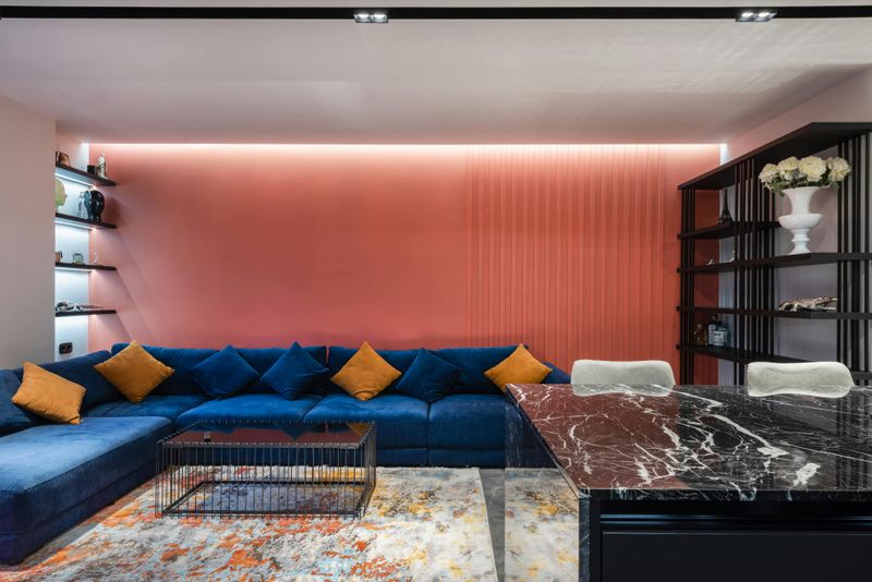
Step into the room and your eyes dart around frantically, unsure where to settle.
Is it the TV?
The window?
That random chair in the corner?
When there’s no clear focal point, spaces feel unsettling and directionless.
Designers deliberately create hierarchy, establishing a main attraction that draws you in immediately.
This might be a fireplace, a stunning view, an accent wall, or a carefully arranged furniture grouping.
Everything else supports this focal point rather than competing with it.
Without this intentional hierarchy, rooms lack personality and purpose.
Your brain works harder to make sense of the space, leaving you feeling subtly uncomfortable even if you can’t articulate exactly why.
8. The Color Palette Feels Random or Unconnected
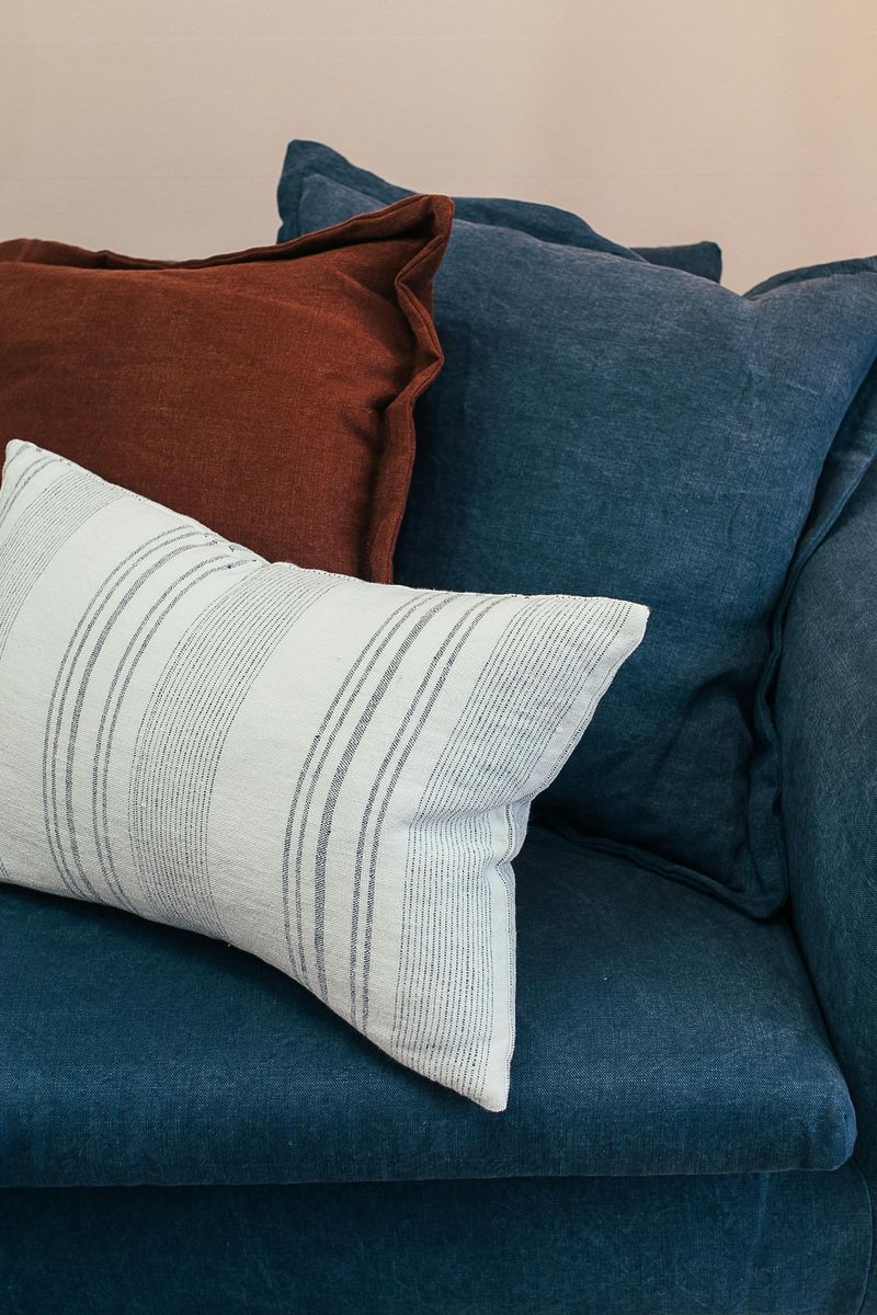
Teal pillows, a burgundy throw, yellow curtains, and a green plant pot walk into a room.
Sounds like the setup to a bad joke, and visually, it kind of is.
Professional designers work with carefully selected color palettes, typically choosing three to five colors that relate harmoniously.
There’s usually a dominant neutral, a secondary supporting color, and one or two accent shades.
These colors appear throughout the space in varying proportions, creating visual rhythm.
Random color choices make rooms feel like thrift store mashups rather than intentionally designed spaces.
Even if individual pieces are lovely, without a unifying palette, they never quite gel into something that feels complete or sophisticated.
9. Storage Looks Improvised Instead of Intentional
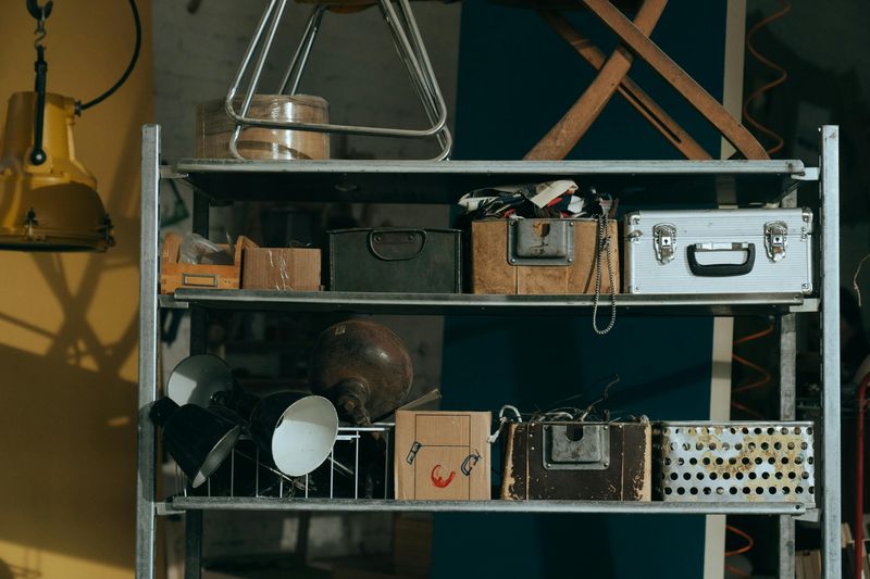
Cardboard boxes stacked in corners, mismatched bins shoved under consoles, and random baskets scattered about.
Storage solutions often reveal whether a designer was involved in planning a space from the beginning.
Designers build storage into their plans, selecting pieces that serve dual purposes while maintaining aesthetic appeal.
Built-ins, coordinated baskets, and furniture with hidden compartments keep clutter at bay without screaming “I’m desperate for organization.” Everything has its place, and that place looks like it belongs there.
When storage feels like an afterthought, it shows.
The room functions poorly, and you’re constantly battling visible clutter that undermines even the prettiest decorative choices you’ve made.
10. The Space Looks Fine But Doesn’t Flow or Function Well
Here’s the sneakiest giveaway of all: everything looks acceptable on the surface, but living in the space feels awkward.
You constantly bump into furniture, can’t have conversations comfortably, or struggle to use the room for its intended purpose.
Designers don’t just arrange pretty things; they choreograph how people move through and use spaces.
They consider traffic patterns, conversation distances, and how different activities will happen in each area.
Form follows function in professional design, never the other way around.
A room might photograph beautifully but fail miserably in real life if these practical considerations weren’t addressed.
This is where the designer’s training truly shines, creating spaces that work as well as they look.