Kitchen trends come and go faster than ever before, and what looks modern today might feel old-fashioned tomorrow. Tile choices especially can date your space quickly since they’re such a visible part of your kitchen. Designers are now warning homeowners about certain tile trends that seem popular right now but are already on their way out. If you’re planning a kitchen renovation, you’ll want to know which styles to avoid so your investment stays fresh for years to come.
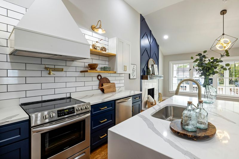
1. Subway Tiles Everywhere (Classic White)
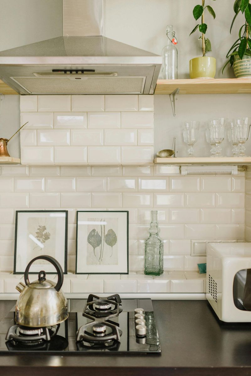
White subway tiles used to feel fresh and clean, but now they’re literally everywhere you look. Walk into any home improvement store or scroll through renovation photos, and you’ll see the same predictable pattern over and over.
The problem isn’t the tile itself—it’s the lack of creativity in how people use it. When every single kitchen has identical white subway tile backsplashes, the look loses its charm and starts feeling generic.
Designers suggest mixing materials or choosing unexpected shapes if you love the subway style. Otherwise, your kitchen risks blending into the sea of sameness that will feel tired very soon.
2. Hexagon Tiles
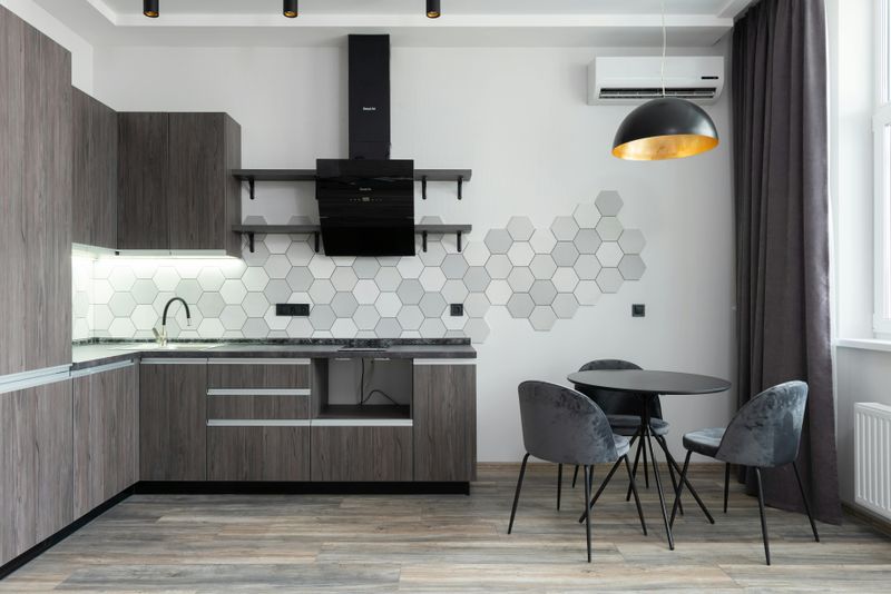
Hexagon tiles burst onto the scene as a geometric alternative to traditional squares and rectangles. Their six-sided shape added visual interest and made kitchens feel contemporary and Instagram-worthy almost instantly.
But here’s the thing about trendy shapes—they become recognizable markers of a specific time period. When you see hexagons now, you immediately think of mid-2010s to early 2020s design, which pins your kitchen to that era.
What once felt special and modern now feels predictable, and designers expect this shape to quickly signal an outdated renovation.
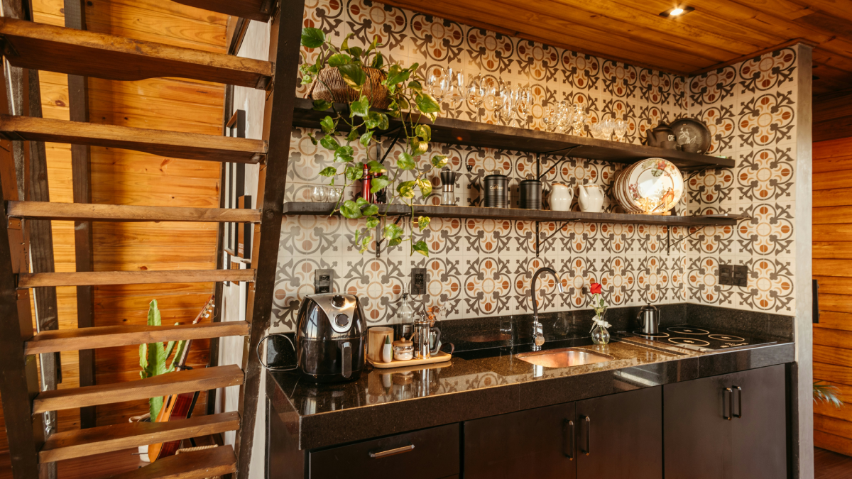
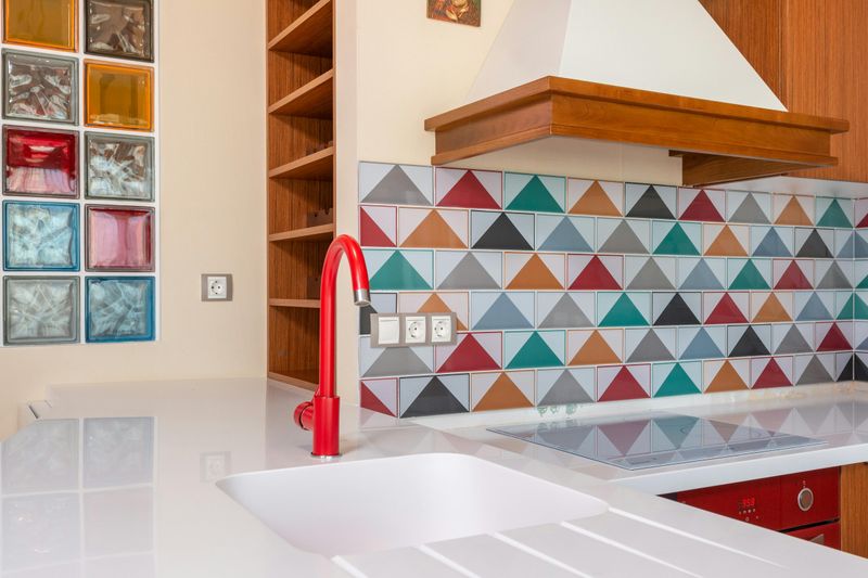
3. Patterned/Busy Tiles
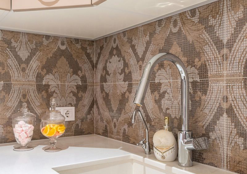
Bold Moroccan patterns and intricate geometric designs make an immediate visual impact that’s hard to ignore. These eye-catching tiles bring personality and color into kitchens that might otherwise feel plain or boring.
The downside? Busy patterns can quickly overwhelm your space and compete with everything else in the room. Your cabinets, countertops, and appliances all get lost when your backsplash screams for attention every single day.
Designers warn that these statement tiles are classic examples of trends that burn bright but fade fast, leaving your kitchen stuck in a specific moment.
4. Tiny Mosaic Tiles
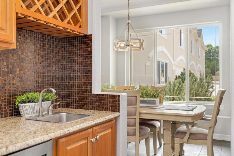
Remember when covering entire walls in penny rounds or tiny glass mosaics felt incredibly sophisticated? Those miniature tiles created texture and sparkle that seemed elegant and detailed at the time.
Fast forward to today, and all those grout lines just look cluttered and fussy. Cleaning between hundreds of tiny tiles becomes a nightmare, and the overall effect feels more dated than refined.
The retro vibe these tiles give off isn’t the good kind of vintage—it’s the kind that reminds people of early 2000s design. Larger, simpler tile formats are taking over because they feel cleaner and more contemporary without all that visual noise.
5. Glossy, Reflective Tiles
Shiny, mirror-like tiles promised to brighten kitchens and make small spaces feel larger through reflection. The glossy finish looked sleek and polished in showrooms, catching light beautifully under perfect conditions.
In real life, though, these surfaces show every fingerprint, water spot, and grease splatter imaginable. The constant maintenance required to keep them looking good becomes exhausting, and the flashy appearance starts feeling dated rather than elegant.
Matte and textured finishes are replacing glossy tiles because they’re more forgiving and sophisticated.
6. Metallic Tiles
Gold, copper, and bronze tiles seemed like the perfect way to add luxury and glamour to kitchen designs. The metallic shimmer promised to elevate ordinary spaces into something special and high-end.
But metallics are tricky—they can quickly cross the line from elegant to tacky. What looks luxurious today often feels gaudy tomorrow, especially as design trends move toward more natural and understated materials.
These tiles also tend to show wear and discoloration over time, losing their luster literally and figuratively.
7. Overly Large Format Tiles
Ultra-large tiles with barely-there grout lines created a sleek, seamless look that felt cutting-edge and modern. The minimalist aesthetic appealed to homeowners wanting clean lines and contemporary sophistication.
However, when taken too far, these massive tiles can make kitchens feel cold and unwelcoming. The stark, uninterrupted surfaces lack the warmth and character that make spaces feel like home rather than showrooms.
Design trends are already shifting back toward more human-scaled materials with visible texture and variation.
8. 3D Tiles
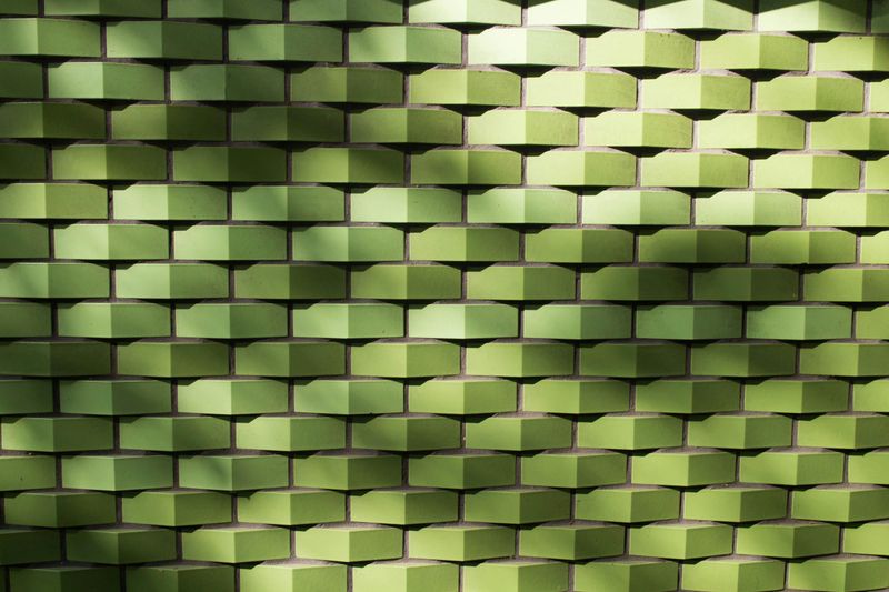
Tiles with dramatic three-dimensional textures and raised patterns made backsplashes into sculptural focal points. The play of light and shadow across these surfaces added depth and drama that flat tiles simply couldn’t match.
The problem is that this effect feels gimmicky after the initial wow factor wears off. Heavy textures collect grease and dust in kitchen environments, making them impractical despite their visual appeal.
What seemed like an innovative design statement now reads as trying too hard to be different.
9. Color-Blocked Tiles
Arranging tiles in bold blocks of contrasting colors created playful, energetic kitchens that felt fun and personalized. The rainbow effect or striking color combinations made spaces feel youthful and Instagram-ready.
But color trends change faster than any other design element, and what feels fresh now will look very specific to this era soon. Bold color blocking is already starting to feel like it belongs to a particular moment rather than a timeless choice.
10. Dark Grout with Contrasting Tiles
Black grout against white tiles creates a bold graphic look that caught everyone’s attention a few years back. The stark contrast makes each tile stand out, giving walls a distinct grid-like appearance that feels modern and edgy.
However, this high-contrast approach can make your kitchen feel harsh rather than welcoming. The heavy visual weight of dark grout lines draws constant attention and can overwhelm the space instead of complementing it.
Timeless kitchens usually feature softer, more harmonious color combinations. As design preferences shift toward warmer and gentler aesthetics, this dramatic contrast will likely feel too trendy and dated.