Even the most beautiful rooms can be undermined by tiny design mistakes that most people don’t notice right away. These small errors slowly chip away at your space’s potential, creating visual discomfort you might feel but can’t quite identify. Whether you’re decorating a new space or refreshing your current home, avoiding these common pitfalls can dramatically improve how your rooms look and feel.
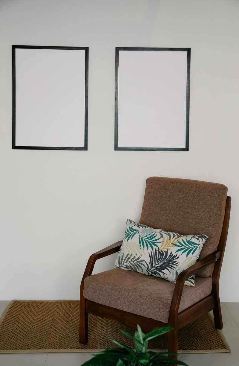
1. Hanging Artwork Too High
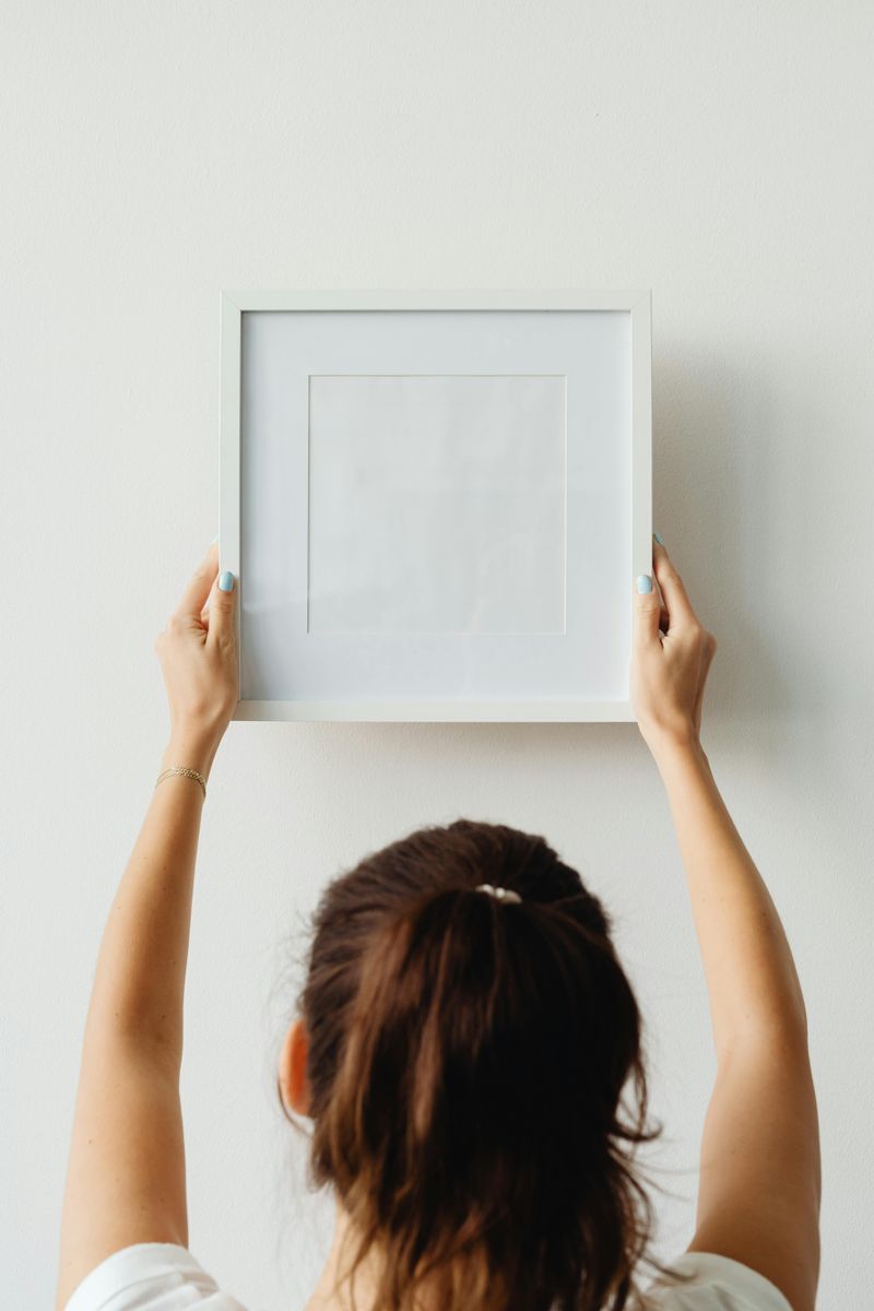
Walking into a room with artwork floating near the ceiling creates an immediate disconnect. Art should be at eye level, with the center positioned about 57-60 inches from the floor—the standard gallery height.
Many homeowners mistakenly hang pieces based on their own height rather than this standard measurement. This simple error throws off the room’s proportions and makes the space feel unbalanced.
Properly positioned art creates visual anchors that ground your furniture arrangements and make spaces feel cohesive rather than awkward.
2. Pushing All Furniture Against Walls
The ‘furniture against walls’ syndrome creates a hollow, dance-hall effect that makes conversation difficult and rooms feel cavernous. Pulling pieces away from walls creates intimate groupings and proper traffic flow.
Floating furniture actually makes rooms feel larger by creating depth and defining functional zones. The space behind a sofa or chair can be as little as a few inches to make a significant difference.
Try creating conversation areas where people can comfortably talk without raising their voices—your room will instantly feel more welcoming and professionally designed.
3. Mismatched Lighting Heights
Random pendant heights over kitchen islands or dining tables create visual chaos. A good rule is hanging pendants 30-36 inches above tables and 72 inches from the floor in walkways.
Beyond height, inconsistent lighting temperatures make rooms feel disjointed. Mixing cool white bulbs with warm ones creates an uncomfortable visual experience that subtly bothers everyone.
Proper lighting coordination includes consistent fixture heights, complementary styles, and matching light temperatures (warm, neutral, or cool) throughout connected spaces for a harmonious glow that enhances rather than fights your design.
4. Rug Too Small For The Space
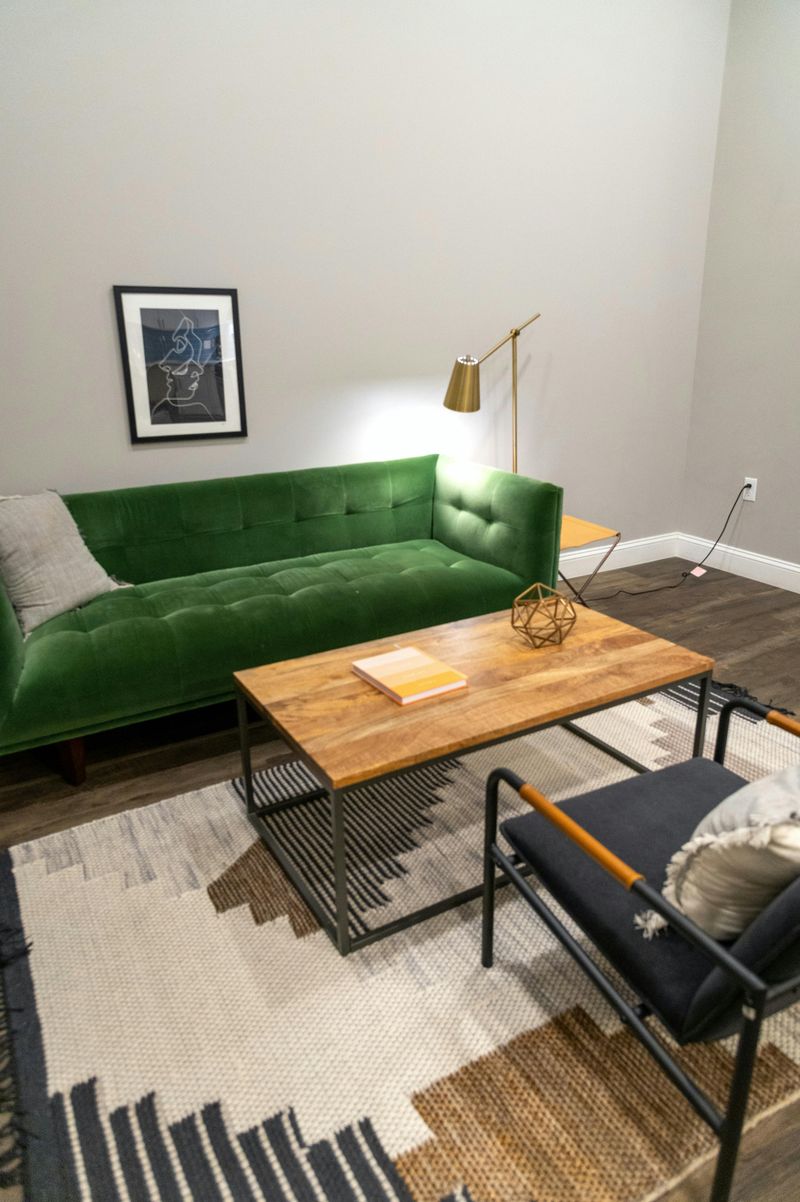
Tiny area rugs floating like islands make rooms feel smaller and disconnected. A properly sized rug should accommodate all furniture legs—at least the front legs if working with a larger seating arrangement.
For dining areas, ensure the rug extends at least 24 inches beyond the table edge so chairs remain on the rug when pulled out. Bedroom rugs should extend 18-24 inches beyond the bed sides.
When in doubt, go bigger! A generous rug anchors furniture groupings, defines spaces in open floor plans, and creates the visual foundation that pulls your entire room design together.
5. Overlooking Scale And Proportion
Massive sectionals drowning in tiny rooms or dainty coffee tables lost beneath towering sofas create uncomfortable visual tension. Furniture should be proportional to both the room and to other pieces around it.
Before purchasing, map out furniture dimensions on the floor with painter’s tape to visualize how pieces will fit together. Consider ceiling height too—tall rooms need taller or more substantial pieces to avoid feeling dwarfed.
The most pleasing rooms follow the interior design rule of thirds, creating visual harmony through balanced proportions rather than matching sizes or perfectly symmetrical arrangements.
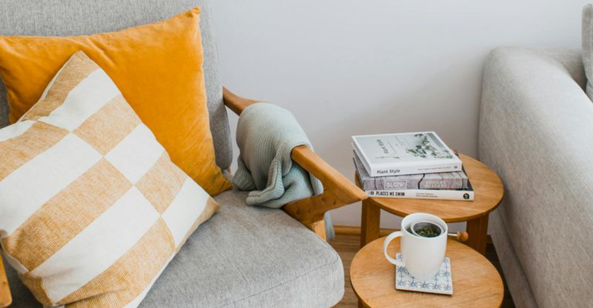
6. Chaotic Throw Pillow Arrangements
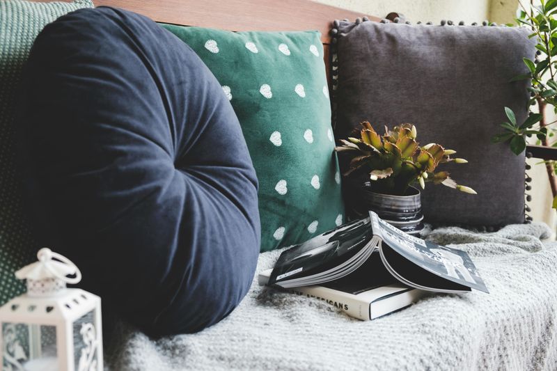
Random pillow collections without thought to color, pattern, or size create visual noise instead of comfort. Successful pillow arrangements follow the odd-number rule—groups of three or five work better than even numbers.
Mix sizes and shapes while maintaining a cohesive color story. Try combining solids with patterns at different scales (large, medium, small) while pulling colors from your existing décor.
Quality matters more than quantity—fewer well-chosen pillows create more impact than numerous mismatched ones. And remember to include inserts one size larger than your covers for that professional, plump look.
7. Neglecting Wall Outlets And Switches
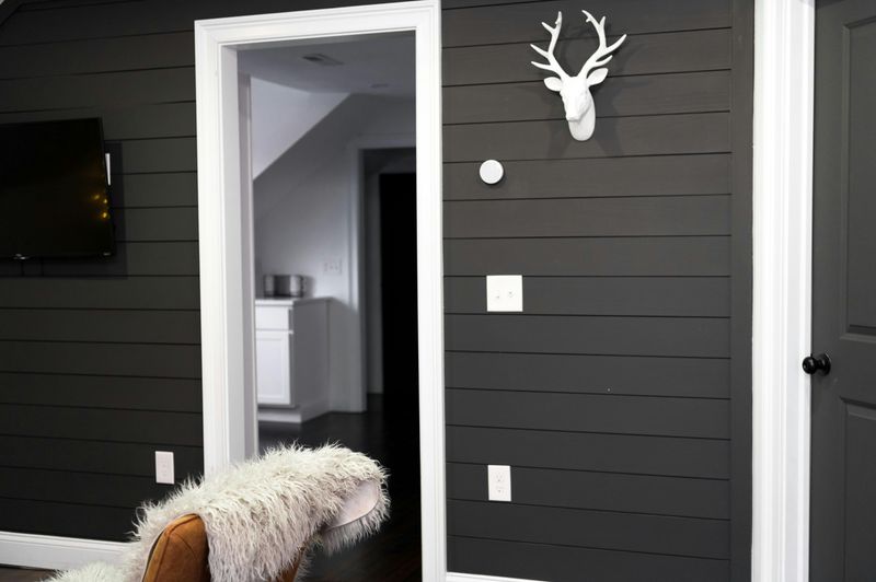
White plastic outlet covers scream for attention against dark walls, breaking the flow of your beautiful paint color. Matching covers to wall colors creates visual continuity that elevates the entire room.
Consider decorative plates in metallic finishes that complement your hardware, or splurge on flush outlets that virtually disappear. Smart placement matters too—planning outlet locations during renovations prevents awkward furniture arrangements forced by charging needs.
For existing rooms, simple solutions like cord covers, strategic furniture placement, or decorative boxes can disguise necessary but unsightly electrical elements without sacrificing function.
8. Ignoring The Fifth Wall
Flat white ceilings represent missed design opportunities in many homes. The ceiling—often called the fifth wall—can transform a room through color, texture, or pattern that complements your overall design.
For low ceilings, paint them a shade lighter than walls to create height. Taller ceilings can handle darker colors that make spaces feel cozier. Architectural details like beams, coffers, or even simple molding add dimension.
Wallpaper, stencils, or painted patterns on ceilings create unexpected visual interest that draws the eye upward and makes rooms feel complete rather than top-heavy or unfinished.
9. Matching Furniture Sets
Purchasing entire bedroom or living room sets straight from showroom floors creates spaces that feel impersonal and flat. Designer rooms gain depth through thoughtfully mixed pieces that share proportions but not manufacturers.
Try pairing vintage finds with contemporary pieces, or mixing wood tones and finishes while maintaining a consistent color temperature (warm or cool). Different textures—smooth, rough, shiny, matte—add sensory richness that matching sets lack.
Even budget-friendly rooms benefit from one unexpected element, like a distinctive chair or unusual coffee table, that breaks the matchy-matchy feel and adds personality.
10. Poor Curtain Placement
Hanging curtains directly above window frames at exact window width visually shrinks both windows and rooms. The most flattering placement extends rods 8-12 inches beyond window frames on each side and positions hardware 4-6 inches above the frame (or higher in rooms with tall ceilings).
Length matters tremendously—curtains should either kiss the floor, break slightly like trousers, or puddle luxuriously for formal spaces. The awkward floating curtain that ends inches above the floor creates an unintentional, unfinished appearance.
Proper placement creates the illusion of larger windows, higher ceilings, and more generous proportions throughout the room.