Have you ever walked into a home that just feels right, but you can’t quite put your finger on why? It’s probably because of the small details working together to create harmony. These little touches might seem unimportant on their own, but together they create the feeling of a thoughtfully designed space. From hardware to lighting, these elements work like invisible threads connecting every room in your home.
1. Matching Door and Cabinet Hardware
Imagine walking through a home where every doorknob, drawer pull, and cabinet handle speaks the same design language. This simple consistency creates an immediate sense of intention throughout your space.
Choosing hardware in complementary finishes—whether brushed nickel, matte black, or antique brass—establishes a subtle rhythm as you move from room to room. The style matters too; sleek modern handles in the kitchen feel jarring if paired with ornate vintage doorknobs elsewhere.
Even mixing metals can work beautifully when done purposefully, like pairing brass cabinet pulls with black hinges for contrast. This small detail might cost just a few hundred dollars to update but delivers massive impact.
2. Unified Switch Plates and Outlet Covers
Often overlooked, these functional necessities appear on virtually every wall in your home. Mismatched plastic covers—some almond, others white, a few beige—create visual noise that subtly disrupts your carefully planned décor.
Replacing all switch plates and outlet covers with matching styles instantly elevates your space. Consider upgrading from builder-grade plastic to brushed metal, sleek black, or decorative ceramic options that complement your overall design scheme.
For older homes with oddly positioned outlets, specialty covers can help them blend into walls. This weekend project typically costs under $100 yet delivers a remarkably polished look that guests notice subconsciously.
3. Continuous Trim and Molding Profiles
Crown molding, baseboards, and door casings serve as the framework for your home’s interior. When these architectural elements maintain consistent profiles throughout your space, they create an invisible outline that guides the eye smoothly from room to room.
Many homeowners make the mistake of installing different trim styles during various renovation phases. Instead, select one cohesive style—whether simple and modern or ornate and traditional—and carry it throughout your home.
The depth and scale should reflect your ceiling height; taller ceilings can support more substantial crown molding. This detail particularly shines in open-concept homes where multiple spaces flow together visually.
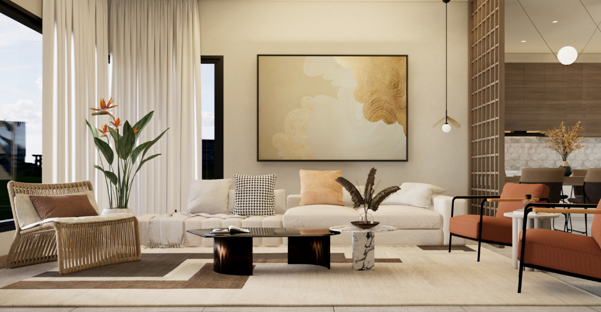
4. Harmonious Color Story
Color connects spaces like invisible threads. The most cohesive homes don’t necessarily use identical colors everywhere—they feature thoughtfully related hues that create pleasant transitions as you move through rooms.
Start by selecting 3-5 main colors for your entire home. Perhaps a warm neutral for walls, a complementary tone for large furniture pieces, and 1-2 accent colors that appear in accessories throughout. The kitchen might feature your accent color in dishware while the living room incorporates it in throw pillows.
Paint color cards make this easy—choose colors from the same strip or complementary strips. This approach allows each room to have personality while maintaining a conversation with adjacent spaces.
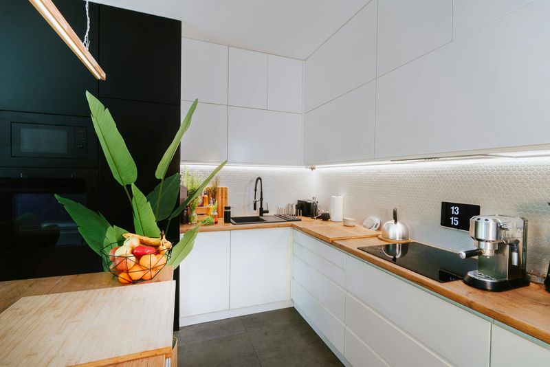
5. Recurring Material Textures
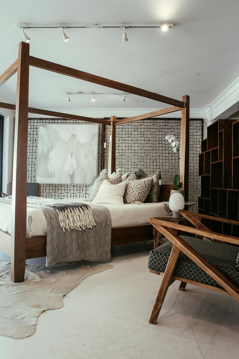
The tactile elements in your home speak volumes about your style. Repeating specific materials—whether natural wood tones, metal finishes, or stone textures—creates visual rhythm that makes spaces feel connected.
A wooden dining table that echoes the same wood species used in your kitchen open shelving creates immediate harmony. Similarly, the marble used in your kitchen counters might reappear in bathroom accessories or a living room side table.
Even fabric textures matter! The linen curtains in your bedroom might connect to linen throw pillows in the living room. These material echoes don’t need to be exact matches—variations in a theme often create more interesting, layered spaces that feel intentionally designed rather than matchy-matchy.
6. Coordinated Window Treatments
Windows frame your view of the outside world and dramatically impact how light enters your space. When window treatments vary wildly from room to room—blinds here, mismatched curtains there—they create visual chaos that disrupts the flow of your home.
You don’t need identical treatments everywhere, but maintaining a consistent approach works wonders. Perhaps all bedrooms feature the same style of Roman shades in coordinating fabrics, while living spaces use simple linen panels hung at the same height.
Consider practical needs by room (privacy, light control) while maintaining visual consistency through color, material, or mounting style. Even mixing treatment types can work beautifully when there’s an intentional connection between them.
7. Seamless Flooring Transitions
Nothing disrupts visual flow quite like awkward flooring changes. The junction where hardwood abruptly meets tile or carpet deserves thoughtful planning to maintain harmony throughout your home.
Smart transitions occur at logical boundaries—doorways, changes in room function, or architectural shifts. When possible, carry the same flooring through connected spaces, especially in open-concept areas. For necessary material changes, consider complementary colors and thoughtful transition strips.
Flooring direction matters too! Wood planks or tile laid in the same direction throughout creates continuity, while herringbone patterns can mark special areas without disrupting flow. This foundational element sets the stage for everything above it, making it worth careful consideration.
8. Consistent Baseboard Proportions
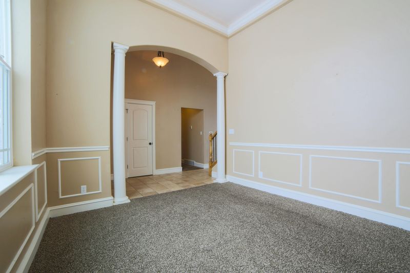
Baseboards might seem like mundane details, but their height and style dramatically impact how finished a space feels. These humble trim pieces create a crucial transition between walls and flooring throughout your home.
Maintaining consistent baseboard height (typically 4-6 inches for modern homes) creates an uninterrupted visual line that connects rooms. Even when wall treatments change, this continuous element helps spaces feel related rather than disjointed.
For homes with varying ceiling heights, consider proportional consistency instead of identical measurements. Taller ceilings can support taller baseboards, but maintaining the same style creates cohesion. This detail particularly shines in hallways and open areas where multiple rooms connect visually.
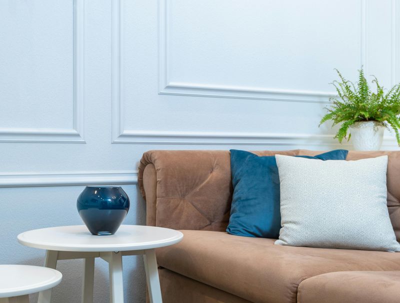
9. Strategic Accent Color Repetition
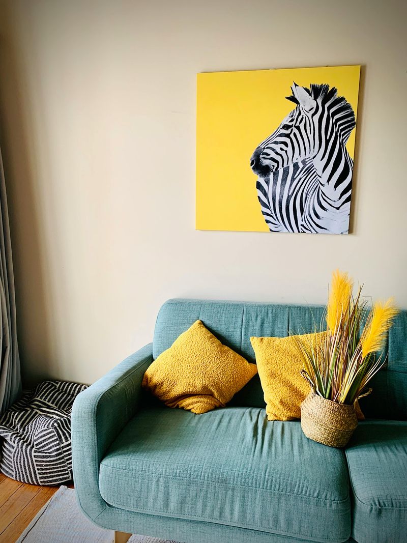
Remember playing “I Spy” as a kid? Accent colors work similarly in home design—creating a delightful game of visual connection as the same hue appears throughout different spaces.
The emerald green in your living room throw pillows might reappear in kitchen canisters, then echo again in bathroom hand towels or bedroom art. This intentional repetition creates a sense that spaces are in conversation with each other rather than existing as isolated rooms.
Limit yourself to 2-3 accent colors for maximum impact. Too many competing accents create chaos rather than cohesion. This approach allows easy seasonal refreshes—swap out accessories in your accent colors rather than repainting entire rooms.
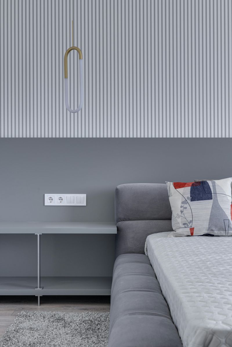
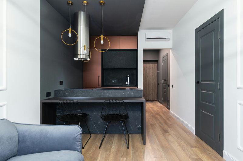
10. Cohesive Lighting Elements
Light fixtures serve as jewelry for your home—functional art pieces that can either connect or disconnect your spaces. The most harmonious homes feature lighting with related design elements, even when individual fixtures differ by room.
Perhaps all pendant lights share a similar metal finish while ceiling fixtures maintain consistent shapes. Even mixing vintage and modern pieces works beautifully when connected through color, material, or form.
Consider light temperature too! Bulbs with consistent color temperatures (measured in Kelvins) ensure your spaces feel connected rather than jarring. Warm lighting (2700-3000K) creates inviting ambiance throughout, while mismatched temperatures can make adjacent rooms feel disconnected even when their design elements match perfectly.
11. Thoughtful Art Arrangement
Art transforms houses into homes, but haphazard placement creates visual chaos. The secret? Consistent hanging heights and thoughtful groupings that speak to each other across rooms.
Gallery walls don’t need identical frames, but maintaining similar finishes or matting styles creates subtle connections. Perhaps black frames in the dining room relate to black-framed mirrors elsewhere. Or maybe your art collection features complementary color palettes that echo your home’s overall scheme.
Standard hanging height (57-60 inches from floor to center) creates a unified horizontal line throughout your home. This approach feels especially impactful in hallways and open spaces where multiple art pieces can be viewed simultaneously, creating a curated gallery feel.