Interior designers spend their careers studying spaces, learning what works and what doesn’t, and perfecting the art of creating beautiful, functional homes. Through years of experience, they develop a keen eye for spotting design mistakes that most people might overlook.
When it comes to their own homes, these professionals know exactly what to avoid, steering clear of certain trends, materials, and decorative choices that can cheapen a space or create unnecessary headaches. Here are eleven things you’ll rarely, if ever, find in an interior designer’s personal living space.
1. Artificial Flowers That Collect Dust
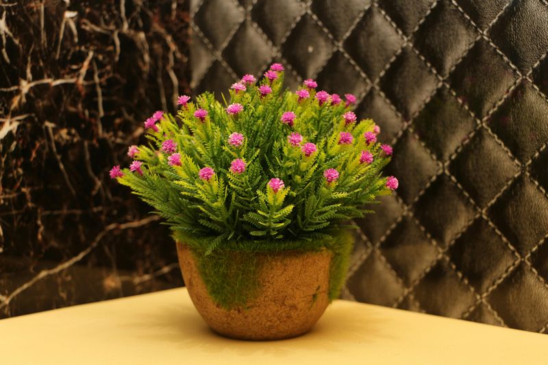
Walk into any designer’s home and you’ll notice something missing: fake flowers sitting on every surface.
While silk blooms might seem like a low-maintenance solution, they become magnets for dust and grime over time.
Real flowers bring life, fragrance, and genuine beauty to a room, even if they only last a week.
Designers prefer empty vases or seasonal branches over plastic petals any day.
If maintenance is a concern, sculptural objects or art pieces make far better focal points.
The authenticity of natural elements simply cannot be replicated by manufactured alternatives.
When something looks fake, it cheapens the entire aesthetic of a carefully curated space, no matter how expensive the rest of the decor might be.
2. Decorative Mason Jars as Statement Pieces

Mason jars had their moment in the spotlight, appearing everywhere from weddings to kitchen counters.
However, designers have moved far beyond this overused trend.
These utilitarian containers rarely add sophistication to a space and often signal a lack of design confidence.
Professional designers choose vessels with interesting shapes, textures, or historical significance instead.
A vintage ceramic crock or hand-blown glass container tells a much richer story.
The rustic farmhouse look that mason jars represent has become dated and predictable.
When every home improvement blog features the same DIY mason jar projects, it’s time to explore more original options that reflect personal style rather than following exhausted trends.
3. Roller Shades for Window Treatments
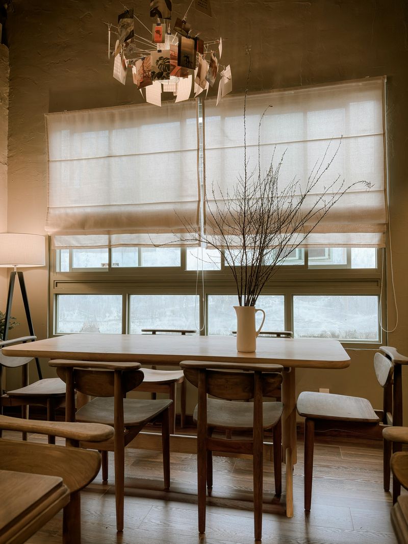
Window treatments frame your view and control light, making them crucial design elements.
Roller shades, despite their practical benefits, often appear outdated and institutional in residential settings.
They lack the softness and sophistication that custom drapery or Roman shades provide.
Designers gravitate toward layered window treatments that add depth and visual interest.
Combining sheer panels with heavier drapes creates flexibility for light control while maintaining elegance.
The harsh, straight lines of roller shades can make rooms feel cold and unwelcoming.
Even budget-conscious designers find creative alternatives like bamboo shades or simple linen curtains that bring warmth without breaking the bank or sacrificing style for mere functionality.
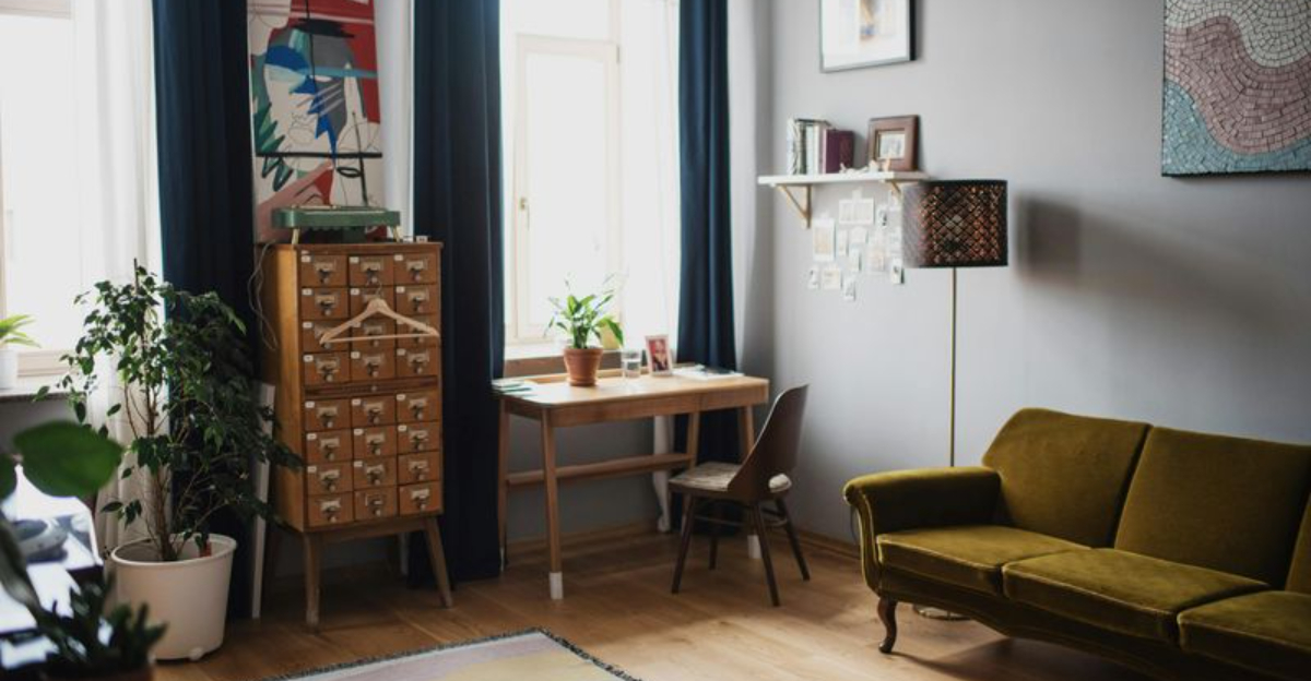
4. Matching Bedroom Furniture Sets
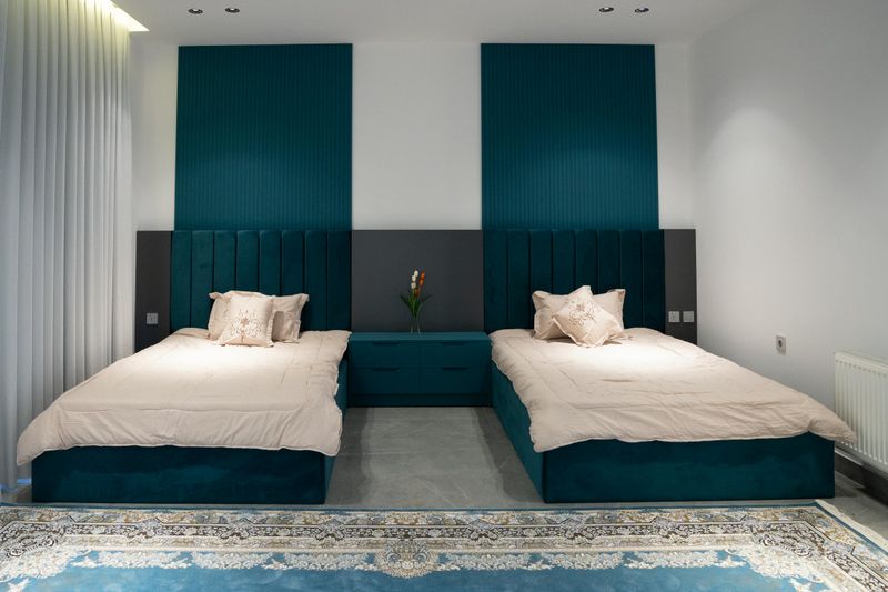
Furniture showrooms love to sell complete bedroom sets with matching nightstands, dressers, and headboards.
Designers, however, understand that this approach creates spaces that feel generic and hotel-like.
Mixing different pieces adds character and tells a more interesting visual story.
A vintage dresser paired with a modern bed frame creates unexpected harmony.
Combining various wood tones and styles demonstrates confidence and personal taste.
Matchy-matchy furniture removes the opportunity for creativity and self-expression.
Professional designers curate their bedrooms like art galleries, selecting pieces that complement each other without being identical twins, resulting in spaces that feel collected over time rather than purchased in one shopping trip.
5. Meaningless Filler Accessories
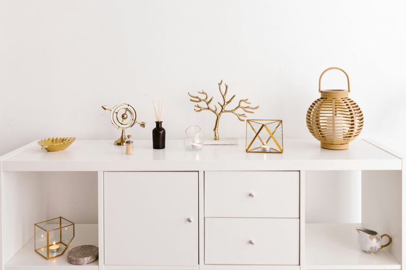
Those generic decorative objects that fill store shelves serve only one purpose: taking up space.
Interior designers stock their shelves with items that hold personal significance or visual interest.
A souvenir from travels, family heirlooms, or handmade pottery from local artisans carry stories that mass-produced tchotchkes never could.
Every object in a well-designed home should earn its place through beauty, function, or emotional connection.
Random decorative balls in a bowl or meaningless sculptures add clutter without value.
Designers edit ruthlessly, displaying only pieces that spark conversation or joy.
This intentional approach creates depth and authenticity, transforming houses into homes that reflect the people living there rather than catalog pages.
6. Red and Black Color Schemes
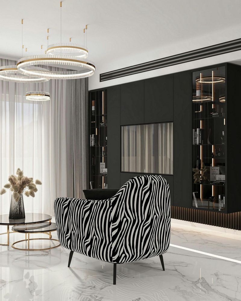
Color psychology plays a powerful role in how spaces make us feel.
Red and black combinations create dramatic, aggressive environments that most designers avoid in residential settings.
These high-contrast pairings can feel overwhelming and make relaxation nearly impossible.
While a pop of red as an accent might work in small doses, painting entire rooms in this color scheme creates visual tension.
Black walls absorb light and make spaces feel smaller and cave-like.
Designers prefer softer, more sophisticated palettes that stand the test of time.
Neutrals with layered textures or muted jewel tones create depth without the harshness, allowing rooms to feel both stylish and livable for years to come.
7. Polypropylene Rugs That Wear Quickly
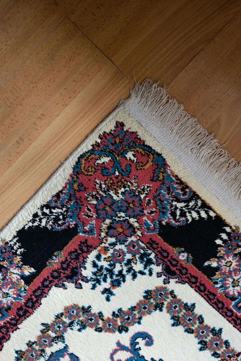
Budget-friendly polypropylene rugs tempt homeowners with their low price tags and stain resistance.
Designers know these synthetic materials flatten quickly, losing their shape and appearance within months of regular use.
The plastic-like texture never develops the patina that natural fiber rugs acquire over time.
Wool, cotton, or jute rugs might cost more initially but provide better value through longevity and beauty.
Natural materials feel better underfoot and improve with age.
Polypropylene rugs also off-gas chemicals and lack the depth and richness of natural fibers.
Investing in quality rugs transforms a room’s foundation, making the space feel more grounded and intentionally designed rather than cheaply decorated.
8. Open Clothing Racks on Display
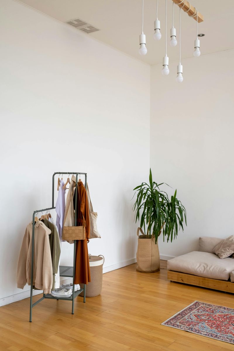
Instagram might make exposed clothing racks look effortlessly chic, but reality tells a different story.
Maintaining a perfectly styled clothing rack requires constant curation, color coordination, and tidying that most people simply don’t have time for.
One messy day and the entire aesthetic crumbles into visual chaos.
Designers prefer closed storage solutions that hide the inevitable clutter of daily life.
Armoires, built-in closets, or dressers keep clothing protected from dust while maintaining clean lines.
Exposed garments fade from sunlight and collect dust, shortening their lifespan.
The high-maintenance nature of display racks makes them impractical for real living, despite how photogenic they might appear in carefully staged photos.
9. Molded Sink and Counter Vanities
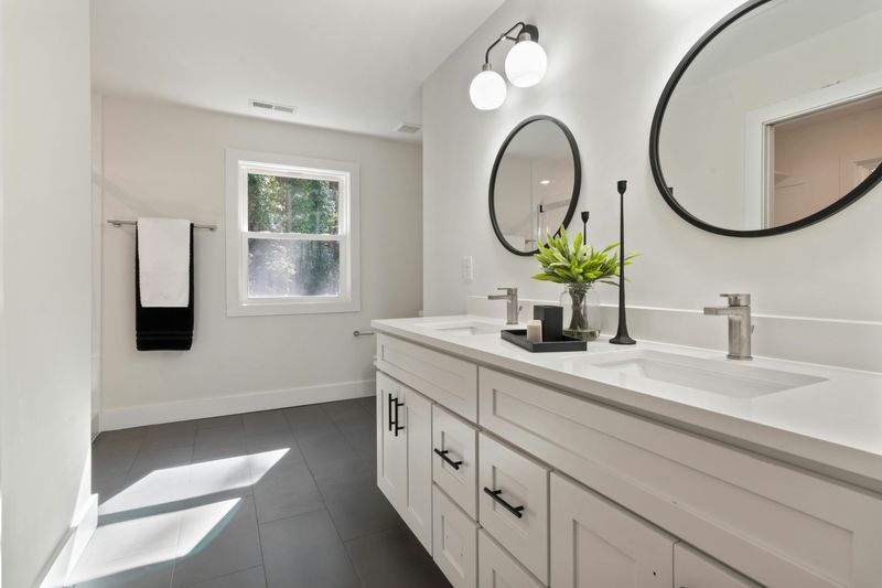
Bathroom vanities with integrated sinks and counters might seem practical, but they lack character entirely.
These one-piece units scream builder-grade and offer no opportunity for customization or personality.
Designers prefer separate components that can be mixed, matched, and replaced independently over time.
A beautiful vessel sink paired with a unique countertop material creates visual interest and elevation.
The seamless molded look feels institutional rather than residential.
When damage occurs to one section of a molded unit, the entire piece requires replacement, proving costly and wasteful.
Separating elements allows for easier updates and repairs while creating bathrooms that feel thoughtfully designed rather than quickly constructed by developers.
10. Floor-to-Ceiling Mirrored Walls
Mirrored walls became popular in the 1980s for making small spaces appear larger.
Unfortunately, this trick often backfires, creating disorienting environments that feel more like dance studios than homes.
The constant reflection becomes visually exhausting and makes rooms feel cold and impersonal.
Designers use mirrors strategically as accent pieces rather than architectural features.
A well-placed mirror can bounce light beautifully without overwhelming the senses.
Large mirrored walls also highlight every fingerprint, smudge, and imperfection, requiring constant cleaning.
They’re difficult to decorate around and date a space immediately, making homes feel stuck in a specific era rather than timeless and thoughtfully composed through careful design choices.
11. Textured Walls and Popcorn Ceilings
Popcorn ceilings and heavily textured walls served practical purposes decades ago, hiding imperfections and absorbing sound.
Today, these surfaces look outdated and collect dust, cobwebs, and grime that’s nearly impossible to clean effectively.
They also make future repairs and painting significantly more difficult and expensive.
Smooth walls and ceilings create clean canvases for art, lighting, and furniture to shine.
Modern designers embrace the simplicity of flat surfaces that reflect light beautifully.
Texture can be introduced through fabrics, artwork, and accessories rather than permanent architectural features.
Removing these dated finishes instantly modernizes a space and increases property value while creating the sophisticated backdrop that quality design requires.