Adding soft pastel colors to your home creates a feeling of light and happiness no matter what season it is outside. These gentle hues can transform a dull space into a cheerful sanctuary without overwhelming your existing decor. From simple accessories to statement furniture pieces, pastel touches offer an affordable way to refresh your living space throughout the year.
1. Dreamy Accent Pillows
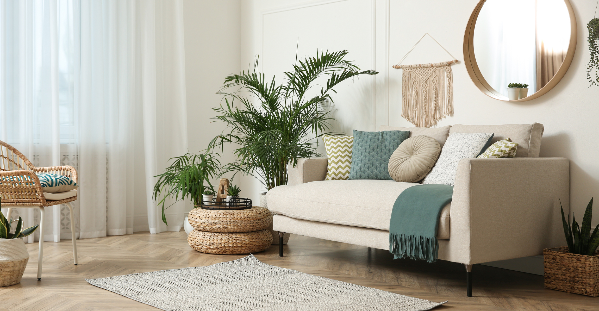
Tossing a few pastel pillows onto your sofa instantly refreshes your living room without a major commitment. Soft pinks, blues, and mint greens mix beautifully with neutral furniture, creating a welcoming atmosphere that guests will notice right away.
For seasonal updates, simply swap pillow covers rather than buying entirely new pillows. Cotton and linen fabrics work wonderfully for spring and summer, while velvet and knit textures bring coziness to fall and winter months.
The best part? You can rearrange these colorful accents throughout your home whenever you crave a change, moving them from sofa to bedroom to reading nook with minimal effort.
2. Blush-Tinted Accent Wall
Painting just one wall in a soft blush tone creates a focal point without overwhelming your space. This subtle backdrop works magic with both modern and vintage furnishings, bringing warmth and dimension to rooms that previously felt flat or uninspired.
Morning light makes blush walls glow with a flattering warmth that complements all skin tones—perfect for spaces where you entertain or take photos. Evening lighting transforms the same color into a cozy, intimate backdrop.
Not ready for permanent paint? Removable wallpaper in soft pink offers the same effect without the commitment, making it perfect for renters or the design-indecisive.
3. Mint Green Furniture Statements
A mint green cabinet or dresser becomes the conversation piece every room needs. This refreshing color evokes springtime all year round while pairing beautifully with woods, metals, and other pastel companions.
Vintage furniture pieces take on new life with mint paint, creating that perfect balance between nostalgic and modern. The color works equally well in kitchens, bedrooms, and living spaces, making it versatile for whole-home coordination.
For smaller spaces, try a mint green side table or bookshelf that adds color without dominating the room. The key is finding that perfect shade—not too bright, not too muted—that makes your heart happy every time you see it.
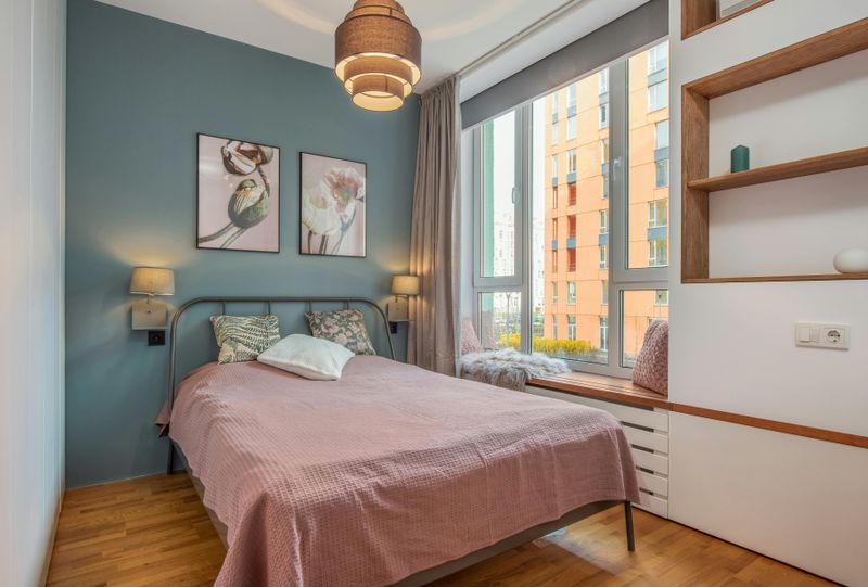
4. Lavender Linens for Sweet Dreams
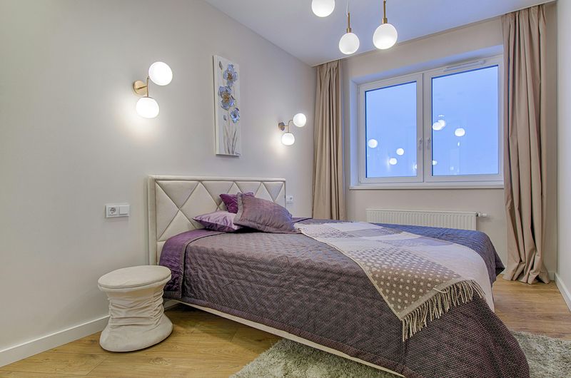
Lavender bedding transforms your bedroom into a serene retreat reminiscent of fragrant flower fields. This gentle purple hue promotes relaxation naturally, making it perfect for spaces dedicated to rest and rejuvenation.
Layer different shades and textures of lavender for dimension—perhaps a lilac duvet with deeper purple throw blankets or lighter pillowcases. The color pairs beautifully with grays, whites, and natural wood tones for a balanced look that never feels childish.
Beyond the bedroom, lavender throws draped over living room furniture bring this calming color into shared spaces. The subtle hue works surprisingly well as a neutral, complementing rather than competing with existing decor.
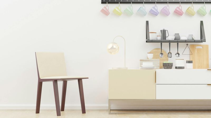
5. Sunshine Yellow Accents
Small touches of pale yellow bring unexpected joy to any room, mimicking sunlight even on cloudy days. A butter-yellow lamp base, a collection of pale lemon vases, or a soft gold picture frame can lift spirits instantly without overwhelming your color scheme.
Yellow particularly shines in rooms with limited natural light, creating the illusion of sunshine in basement apartments or north-facing spaces. Place these accents where they’ll catch your eye during daily routines—perhaps a yellow teapot that brightens morning coffee or a pale yellow clock that makes checking the time a moment of happiness.
This versatile pastel pairs beautifully with grays and blues for a contemporary feel, or with whites and creams for a softer, cottage-inspired approach.
6. Peachy Window Treatments
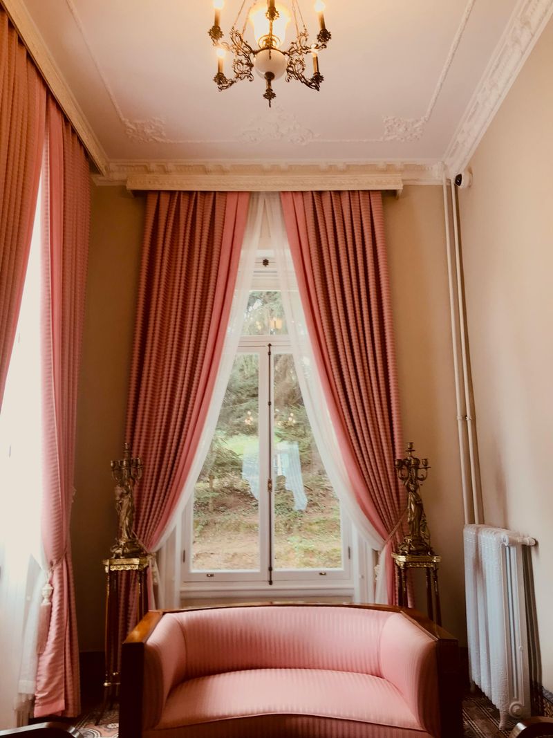
Peach or coral curtains filter sunlight into a warm, flattering glow that transforms any room throughout the day. This unexpected window treatment creates a subtle sunset effect that makes spaces feel instantly cozier and more inviting than standard white or beige options.
Sheer peach fabrics maintain privacy while allowing maximum light, perfect for bedrooms and living areas. For rooms needing more darkness, layer peach sheers under neutral blackout curtains that can be pulled back during daytime hours.
The beauty of peach tones lies in their versatility—they complement both cool and warm color schemes, working with everything from crisp whites to rich browns. When evening light hits these curtains, the entire room bathes in a golden-hour glow year-round.
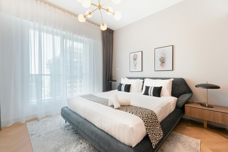
7. Powder Blue Seating Spots
A powder blue accent chair or couch can create the perfect reading nook or conversation spot in any room. This calming color encourages relaxation while adding architectural interest through furniture silhouettes rather than bold patterns or bright colors.
Velvet or linen upholstery in sky blue tones adds textural dimension that changes subtly as light shifts throughout the day. Place these seating options near windows where natural light enhances their color, or in darker corners where they brighten otherwise overlooked spaces.
For smaller homes, a powder blue ottoman serves double duty as both seating and a soft color statement that can be easily moved between rooms. The versatility of this pastel shade means it works equally well in traditional, modern, or eclectic decorating schemes.
8. Seafoam Floor Coverings
A pastel seafoam rug anchors a room while visually expanding the space—lighter colors make floors appear larger than darker alternatives. This refreshing hue brings a subtle beach-inspired feel without resorting to obvious coastal themes or patterns.
Seafoam works wonderfully in high-traffic areas like living rooms and hallways, as the color naturally hides minor dirt between cleanings better than pure white options. Pair with natural wood tones for an organic feel, or with metallics for a more glamorous interpretation.
Beyond standard rectangular rugs, consider seafoam runners for hallways or round rugs under dining tables for unexpected applications of this versatile pastel. The color’s natural association with water makes it subconsciously cooling—perfect for homes in warmer climates.
9. Rosy Wall Artwork
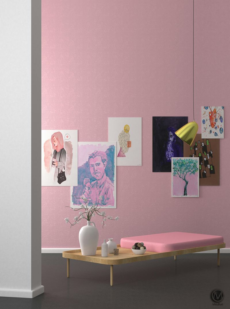
Dusty rose artwork brings warmth to walls without the commitment of pink paint. Abstract pieces featuring blush tones create sophisticated focal points that elevate rooms beyond basic white walls and standard prints.
Gallery walls mixing rose-tinted photography, paintings, and prints add dimensional interest while maintaining a cohesive color story. The beauty of pink art lies in its chameleon-like quality—appearing more vibrant in morning light and settling into a deeper, moodier tone by evening.
For maximum impact, hang rose artwork against contrasting walls—deep navy, soft gray, or clean white all make pastel art pop. Consider oversized pieces for minimalist spaces or collections of smaller works for more traditional rooms, letting the gentle color be your unifying element.
10. Plant Pots with Pastel Personality
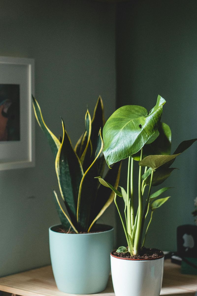
Mint green planters transform ordinary houseplants into purposeful decor elements that breathe life into any room. The contrast between lush greenery and soft pastel containers creates a fresh, intentional look that plastic nursery pots simply can’t achieve.
Group different sizes of matching mint pots for a cohesive collection, or mix pastel planters in complementary hues for an eclectic approach. The gentle colors particularly enhance the appearance of plants with silver or purple-toned foliage like snake plants, lavender, or purple heart.
Beyond aesthetics, pastel planters serve as visual reminders to care for your plants—their noticeable presence ensures you won’t forget to water your leafy friends. Place them on windowsills, shelves, or plant stands where their color can catch light throughout the day.
11. Whimsical Wallpaper Moments
Pastel wallpaper transforms spaces without overwhelming them, especially when used thoughtfully in smaller areas. Think powder rooms, reading nooks, or the backs of bookshelves where soft-patterned papers create unexpected moments of joy.
Floral patterns in muted lavenders and blush tones bring a garden-inspired freshness indoors year-round. For more contemporary spaces, geometric prints or subtle stripes in seafoam or powder blue add architectural interest without permanent construction.
Modern peel-and-stick options make pastel wallpaper accessible even for renters or the commitment-phobic. Try wrapping just the lower half of a wall for a modern take on wainscoting, or create a focal wall behind your bed or desk where you’ll appreciate the pretty backdrop daily.
12. Creamy Furniture with Colorful Details
White furniture pieces with pastel-painted legs or trim offer the perfect balance between neutral and playful. A cream-colored desk with blush pink drawer pulls or a white bookcase with mint green shelves adds personality without dominating your color scheme.
This two-tone approach works particularly well for inherited or secondhand furniture that needs refreshing. By keeping the majority surface white, the pieces remain versatile while pastel accents add that custom, curated look everyone covets.
For an easy weekend project, try painting just the interior back panel of a white cabinet in soft lavender, or adding baby blue caps to white table legs. These small colorful moments create visual interest that draws the eye without requiring a complete furniture overhaul.
13. Glowing Pastel Illumination
Soft-colored lighting transforms ordinary rooms into magical spaces, especially during evening hours. Paper lanterns in baby blue, blush lampshades on bedside tables, or mint green pendant lights above kitchen islands create ambiance that standard white lighting simply cannot match.
The glow from pastel light sources casts a flattering, filtered illumination that makes everyone and everything look better. Pink-tinted bulbs or shades are particularly complimentary to skin tones, making dining areas and bathrooms feel like they’re equipped with built-in filters.
For temporary or seasonal lighting, pastel-colored string lights or candles in colored glass holders add festive touches without permanent installation. The subtle colored glow creates depth and dimension, turning basic rooms into layered, intentional spaces with minimal effort.