 MomSkoop
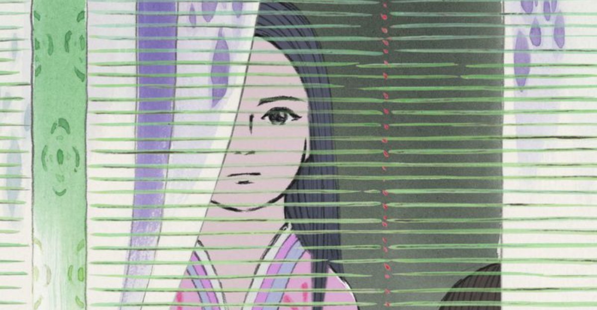
Some anime are unforgettable not just because of their stories, but because of how they look. From watercolor dreamscapes to neon-soaked chaos, certain shows push animation into something closer to art.
These 14 anime stand out from the crowd with visual styles so unique, you could recognize them in a single frame. Get ready to see just how creative animation can truly get.
1. Mononoke
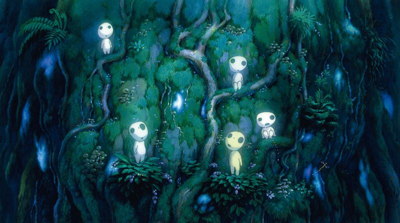
Flat, golden, and almost alive with pattern, Mononoke looks less like a cartoon and more like a museum exhibit that decided to move.
Every frame is packed with ukiyo-e-inspired textures, decorative borders, and color combinations that feel ancient and electric at the same time.
The Medicine Seller travels through haunted spaces that shift and ripple with ornate design, making each story feel genuinely otherworldly.
The show aired in 2007 and was a spinoff of Ayakashi: Samurai Horror Tales, but it quickly outgrew its origins.
Few anime commit this hard to a visual identity.
Watching Mononoke feels like flipping through a supernatural art book that breathes.
2. The Tatami Galaxy
Words fly.
Colors flash.
Time collapses.
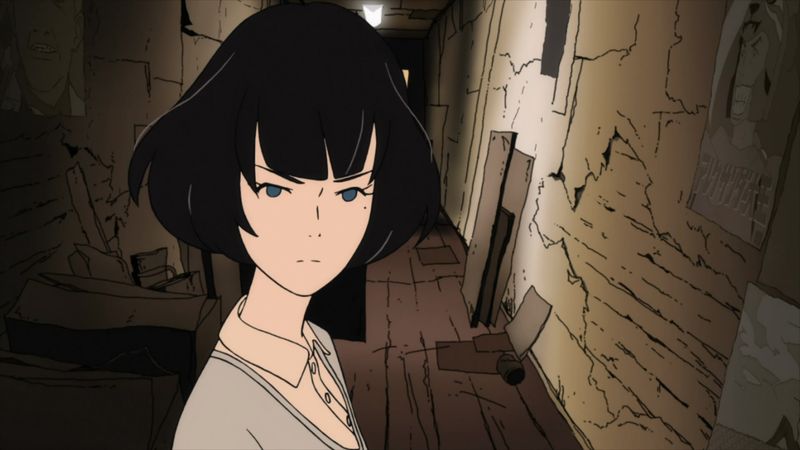
The Tatami Galaxy moves at a pace that feels almost impossible to follow, and that is completely the point.
The show tells the story of a college student reliving his university years, and its animation reflects that frantic, looping energy perfectly.
Character designs are exaggerated and angular, with flat shading and bold outlines that feel like a graphic novel in motion.
Director Masaaki Yuasa pushed the animation team to match the breakneck speed of the original novel’s narration, and the result is something genuinely one-of-a-kind.
Even viewers who struggle to keep up agree: The Tatami Galaxy is visually thrilling in a way that rewards repeated watching.
3. Ping Pong the Animation
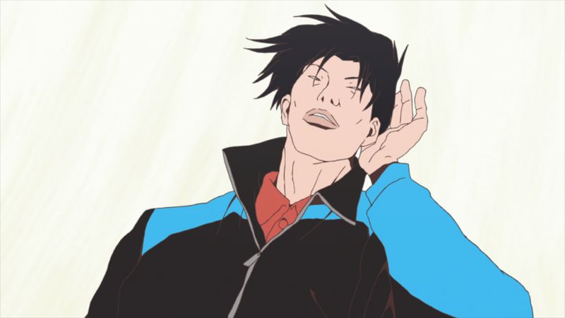
Most sports anime look polished and dramatic.
Ping Pong the Animation looks like someone drew it on a napkin during lunch, and that is exactly why it works so well.
The rough, sketch-like linework gives every match a raw, nervous energy that slick animation simply cannot replicate.
Based on Taiyo Matsumoto’s manga, the show embraces wobbly anatomy and scratchy outlines as stylistic choices, not mistakes.
Director Masaaki Yuasa treated the imperfect look as a strength, letting the art feel as unpredictable as the characters themselves.
Viewers expecting conventional sports animation are often caught off guard.
But once the style clicks, it becomes impossible to imagine this story told any other way.
4. JoJo’s Bizarre Adventure
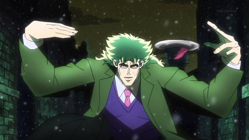
Nobody poses quite like a JoJo character.
Arms twisted at impossible angles, chins jutting forward, legs spread wide like they are about to model for a magazine cover while also punching someone into another dimension.
JoJo’s Bizarre Adventure turned fashion-editorial posing into a combat art form.
Creator Hirohiko Araki drew heavy inspiration from Western fashion photography, and that influence bleeds into every panel and frame.
The anime adaptation leaned into the surreal color shifts, flipping skies from orange to purple mid-scene just because it looked incredible.
The shading is dramatic, the outlines are thick, and the whole aesthetic is confidently weird.
JoJo does not follow visual trends.
It creates them.
5. Mob Psycho 100
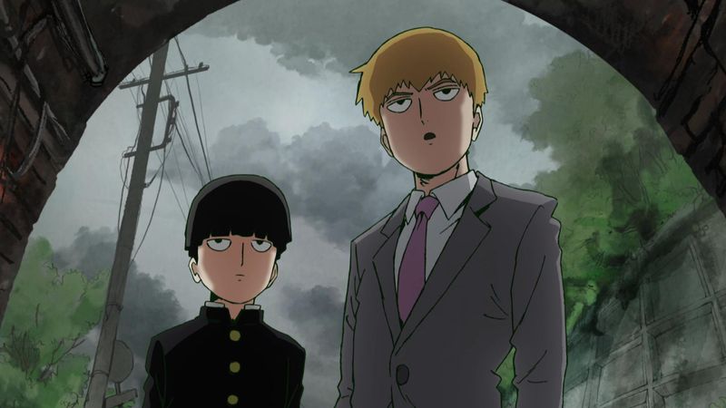
Mob Psycho 100 looks like five different artists collaborated on a single frame, and somehow it works beautifully.
The show blends loose, sketchy character lines with bursts of painted color, pencil textures, and abstract psychedelic explosions that feel genuinely handmade.
Studio Bones gave animators unusual freedom, allowing experimental techniques like smear frames and mixed media to run wild during action sequences.
The result is some of the most exciting animation ever produced for television.
What makes it even more clever is the contrast.
Mob himself is drawn simply, almost blandly, which makes the visual chaos surrounding his powers feel even more overwhelming.
Creator ONE originally drew the manga in a deliberately rough style, and the anime honored that spirit completely.
6. Land of the Lustrous
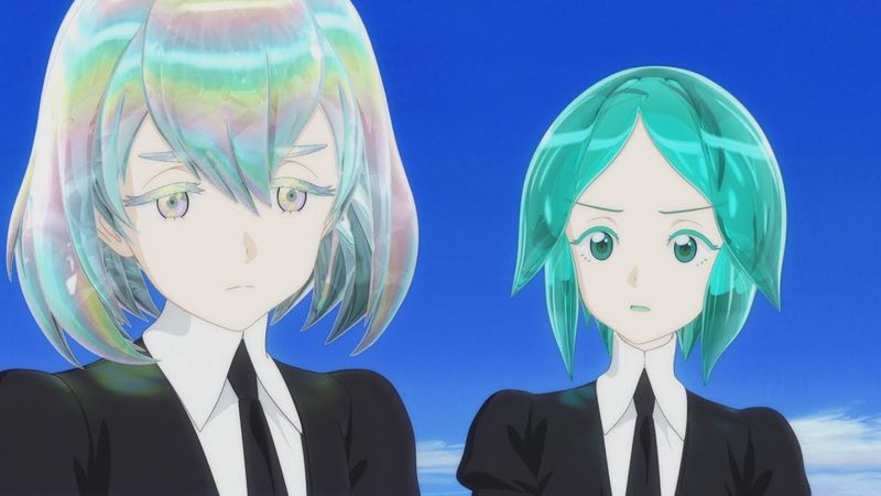
At first glance, Land of the Lustrous looks like no other anime in existence.
The characters are gem beings, and Studio Orange rendered them in 3D CGI with a level of care that makes each crystal body shimmer and refract light in genuinely beautiful ways.
Most anime fans approach CGI with skepticism, and for good reason.
But this show changed a lot of minds.
The elegant compositions, unusual camera angles, and cool, almost clinical color palette create an atmosphere that feels alien and meditative at the same time.
Released in 2017, it proved that 3D animation could carry real emotional weight when handled with artistic intention.
The visual style here is not a gimmick.
It is the story.
7. Keep Your Hands Off Eizouken!
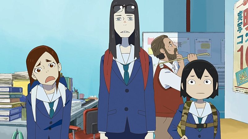
Eizouken is an anime about making anime, and it uses that premise to show off some of the most joyful animation sequences ever created.
Whenever the characters imagine their worlds, the screen transforms into rough concept-art sketches filled with mechanical gadgets, strange creatures, and half-finished environments that feel bursting with creative energy.
Director Masaaki Yuasa treated these imagination sequences as a love letter to the animation process itself.
The deliberately unfinished, hand-drawn look reflects how ideas actually feel when they first appear in a creative person’s mind.
The contrast between the ordinary school setting and the wild imaginary worlds makes each daydream sequence feel like a reward.
Few anime celebrate the act of creation with this much visible enthusiasm.
8. Devilman Crybaby
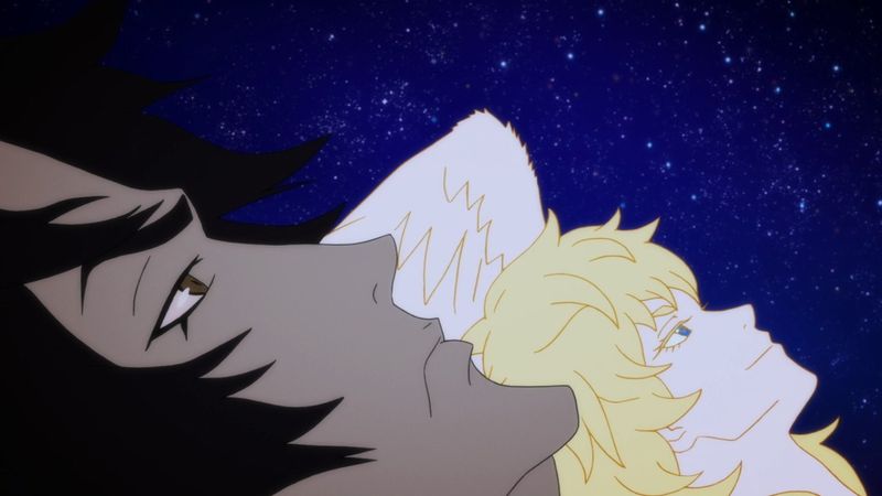
Devilman Crybaby does not ease you in.
Within minutes, the show’s raw, neon-drenched visual style makes it clear this is not a comfortable viewing experience, and that discomfort is very much the point.
Director Masaaki Yuasa stripped character anatomy down to loose, almost minimalist shapes that distort and stretch during moments of violence and transformation.
The neon palette is aggressive, all hot pinks, electric blues, and deep blacks that make every scene feel like it is about to combust.
Movement is fluid in an unsettling way, bodies bending beyond what feels natural.
Released on Netflix in 2018, it introduced a new generation to Go Nagai’s classic manga.
The visual approach perfectly matches a story about humanity colliding with something monstrous.
9. Gankutsuou: The Count of Monte Cristo
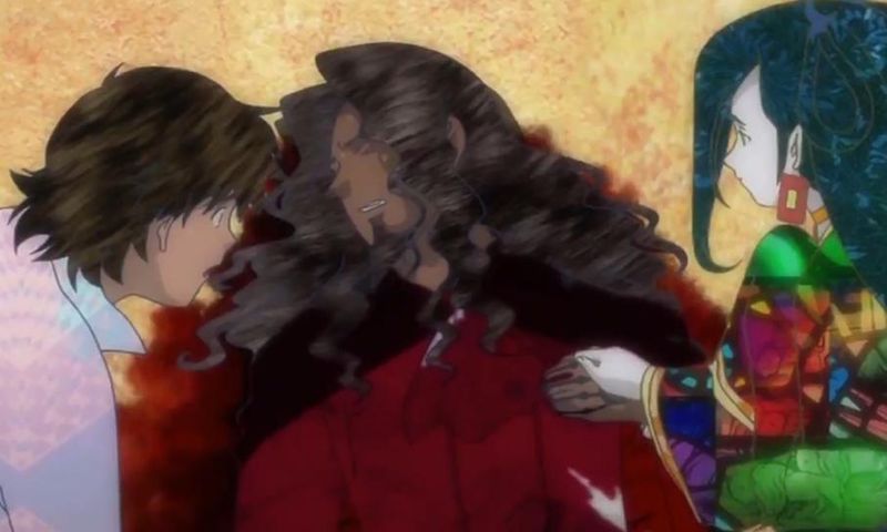
Gankutsuou pulls off a visual trick that sounds impossible: the patterns on characters’ clothing and skin do not move with them.
Instead, they stay fixed in place while the character animates over them, creating a collage-like, almost hallucinatory effect that is completely unlike anything else in animation.
Set in a futuristic sci-fi retelling of The Count of Monte Cristo, the show uses this technique to make its aristocratic world feel both glamorous and deeply wrong.
The elaborate digital textures, rich purples, and gold-threaded fabrics give every scene a theatrical, almost theatrical quality.
Director Mahiro Maeda wanted viewers to feel the excess and artificiality of high society.
The fixed-pattern animation technique delivers that feeling instantly, without a single word of dialogue needed.
10. Puella Magi Madoka Magica
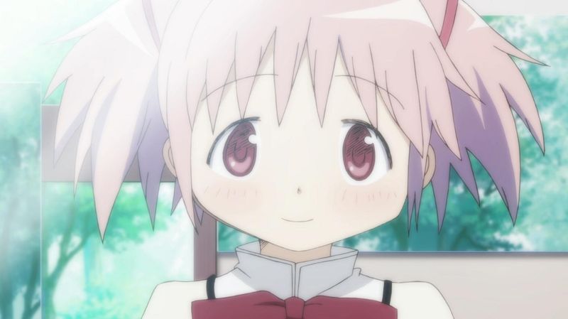
On the surface, Puella Magi Madoka Magica looks like a sweet magical girl show with big eyes, pastel colors, and adorable character designs.
That surface is a trap, and the anime knows exactly what it is doing.
When characters enter witch labyrinths, the visual style shatters into surreal mixed-media chaos.
Paper cutouts, crayon scribbles, German text, and collage imagery create nightmare worlds that feel genuinely disturbing against the otherwise cheerful art style.
Studio Shaft hired artist Gekidan Inu Curry to design these sequences, and the contrast they created is devastating in the best way.
The visual whiplash between cute and horrifying is not accidental.
It mirrors the show’s central theme: that innocence and darkness can exist in the same space, sometimes at the same time.
11. Kaiba
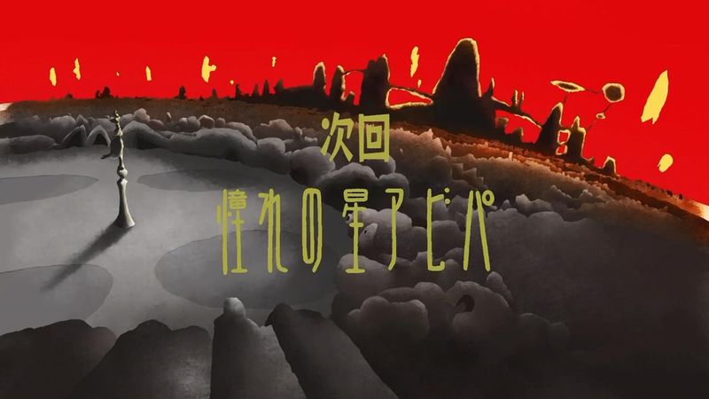
Kaiba looks like a children’s show from another planet.
The character designs are deceptively simple, almost cute, with round heads, tiny features, and soft pastel colors that suggest something gentle and safe.
Then the story begins, and the imagery becomes genuinely strange and often deeply unsettling.
Director Masaaki Yuasa used this contrast deliberately, pairing innocent-looking visuals with a science fiction world built on memory theft, body swapping, and social inequality.
The simplicity of the character art makes the disturbing content hit harder, not softer.
Released in 2008, Kaiba is still one of the most underappreciated visual experiments in anime history.
Its retro-cartoon aesthetic feels both nostalgic and alien, which perfectly reflects a story about identity slipping away from the people who need it most.
12. Tekkonkinkreet
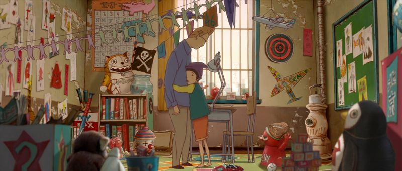
Tekkonkinkreet’s city, Treasure Town, feels like a place that grew without a plan, with crooked buildings stacked on top of each other and alleyways that twist in directions that should not be possible.
The warped, perspective-bending environments give the film a graffiti-art energy that feels both chaotic and alive.
Directed by Michael Arias and produced by Studio 4 degrees C, the 2006 film is based on Taiyo Matsumoto’s manga.
The visual approach blends rough urban textures with a storybook warmth, making Treasure Town feel dangerous and beloved at the same time.
The two main characters, Black and White, are drawn with loose, expressive lines that match their wild personalities.
Every frame rewards a slow look, packed with background details that tell their own quiet stories.
13. Redline
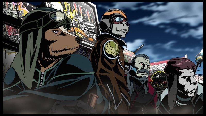
Seven years.
That is how long Koike Takeshi and Madhouse spent making Redline, and every single frame shows the effort.
The film is an explosion of hand-drawn animation pushed to its absolute limit, with racing sequences so fast and detailed they feel physically overwhelming to watch.
Heavy black shadows, extreme perspective angles, and exaggerated speed effects combine into something that feels closer to a moving comic book than a traditional film.
The character designs are retro-futuristic and wildly stylized, all big hair, sharp lines, and impossible cool.
Released in 2009 after years in production, Redline was not a major box office hit, but it became a cult classic almost immediately.
It stands as proof that hand-drawn animation, done with total commitment, can still do things digital tools simply cannot replicate.
14. The Tale of the Princess Kaguya
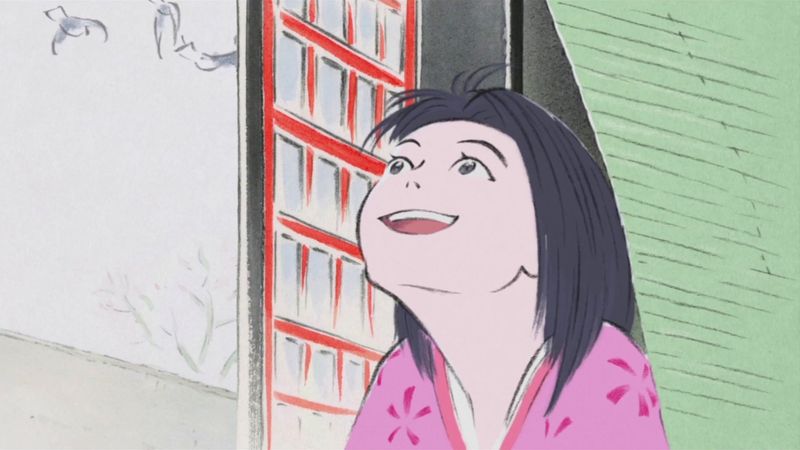
Studio Ghibli’s The Tale of the Princess Kaguya looks like a painting that learned to breathe.
Director Isao Takahata and art director Kazuo Oga created a visual style rooted in traditional Japanese ink-and-watercolor illustration, with soft brushstroke lines and muted, earthy tones that feel genuinely ancient.
Characters are sketched with loose, expressive strokes that shift in weight and detail depending on emotion.
During moments of distress, the art becomes even rougher and more frantic, as if the drawing itself is struggling to contain the feeling.
Released in 2013, the film took eight years to complete.
The result is one of the most visually gentle and emotionally powerful films Ghibli ever produced.
It proves that restraint and simplicity can carry just as much visual weight as spectacle.