Mixing different wood tones in your home can feel tricky, but it doesn’t have to be. When done right, combining various wood finishes adds warmth, depth, and character to any room.
The key is knowing a few simple tricks that help different woods work together instead of fighting for attention. With these smart strategies, you can create a beautifully layered look that feels intentional and stylish.
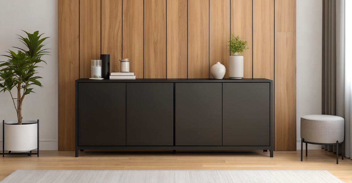
1. Start with a Dominant Wood Tone

Choosing one wood tone to be the star of your room makes everything else fall into place naturally. Think of this as your anchor—maybe it’s your flooring, a large dining table, or built-in shelving that covers a whole wall. Once you’ve picked your main player, the other wood pieces become supporting actors that complement rather than compete.
Your dominant tone should cover the largest surface area in the space. This creates visual stability and gives your eye a place to rest. When other wood tones appear in smaller doses, they add interest without overwhelming the room.
Most designers recommend sticking with one dominant tone throughout connected spaces for better flow.
2. Match Undertones for Harmony

Wood isn’t just light or dark—it has hidden color personalities called undertones. Some woods lean warm with golden, red, or orange hues, while others feel cool with gray or taupe notes. Neutral woods sit comfortably in between without leaning either direction.
Pairing woods with similar undertones creates instant harmony. A warm oak floor looks beautiful with a warm walnut coffee table because they speak the same color language. Mixing warm and cool undertones, however, can create tension that feels unintentional.
Hold wood samples next to each other in natural light to spot their true undertones. This simple check prevents clashing before you even bring furniture home.
3. Use Contrast Intentionally

Contrast creates drama and keeps a room from feeling flat. Pairing light wood with dark wood is like adding punctuation to a sentence—it gives your space rhythm and visual excitement. A pale ash dresser against a rich mahogany headboard tells a story of thoughtful design.
The trick is making contrast look deliberate, not accidental. Space out your light and dark pieces so they balance across the room. If all your dark wood clusters in one corner, it feels lopsided.
Aim for at least two shades of difference between contrasting woods. Too similar feels wishy-washy, while extreme opposites create bold, confident statements that really work.
4. Bring in a Unifying Accent Color

Sometimes different woods need a peacemaker, and that’s where accent colors come in. A repeated color in pillows, artwork, or rugs helps tie various wood tones together by giving your eye something else to follow. Navy blue, sage green, or burnt orange can work wonders.
Pick one or two accent colors and sprinkle them throughout the space. When your eye catches that same blue in a throw pillow, wall art, and lamp base, it creates connections that make mixed woods feel intentional.
This trick is especially helpful when you’ve inherited furniture from different places and need to make them feel like family.
5. Repeat Each Wood Tone at Least Once

Repetition is the secret ingredient that makes mixing woods look purposeful rather than random. If you have a cherry wood side table, echo that cherry tone somewhere else—maybe in a picture frame, shelf, or chair legs. This creates visual rhythm.
When a wood tone appears only once, it can look like a mistake or an afterthought. But when it shows up twice or more, it becomes part of the design story. Your brain recognizes the pattern and relaxes.
You don’t need huge pieces for repetition to work. Even small touches like wooden drawer pulls or decorative bowls count toward building that cohesive, layered look everyone loves.
6. Use Rugs or Textiles to Soften Transitions

Rugs act like friendly mediators between different wood tones, especially when they touch the floor. A beautiful area rug creates a buffer zone that lets various woods coexist peacefully. The rug’s colors and patterns distract the eye just enough to make transitions feel smooth.
Textiles like curtains, table runners, and upholstered chairs do the same job. They break up large expanses of wood and add softness that prevents the space from feeling too hard or busy. Fabric introduces texture that wood alone can’t provide.
Choose rugs and textiles that pull colors from your different wood tones. This weaves everything together into one harmonious design story.
7. Balance Grains and Textures

Wood grain is like personality—some pieces are bold and dramatic with swirling patterns, while others are quiet and smooth. Mixing both types adds dimension without relying only on color differences. A heavily grained oak table paired with smooth maple chairs creates interest through texture.
Too much bold grain in one space can feel chaotic, like everyone talking at once. Balance loud, dramatic grains with calmer, subtler ones. This gives your eyes places to rest while still keeping things interesting.
Pay attention to texture too—rough-hewn beams contrast beautifully with polished furniture. Variety in both grain and texture makes a room feel thoughtfully curated and genuinely lived-in.
8. Incorporate Painted or Upholstered Pieces as Buffers

Not every piece of furniture needs to be wood. Painted cabinets, upholstered chairs, and metal shelving create breathing room between different wood tones. These buffer pieces prevent wood overload and give each wooden element space to shine on its own.
White or cream painted furniture works especially well as a neutral separator. A white dresser between a pine bed frame and oak nightstands lets each wood stand out without competing. Upholstered pieces add softness and color variety.
Think of these buffers as palate cleansers in a fancy meal. They reset your visual experience so you can appreciate each wood tone fresh, making the whole room feel more balanced and intentional.
9. Use Metal Accents to Tie Tones Together

Metal accents like brass drawer pulls, iron lamp bases, or copper picture frames create unexpected unity among different woods. When the same metal finish appears throughout a room, it acts like jewelry that ties your whole outfit together. The eye follows the metal, connecting the dots.
Choose one metal finish and stick with it for consistency. Brass warms up a space and complements honey-toned woods, while black iron adds modern edge and works with cooler tones. Silver and chrome feel crisp and contemporary.
Even small metal details matter—cabinet hardware, curtain rods, and shelf brackets all count. These little touches create a thread that weaves through your mixed wood tones beautifully.
10. Keep Finishes Consistent

The shininess of wood—called its finish—matters just as much as its color. Mixing glossy, polished pieces with matte, natural ones can feel jarring, like wearing patent leather shoes with suede pants. Keeping finishes similar creates visual flow even when colors differ.
If your dining table has a satin finish, look for chairs and cabinets with similar sheen levels. All matte woods feel organic and casual together, while matching glossy finishes create sophisticated elegance. Consistency in shine helps different tones feel related.
You can always refinish pieces to match if you fall in love with furniture that has the wrong sheen. A quick sanding and new topcoat makes all the difference.