Color experts and interior designers have spoken, and the paint trends for 2026 are all about bringing nature indoors while embracing warmth and calm. From soothing blues to earthy browns, next year’s palette focuses on creating peaceful spaces that feel both modern and timeless.
Whether you’re planning a full room makeover or just refreshing an accent wall, these expert-approved shades will help transform your home into a stylish sanctuary.
1. Smoky Jade: The New Neutral
Forget everything you thought you knew about neutrals because smoky jade is rewriting the rules.
This muted blend of blue and green, like Behr’s “Hidden Gem,” creates a backdrop that feels fresh yet surprisingly versatile.
Designers love how it shifts throughout the day, appearing more blue in morning light and greener as evening approaches.
The shade works beautifully with both warm wood tones and crisp white trim, making it adaptable to various decorating styles.
Homeowners appreciate that it adds personality without overwhelming a space.
Unlike stark grays that can feel cold, smoky jade brings subtle color while maintaining that coveted neutral flexibility everyone craves for their walls.
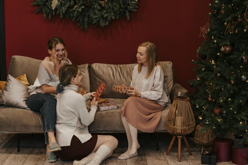
2. Warm Beige: Grounded Comfort
Soft and inviting, warm beige tones like Sherwin-Williams’ “Universal Khaki” are making a major comeback after years of cool gray dominance.
These grounded neutrals create an instant sense of coziness that makes any room feel like a warm hug.
They pair effortlessly with natural wood elements, from oak floors to walnut furniture, creating harmonious spaces that never feel dated.
The beauty of warm beige lies in its ability to complement both traditional and contemporary styles without competing for attention.
Whether you’re decorating a farmhouse kitchen or a modern office, these shades provide the perfect canvas.
Plus, they photograph beautifully, which matters in our Instagram-obsessed world.
3. Dusty Greens: Nature’s Embrace
Bringing the outdoors inside has never been easier than with dusty, earthy greens that capture the essence of forest walks and garden retreats.
These deep, nature-inspired tones evoke immediate feelings of calmness and help create that coveted connection to the natural world.
Interior designers recommend them for spaces where you want to unwind, like bedrooms or reading nooks, because they genuinely promote relaxation.
The muted quality keeps them from feeling too bold or overwhelming, unlike brighter greens that can tire the eyes.
They work wonderfully with natural materials like jute, linen, and rattan, enhancing that organic, grounded aesthetic.
Homeowners report feeling more peaceful in rooms painted these soothing shades.
4. Tranquil Teals: Jewel-Toned Serenity
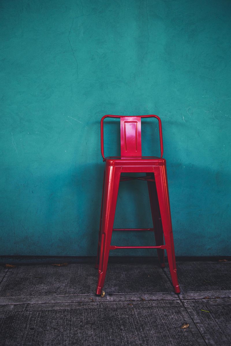
Straddling the line between sophisticated and soothing, tranquil teals deliver jewel-toned richness without sacrificing calmness.
These blue-green-teal shades bring depth and character to spaces that might otherwise feel bland with standard neutrals.
Bathrooms especially benefit from teal’s spa-like qualities, transforming ordinary powder rooms into luxurious retreats.
The color’s versatility shines when paired with both warm metals like brass and cool finishes like chrome or nickel.
Unlike trendy colors that quickly feel dated, teal has staying power because it balances boldness with timelessness.
Decorators suggest using it in smaller spaces first to experience its mood-boosting effects before committing to larger rooms.
The payoff is absolutely worth it.
5. Rich Browns: Moody Depth
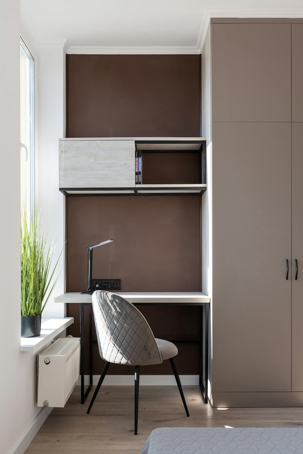
Chocolate, carbon-brown, and near-black brown shades are having a major moment as homeowners embrace moody, dramatic interiors.
These grounding hues bring unexpected warmth and depth, especially when used on accent walls or in rooms with plenty of natural light.
The richness creates instant sophistication without requiring expensive furnishings or elaborate decor.
Brown’s versatility surprises many people—it pairs beautifully with jewel tones, soft pastels, and crisp whites alike.
Home offices and libraries particularly benefit from these shades, as they promote focus and create cozy, cocoon-like environments perfect for concentration.
The key is balancing darker walls with lighter furniture and adequate lighting to prevent spaces from feeling too heavy or closed-in.
6. Muted Pastels: Airy Elegance
Soft blues, sea-glass greens, and light lavenders are proving that pastels can be sophisticated when done right.
These subtle, airy tones brighten spaces without overwhelming the senses, making rooms feel larger and more open.
Nurseries and bedrooms naturally benefit from their calming properties, but don’t limit these shades to private spaces.
Muted pastels work beautifully in kitchens and living areas too, especially when balanced with natural wood and neutral accents.
The 2026 versions differ from traditional pastels by incorporating gray or beige undertones, giving them a more grown-up, refined appearance.
They reflect light beautifully, which makes smaller rooms feel more spacious and inviting throughout the day.
7. Earthy Terracotta: Warm Textures

Inspired by clay, earth, and sun-baked landscapes, terracotta and warm rust tones transport you to Mediterranean villas and desert sunsets.
These shades inject instant warmth into any space, making them perfect for north-facing rooms that lack natural light.
The organic, natural quality pairs beautifully with woven textiles, ceramic pottery, and other handcrafted elements.
Kitchen backsplashes, dining rooms, and entryways benefit especially from terracotta’s welcoming energy that makes guests feel immediately at home.
Unlike cooler tones that can feel sterile, these warm shades create spaces that feel lived-in and loved.
Designers recommend starting with smaller doses, like an accent wall, before committing to full rooms if you’re hesitant.
8. Taupe and Greige: Versatile Foundations
When you need a color that works everywhere and offends no one, taupe and greige deliver understated elegance in spades.
These warm grayish neutrals comfortably adapt to different rooms, lighting conditions, and decorating styles without ever looking boring.
The slight warmth prevents them from feeling cold like traditional grays, which have dominated interiors for the past decade.
Real estate agents particularly love these shades for staging homes because they appeal to the broadest range of potential buyers.
They serve as perfect backdrops for colorful artwork, bold furniture, or minimalist decor alike.
The flexibility means you can change your decorating style without repainting, saving time and money while maintaining a cohesive look throughout your home.
9. Mellow Reds: Sophisticated Richness
Moving away from bright, fire-engine reds, the 2026 palette embraces softer, earthier burgundy and mellow red shades that exude sophistication.
These muted, deep reds provide richness without overwhelming spaces, making them ideal for feature walls or formal areas like dining rooms.
The color adds drama and personality while maintaining an approachable warmth that brighter reds often lack.
Historical homes particularly benefit from these shades, which complement traditional architecture without feeling stuffy or outdated.
Paired with gold accents and dark wood, mellow reds create spaces that feel both elegant and inviting.
They’re bold enough to make a statement but restrained enough to live with comfortably for years to come, unlike trendier shades.
10. Near-Black Darks: Bold Contrasts
Charcoal, espresso, and deep slate shades with warm undertones are captivating homeowners who crave dramatic, statement-making interiors.
These near-black darks create bold contrasts that make architectural details pop and artwork stand out in ways lighter walls never could.
The warm undertones prevent them from feeling cold or cave-like, which was a common problem with cooler dark shades.
Bedrooms become cozy sanctuaries, while living rooms gain instant sophistication and intimacy when wrapped in these moody hues.
The key to success lies in layering different lighting sources—ambient, task, and accent—to prevent spaces from feeling too dark.
When done right, these dramatic shades create some of the most memorable, magazine-worthy rooms imaginable.