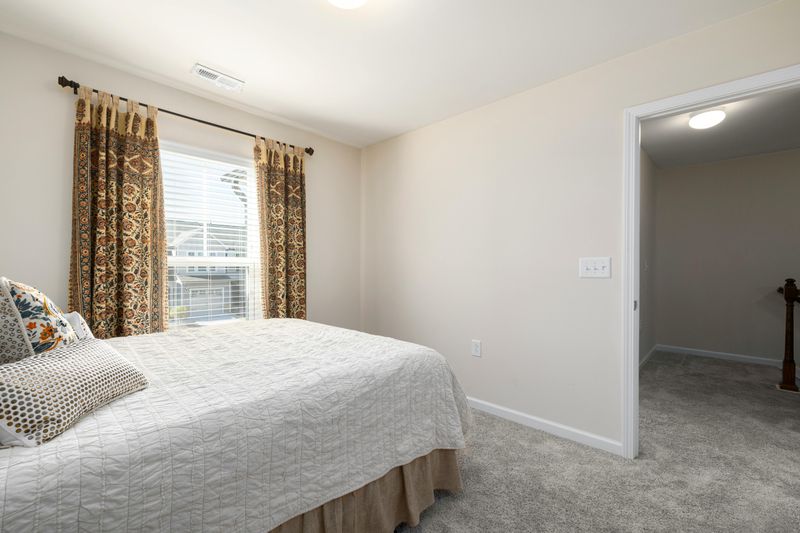
Patterns don’t always have to be loud or overwhelming in your home.
When used thoughtfully, they can work just like neutrals—adding interest and depth without taking over the entire room.
This approach to decorating is gaining popularity in 2026 because it lets homeowners express personality while keeping spaces calm and balanced.
Ready to discover how to make patterns your new favorite neutral?
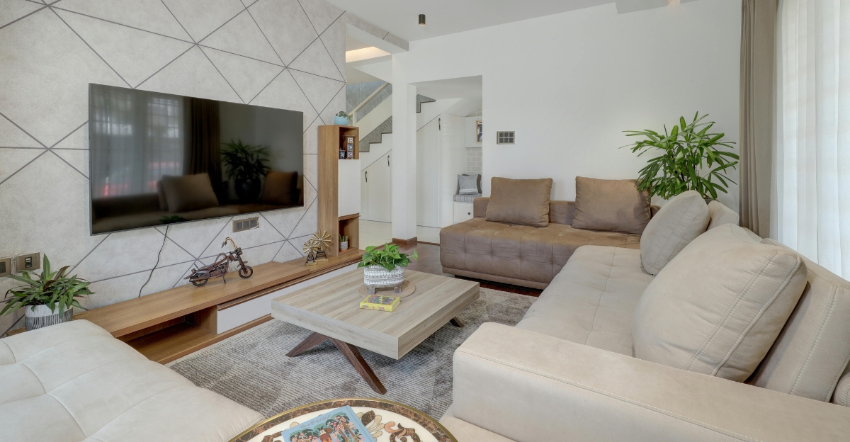
1. Embrace Subtle, Tonal Patterns for Quiet Depth
Soft patterns don’t scream for attention—they whisper.
A rug with a gentle geometric print in similar shades can add layers of interest to your floor without clashing with anything else in the room.
Think tone-on-tone designs where the pattern is there, but it doesn’t jump out at you.
This trick works especially well in bedrooms and living rooms where you want calm vibes.
The pattern adds just enough texture to keep things from feeling flat or boring.
Your eye notices the detail, but your brain reads it as restful.
Choosing these understated designs means you’re building a foundation that won’t tire you out over time.
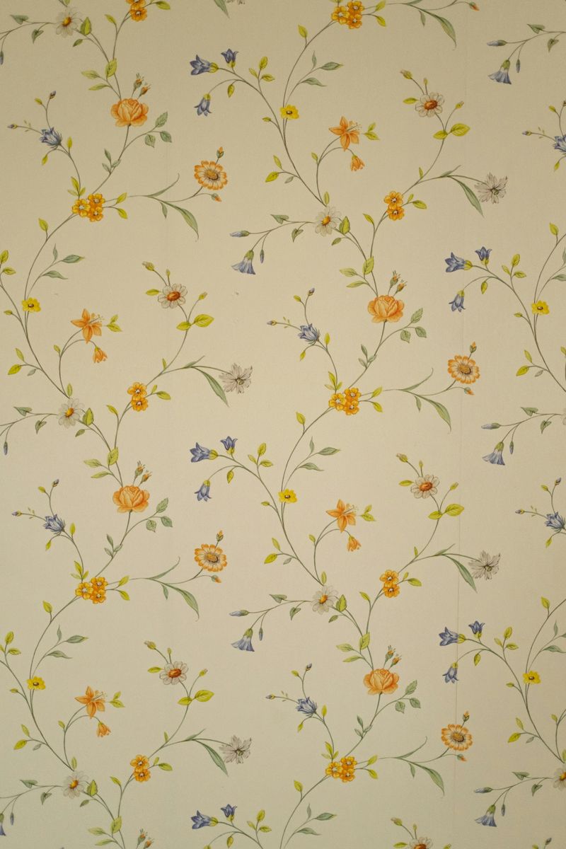
2. Choose a Pattern First, Then Build Your Palette Around It
Flip the script on decorating by starting with a patterned piece you love.
Maybe it’s wallpaper with blues, greens, and creams, or a bold fabric with sunset tones.
Pull those exact colors out and use them throughout the rest of your room.
This method takes the guesswork out of color matching.
Instead of wondering if things go together, you’re using a built-in guide.
Paint your walls one shade from the pattern, choose pillows in another, and suddenly everything feels connected.
Your pattern becomes the glue holding the room together, not just decoration stuck on top.
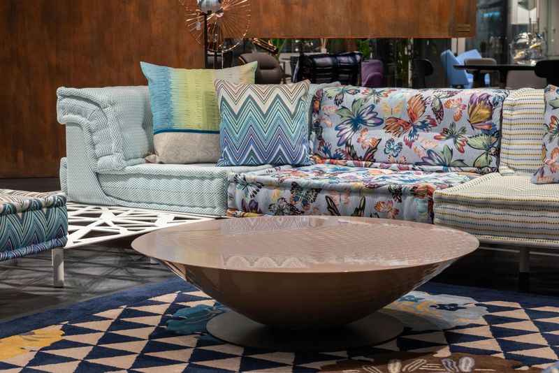
3. Balance Small and Large Prints for Visual Harmony
Mixing pattern sizes keeps your eyes happy and your room from feeling chaotic.
Picture a bold, large-scale wallpaper with oversized botanicals on one wall, then pair it with chair cushions covered in tiny checks or delicate dots.
The big pattern makes a statement, while the smaller one fills in the gaps without competing.
It’s like having a lead singer and backup vocals—both important, but they play different roles.
Too many large patterns together can feel overwhelming, like everyone’s shouting at once.
Getting this balance right means your space feels curated and intentional rather than accidentally busy.
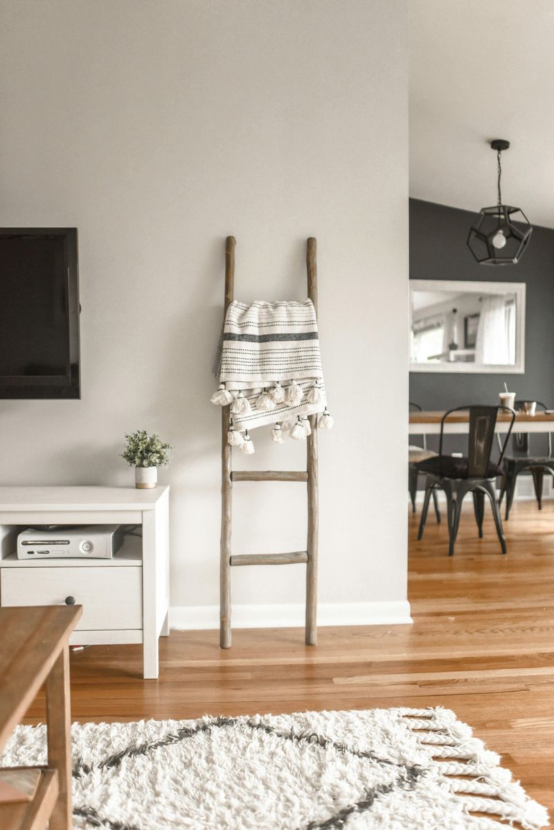
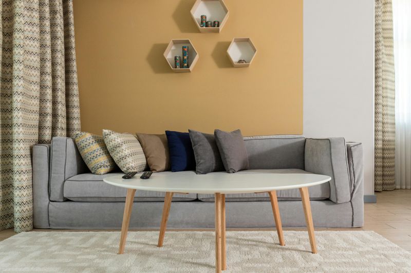
4. Keep Patterns in Accents, Not Everywhere
Less is often more when it comes to pattern.
Instead of covering every surface, focus on a few key spots like pillows, curtains, or one standout chair.
This gives you the personality patterns bring without making your room feel too busy or hard to relax in.
When patterns are everywhere, your eyes don’t know where to rest.
But when they’re used selectively, they become special moments that draw attention.
An accent chair in a fun stripe or a set of botanical pillows can completely change the mood.
This approach also makes it easier to swap things out when you want a fresh look later.
5. Pair Geometric Patterns with Organic Florals
Structured patterns like stripes, plaids, or chevrons need a softer friend.
That’s where organic shapes come in—florals, leaves, or abstract watercolor designs.
Together, they create a conversation between order and nature that feels balanced and interesting.
Imagine striped curtains hanging beside a chair covered in a loose floral print.
The stripe keeps things grounded and clean, while the floral adds warmth and life.
Neither one dominates, and the contrast actually makes both look better.
This combination works in almost any room and prevents your patterns from feeling too matchy or boring.
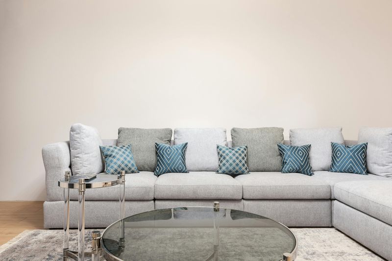
6. Start with a Neutral Base to Let Patterns Shine
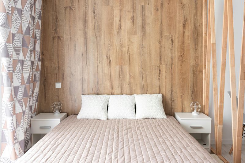
Neutral walls and furniture act like a blank canvas for your patterns.
When your big pieces—sofa, walls, flooring—are calm colors like beige, gray, or white, patterns have room to breathe and stand out.
Think of it like framing a painting.
The frame doesn’t compete with the art; it supports it.
A neutral base does the same thing for your patterned rug or printed pillows.
They become the stars of the show instead of getting lost in the noise.
This strategy also makes it easier to change patterns seasonally or whenever you want a refresh.
7. Layer Textures Alongside Your Patterns
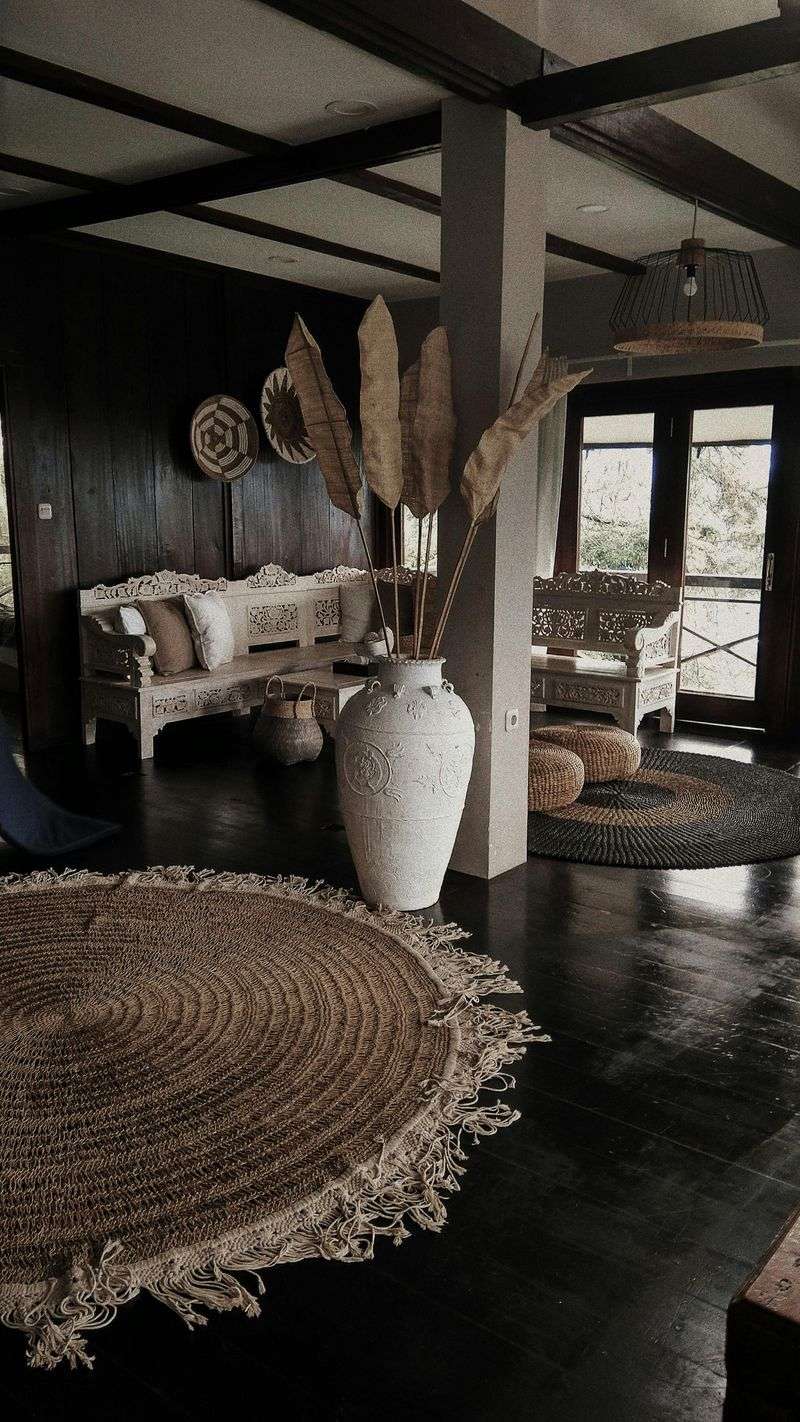
Patterns work even better when you add different textures to the mix.
Pair a printed linen pillow with a chunky knit throw, or place a patterned rug over smooth hardwood floors.
Adding wood, metal, woven baskets, and soft fabrics keeps your room from feeling flat.
Texture gives your eyes something to explore beyond just color and shape.
A velvet cushion feels different from a cotton one, and that variety makes a room more inviting and real.
It’s the difference between a photo and an actual space you want to touch.
This layering trick adds richness without needing more patterns.
8. Stick with Timeless Patterns That Age Gracefully
Some patterns never go out of style.
Stripes, plaids, simple geometrics, and botanical prints have been around for decades and still look fresh today.
Choosing these classics means your room won’t feel dated in a year or two.
Trendy patterns can be fun, but they often lose their appeal quickly.
A zebra print might feel exciting now, but will you still love it in five years?
Timeless patterns are like good jeans—they fit well no matter the season.
Building your space around these reliable designs gives you flexibility and longevity without sacrificing style or personality.
9. Keep Architecture and Major Furniture Simple
Your walls, doors, and big furniture pieces don’t need to compete with your patterns.
When these structural elements stay simple and clean-lined, your patterned accents get the spotlight they deserve.
A plain sofa in a solid color becomes the perfect stage for patterned pillows.
Simple white walls let a patterned rug or curtain take center stage.
If everything is busy, nothing stands out, and your room can feel cluttered even if it’s not.
Letting your architecture fade into the background means your patterns can do the talking without shouting over each other.
10. Limit the Number of Different Patterns in One Space
More isn’t always better when it comes to patterns.
Sticking to two or three different patterns in a single room helps maintain a sense of calm and order.
Too many competing designs can make your space feel like a patchwork quilt gone wrong.
Choose one dominant pattern, then add one or two supporting ones that share similar colors or vibes.
This creates a cohesive look that feels intentional rather than accidental.
Your room will look curated, not chaotic.
This restraint is what separates a stylish space from one that feels overwhelming or confusing to be in.
11. Use Patterns to Add Personality and Warmth
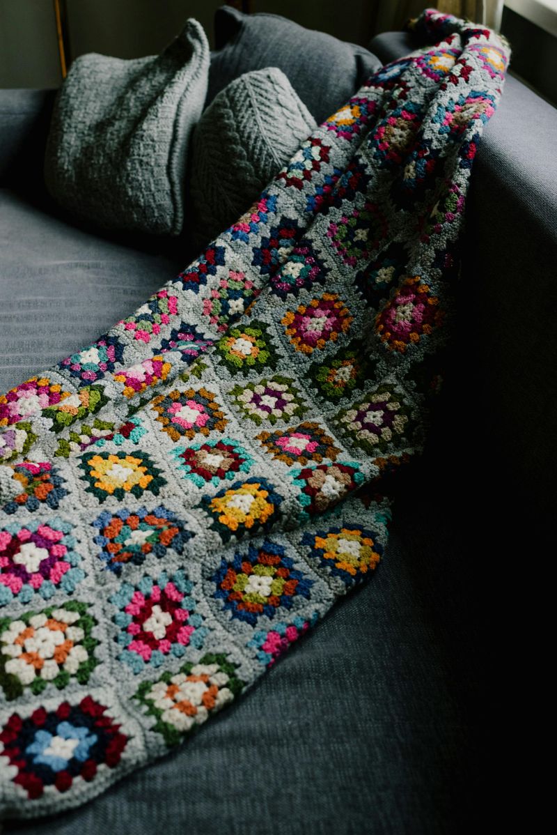
Patterns aren’t just decoration—they tell a story about who you are.
A vintage floral print might remind you of your grandmother’s house, while a modern geometric could reflect your love of clean lines and order.
These choices make your home feel uniquely yours.
Rooms without any pattern can feel cold or impersonal, like a hotel lobby.
But adding a patterned blanket or rug instantly warms things up and makes the space feel lived-in and loved.
It’s the difference between a house and a home.
Patterns bring comfort, character, and a sense of timelessness that plain surfaces just can’t match.