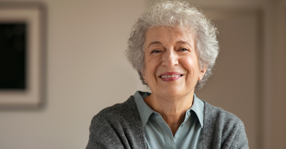
Choosing the right colors can make a huge difference in how vibrant and youthful you look.
Some shades, however, work against mature skin by draining color, casting shadows, or emphasizing fine lines.
Fashion experts agree that certain hues should be avoided after 50 if you want to look fresh and radiant.
Knowing which colors to skip can help you build a wardrobe that truly flatters.
1. Flat Black
Black is often considered chic and slimming, but flat black can be surprisingly harsh on mature complexions.
It creates strong shadows around the face that emphasize wrinkles and fine lines you’d rather downplay.
Instead of making you look polished, this shade can drain warmth from your skin tone.
The stark contrast between dark fabric and your face draws attention to every imperfection.
If you love wearing black, try softer versions like charcoal or pair it with a colorful scarf near your face.
Adding a pop of brightness near your neckline can counteract the aging effect while keeping your sophisticated style intact.
2. Dull Ashy Gray
Gray might seem like a safe neutral, but ashy or smoky grays are anything but flattering for women over fifty.
These murky tones suck the life right out of your complexion, leaving you looking washed out and exhausted.
When gray lacks warmth, it mirrors the natural graying that happens in hair and skin as we age.
Wearing it head-to-toe can make you blend into a foggy backdrop rather than stand out with confidence.
Warmer grays with taupe or beige undertones work much better.
You can also brighten your look with silver jewelry or a vibrant lipstick to add back the vitality that dull gray steals away.
3. Stark White
Crisp white shirts and bright white tops might look clean and fresh on younger skin, but they’re too contrasty for mature complexions.
Stark white reflects light harshly, highlighting every fine line, age spot, and uneven skin tone you have.
The brightness creates an unflattering spotlight effect that makes imperfections more visible.
Rather than looking radiant, you end up appearing washed out or overly exposed.
Softer alternatives like cream, ivory, or off-white provide elegance without the harsh glare.
These gentler shades flatter your skin while still giving you that light, airy feeling you crave in your wardrobe.
4. Muted Pastels
Baby pink, powder blue, and mint green might look sweet and springy, but these muted pastels often wash out mature skin tones completely.
They lack the intensity needed to bring color and life to your face.
When pastels are too soft, they fade into your complexion instead of complementing it.
You end up looking pale, tired, and older than you actually are, especially under indoor lighting.
Brighter, more saturated versions of these colors work far better.
Think coral instead of baby pink, or turquoise instead of mint—these bolder shades add energy and warmth that make your features pop beautifully.
5. Beige and Muddy Neutrals
Beige seems like a wardrobe staple, but muddy, bland neutrals can make you look tired and older than your years.
These colors blend into your skin rather than providing contrast, creating a flat, lifeless appearance.
Without definition, your features disappear into the background.
Muddy beiges and taupes lack the vibrancy needed to bring out your natural glow and can even emphasize sallowness.
Choose neutrals with richer undertones like camel, warm sand, or honey instead.
These shades offer sophistication while adding warmth and dimension that enhance rather than erase your complexion and keep you looking fresh and awake.
6. Salmon Pink
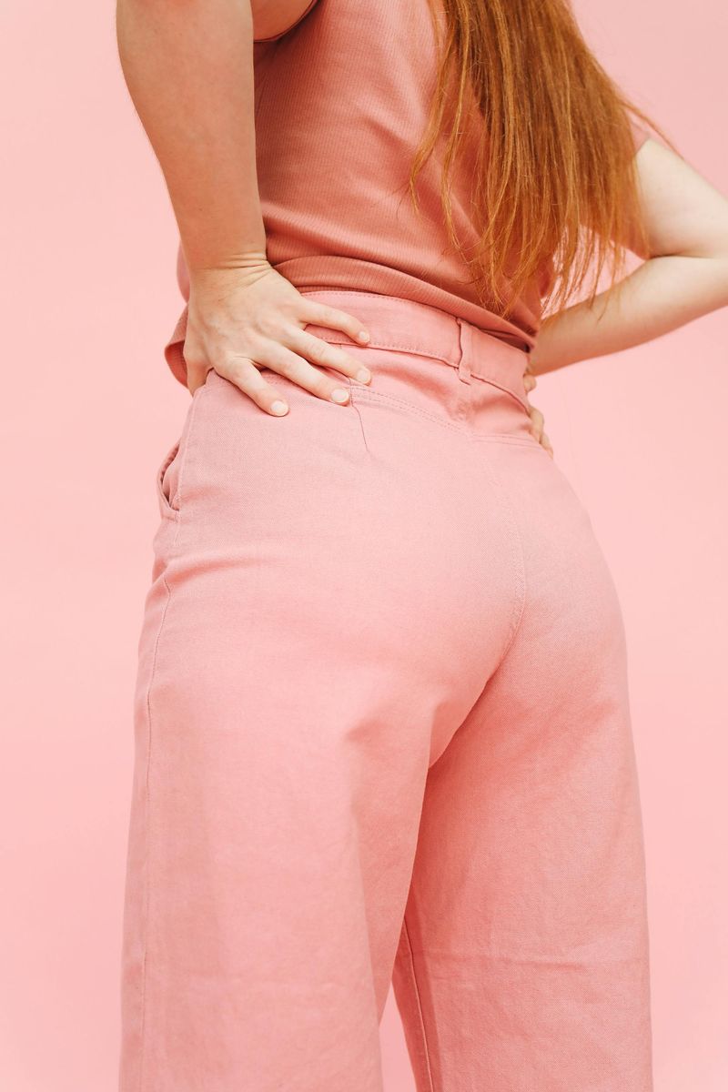
Salmon pink can seem like a cheerful, feminine choice, but it often casts an unflattering fluorescent glow on mature skin.
This tricky shade can make your complexion look aged or even slightly sickly under certain lighting.
The orange-pink undertones clash with natural skin tones rather than harmonizing with them.
Instead of brightening your face, salmon can highlight redness, uneven texture, or a tired appearance.
If you love pink, opt for clearer shades like rose, fuchsia, or blush with cooler undertones.
These alternatives provide the femininity you want without the aging side effects that salmon pink unfortunately delivers every time you wear it.
7. Unflattering Purples
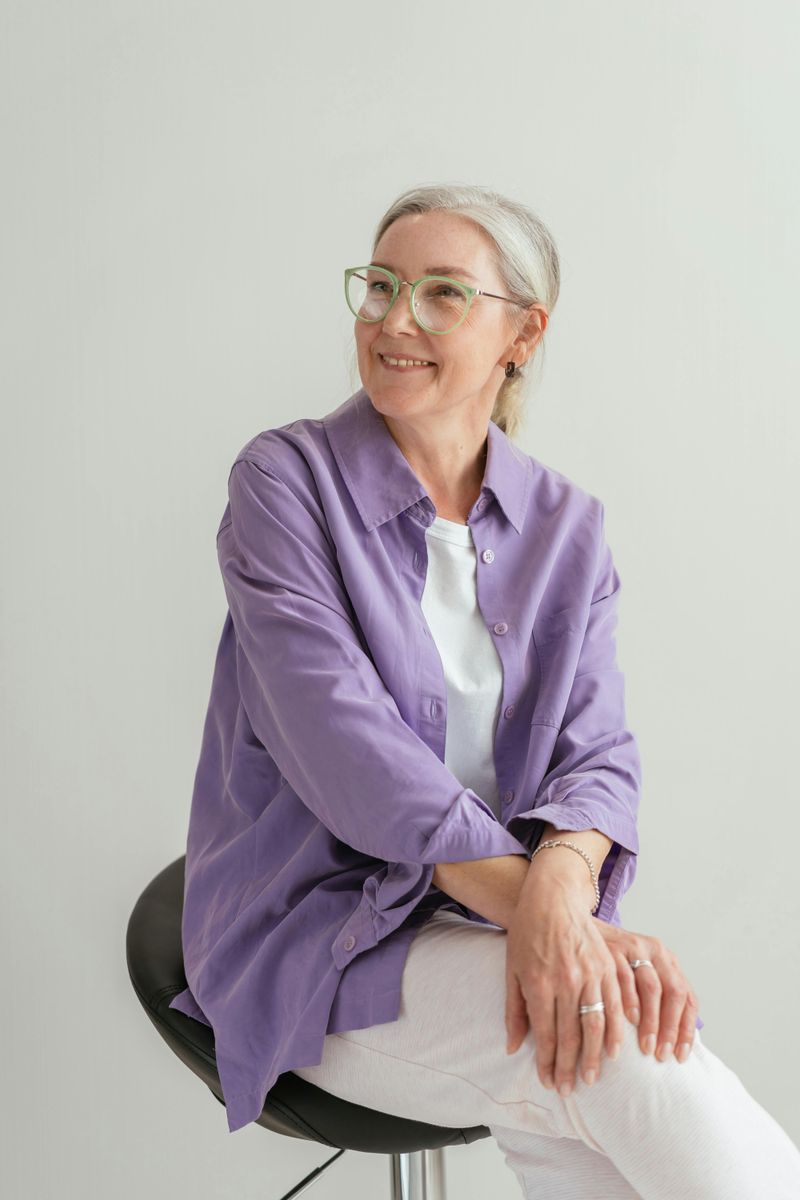
Purple can be regal and beautiful, but grayish or muddy purples leave mature skin looking dull and fatigued.
These dingy shades lack the vibrancy needed to bring out your best features.
When purple turns too gray or brown, it creates a tired, aged appearance rather than a sophisticated one.
Your complexion loses its natural warmth and starts to look shadowy and lifeless.
Brighter purples like violet, magenta, or deep eggplant work much better.
These richer, clearer tones add drama and energy to your look while complementing your skin instead of dragging it down into drabness and exhaustion.
8. Mustard Yellow
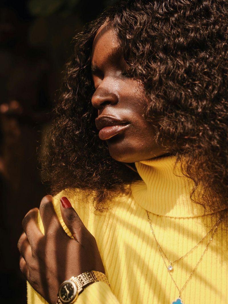
Mustard yellow and other dull yellows can add years to your appearance by casting unflattering shadows on your face.
This murky shade lacks the brightness that makes yellow cheerful and instead creates a heavy, dated look.
The brownish undertones in mustard can emphasize sallowness and make your skin appear tired or jaundiced.
Rather than energizing your outfit, it drags down your entire complexion with an aged quality.
Brighter, clearer yellows like lemon, buttercup, or golden yellow are far more flattering.
These sunnier shades bring warmth and radiance to your face, giving you a youthful glow that mustard simply cannot deliver.
9. Dark Burgundy
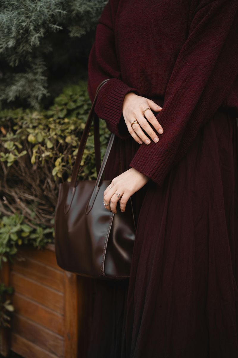
Deep wine and burgundy tones might seem elegant, but they can emphasize shadows and age lines on mature skin.
These heavy, dark shades create depth in all the wrong places, making wrinkles and fine lines more noticeable.
Burgundy’s richness can overwhelm your complexion, especially near your face.
The darkness draws attention to tired eyes and deepens any hollows or shadows you’d prefer to minimize.
Lighter berry shades like raspberry, cranberry, or bright cherry offer sophistication without the aging weight.
These brighter reds and pinks provide the elegance you’re after while keeping your look fresh, vibrant, and youthful instead of heavy and dated.
10. Dark Coffee Brown
Very dark coffee browns can overwhelm mature complexions and create a heavier, older look that weighs down your entire appearance.
These deep, dense shades lack the lightness needed to keep your style feeling fresh and modern.
Dark brown near your face can cast shadows that emphasize lines and make your skin tone appear muddy or dull.
The heaviness of the color creates visual weight that ages rather than flatters.
Lighter browns like caramel, cognac, or milk chocolate provide warmth without the oppressive darkness.
These softer alternatives offer the earthy sophistication you want while maintaining brightness and keeping your overall look youthful and approachable.