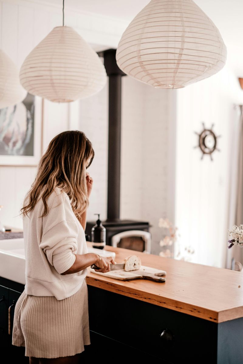
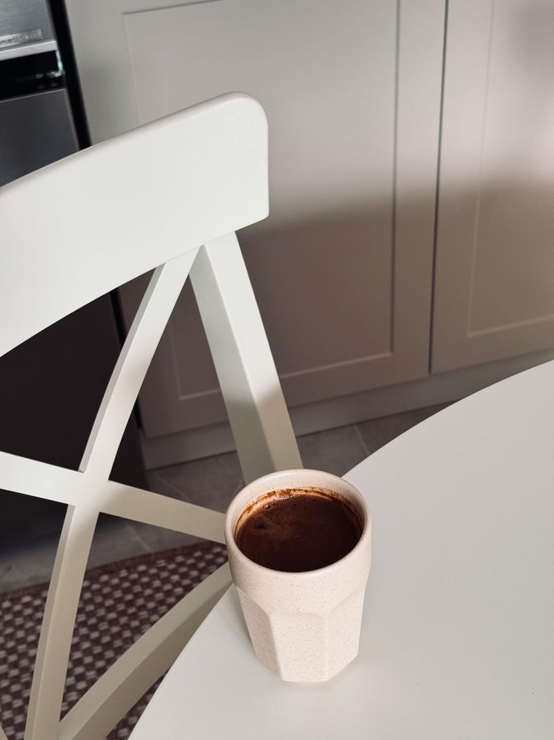
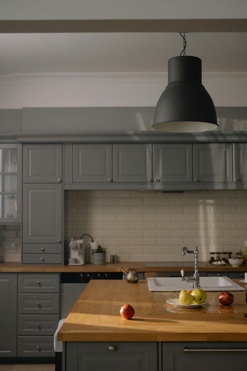
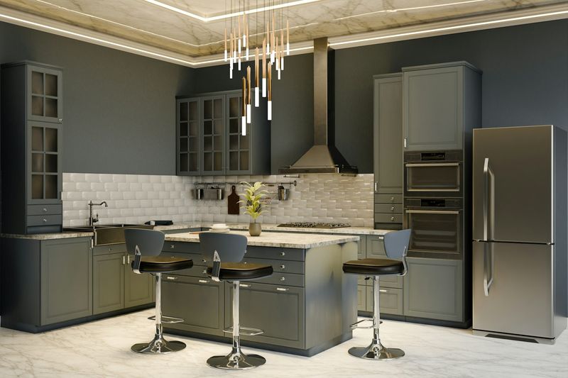
Choosing the right paint color for your kitchen can feel overwhelming, but neutral shades offer a timeless solution that never goes out of style. These versatile colors work beautifully with any decor, from modern to farmhouse, and they create a calm, welcoming space where your family gathers.
Whether you’re painting cabinets, walls, or both, the perfect neutral shade can transform your kitchen into a space you’ll love for years to come.
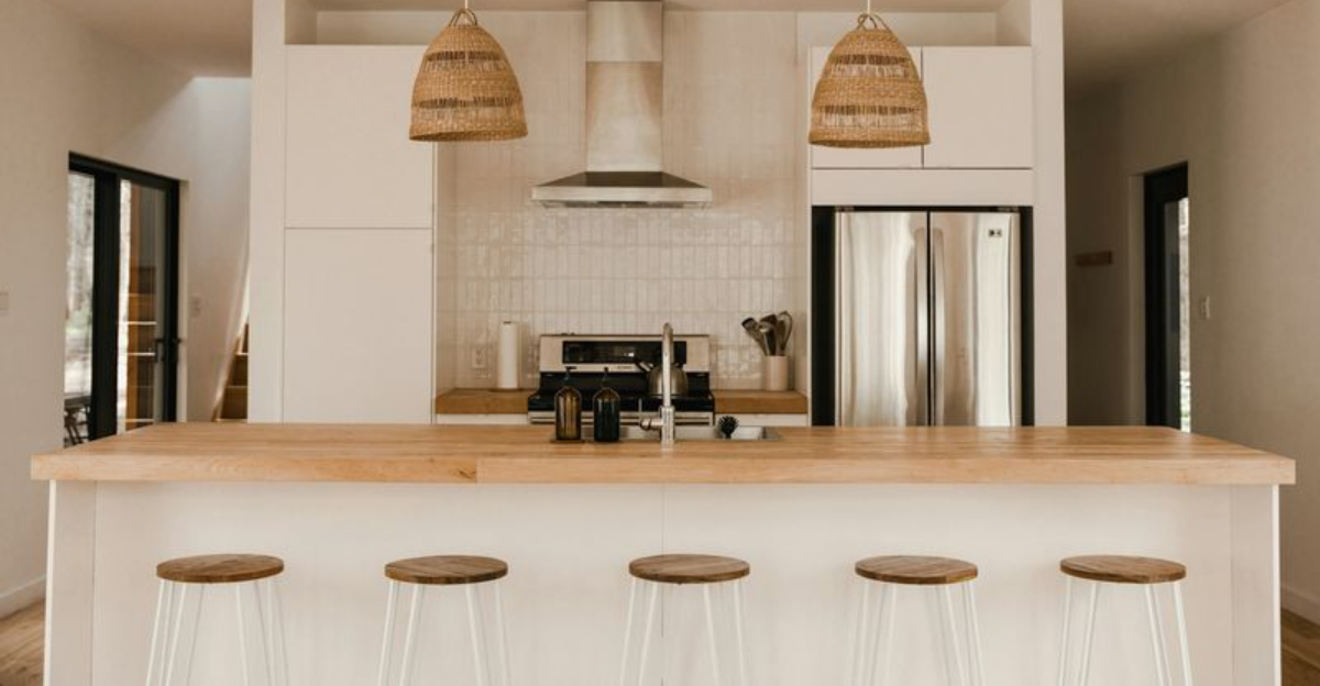
1. Soft White (Benjamin Moore Chantilly Lace OC-65)
Bright mornings feel even better when your kitchen walls reflect sunlight in the most beautiful way.
This crisp white shade brings an airy, spacious feeling to any kitchen without making it feel cold or clinical.
Many homeowners worry that pure white might look too sterile, but this particular shade strikes the perfect balance.
It has just enough warmth to feel inviting while maintaining that fresh, clean appearance everyone loves.
This color works wonderfully on both cabinets and walls, and it pairs beautifully with stainless steel appliances and natural wood accents.
Your kitchen will feel bigger, brighter, and more welcoming from the moment you walk in each morning.
2. Creamy Off-White (Benjamin Moore Swiss Coffee)
Walking into a kitchen painted in this warm off-white feels like coming home to a hug.
The subtle cream undertones create an incredibly welcoming atmosphere that makes everyone want to gather around your kitchen island.
Unlike stark whites that can feel harsh under artificial lighting, this shade maintains its cozy character whether it’s sunny afternoon or evening dinner time.
It’s particularly stunning on kitchen cabinets, where it adds depth and dimension.
Designers love pairing this color with both modern and traditional elements because it adapts so beautifully.
Your granite countertops, subway tile backsplash, and even your colorful dishware will all look more vibrant against this classic backdrop.
3. Warm Greige (Sherwin-Williams Accessible Beige SW 7036)
Can’t decide between gray or beige?
This magical blend gives you the best of both worlds in one gorgeous shade.
It’s become incredibly popular because it works with virtually any design style you can imagine.
The beauty lies in how this color shifts throughout the day as natural light changes.
Morning light might bring out more of the beige warmth, while afternoon sun emphasizes the cooler gray tones, keeping your kitchen interesting all day long.
Whether your style leans farmhouse rustic or sleek contemporary, this versatile neutral creates the perfect foundation.
It looks especially amazing when paired with white trim and natural wood elements throughout your cooking space.
4. Pale Oak (Benjamin Moore Pale Oak OC-20)
There’s something almost magical about how this soft taupe shade responds to sunlight streaming through your windows.
It seems to glow from within, creating an atmosphere that feels both sophisticated and completely comfortable.
This color has subtle warm undertones that prevent it from ever feeling flat or boring.
Throughout different times of day, you’ll notice how it gracefully adapts, sometimes appearing more beige, other times showing hints of gray.
Interior designers often choose this shade for open-concept homes because it flows beautifully from room to room.
Your kitchen will feel connected to adjacent living spaces while maintaining its own special character and warmth that draws people in.
5. Light Greige (Sherwin-Williams Repose Gray)
Understated elegance defines this perfectly balanced neutral that never tries too hard to impress.
It simply creates a calm, sophisticated backdrop that lets your beautiful countertops and backsplash become the stars of the show.
What makes this shade special is how effortlessly it complements both warm wood tones and cool stone surfaces.
Whether you have butcher block counters or sleek quartz, this color makes everything look more expensive and intentional.
Many professional designers reach for this shade when creating modern kitchens because it feels current without being trendy.
Your space will look fresh and updated for years to come, saving you from the expense and hassle of frequent repainting projects.
6. Soft Beige (Benjamin Moore Edgecomb Gray HC-173)
Despite its name, this color reads more as a warm, comforting beige that wraps your kitchen in gentle sophistication.
It’s the kind of shade that makes guests feel immediately at ease the moment they step into your home.
This particular neutral has been a designer favorite for decades because it simply works everywhere.
North-facing kitchens benefit from its warmth, while south-facing rooms appreciate how it tempers bright sunlight without fighting against it.
If you’re dreaming of a classic, timeless kitchen that won’t feel dated in five years, this is your answer.
It creates the perfect canvas for both colorful accessories and neutral decor, adapting beautifully as your style evolves over the years.
7. Earthy Greige (Benjamin Moore Pashmina AF-100)
Subtle sophistication whispers rather than shouts with this beautifully nuanced greige that works magic on both walls and cabinetry.
It brings an understated luxury that makes your entire kitchen feel more refined and intentional.
The earthy quality of this shade grounds your space while maintaining an airy, open feeling.
It’s complex enough to stay interesting but neutral enough to never compete with your decor choices or architectural features.
This color shines particularly bright when used on kitchen islands or lower cabinets, creating gentle contrast with lighter upper elements.
Your kitchen gains depth and dimension, transforming from a simple cooking space into a thoughtfully designed room that feels professionally curated and completely personal.
8. Creamy Neutral (Sherwin-Williams Alabaster SW 7008)
Soft and luminous, this warm white has a secret superpower: it makes every other color in your kitchen look better.
The gentle cream undertones reflect light in the most flattering way, creating a glow that feels almost magical.
Unlike cooler whites that can appear harsh or clinical, this shade maintains warmth even under fluorescent lighting.
Your kitchen stays inviting from early morning coffee to late-night snack runs, never feeling cold or unwelcoming.
This timeless neutral has graced countless magazine-worthy kitchens because it simply never fails.
Whether your style is farmhouse chic, coastal casual, or modern minimalist, this color creates the perfect foundation that lets your personality shine through in every detail.
9. Muted Stone (Benjamin Moore Gray Owl OC-52)
Cool and collected, this soft gray-leaning neutral brings a modern sensibility without feeling cold or industrial.
It’s the color equivalent of a perfectly tailored outfit—polished, current, and effortlessly stylish.
What sets this shade apart is its chameleon-like quality that shifts beautifully throughout the day.
Morning light might reveal subtle green undertones, while evening ambiance brings out warmer gray tones, keeping your kitchen perpetually interesting.
This color reads decidedly modern but avoids trendy territory, meaning your kitchen will feel current for decades to come.
It pairs exceptionally well with both warm wood accents and cool stainless finishes, making it incredibly versatile for any kitchen style or configuration you prefer.
10. Earth-Anchored Neutral (Chalky Mushroom-Style Taupe-Stone)
Grounding and contemporary, this hybrid neutral captures the moment perfectly—it’s what happens when classic taupe meets modern stone gray in the most beautiful way.
Your kitchen gains instant sophistication with this forward-thinking yet timeless shade.
The chalky quality gives it a matte, velvety appearance that feels incredibly current and on-trend.
It reflects contemporary design preferences while maintaining enough classic appeal to remain relevant as trends shift and change.
This shade works brilliantly as an all-over color or as a stunning accent on a kitchen island or feature wall.
It grounds your space without weighing it down, creating a foundation that feels both fresh and enduring, modern and approachable all at once.