Your hallway is the very first thing guests see when they walk through your front door, yet most people treat it like a forgotten storage zone. Designers notice these overlooked spaces immediately, and some common decorating choices make them cringe more than you might expect.
From awkward furniture placement to the wrong rug size, small mistakes can make your entryway feel cramped, dark, or just plain dull. The good news is that fixing these issues is easier than you think.
1. Viewing Your Hallway as an Afterthought
Walk into almost any home and you can tell instantly whether the hallway was planned or forgotten.
Many homeowners pour time and money into living rooms and kitchens, then completely ignore the entryway.
Designers find this frustrating because the hallway sets the tone for everything else inside your home.
Think of it as the opening page of a book.
If it feels rushed or bare, guests already have a certain impression before they even reach the couch.
Giving your hallway even a small amount of intentional thought, like a consistent color palette or a single statement piece, can completely change how your whole home feels.
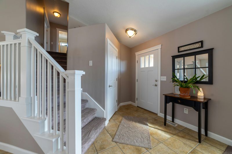
2. Forgetting About Rugs
A hallway without a rug is like a room without a heartbeat.
It feels cold, echoey, and strangely unfinished, even if everything else looks great.
Rugs do more than add color.
They define the space, protect your floors, and give people a visual anchor the moment they step inside.
Designers often say that skipping the rug is one of the easiest mistakes to fix and one of the most common they see.
A well-chosen runner can add warmth, texture, and personality without overwhelming a narrow space.
Even a simple, neutral runner makes a hallway feel more intentional and put-together almost immediately.
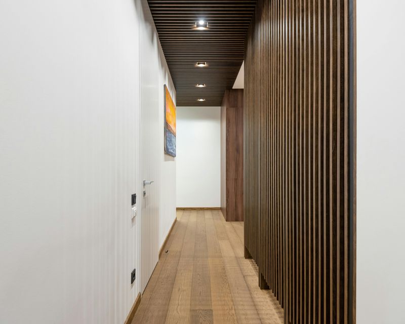
3. Not Layering Your Lighting
Overhead lighting alone makes a hallway feel like a hospital corridor.
One harsh bulb from the ceiling flattens everything and creates unflattering shadows that no amount of pretty decor can fix.
Designers recommend layering light sources.
Wall sconces, a small table lamp on a console, or even a plug-in pendant can dramatically soften and warm up the space.
Lighting layers create depth and make a narrow hallway feel more like a curated space rather than a pass-through zone.
Swapping a basic fixture for something with character, like a brass sconce or a rattan pendant, adds style points while solving the lighting problem at the same time.
4. Playing It Too Safe With Color
Beige is fine.
White is fine.
But when every surface in your hallway is the same safe, neutral tone, the space starts to feel invisible rather than welcoming.
Designers quietly roll their eyes at hallways that seem afraid of personality.
Because hallways are smaller than most rooms, they are actually the perfect place to take a color risk.
A deep navy, a warm terracotta, or even a moody forest green can look absolutely stunning in an entryway without overwhelming the rest of the home.
Bold color in a small space feels dramatic in the best way possible.
You have permission to be a little daring here.
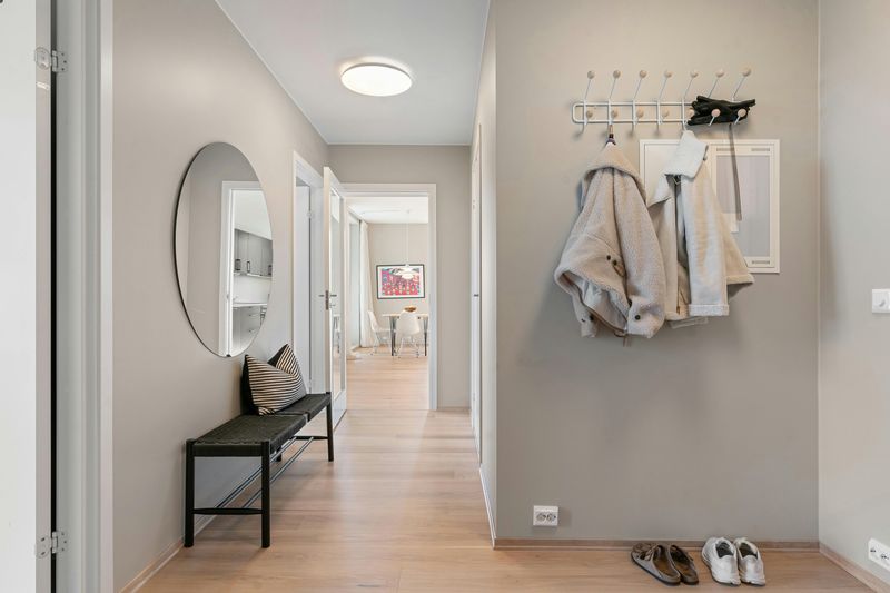
5. Ignoring the Function of Your Walls
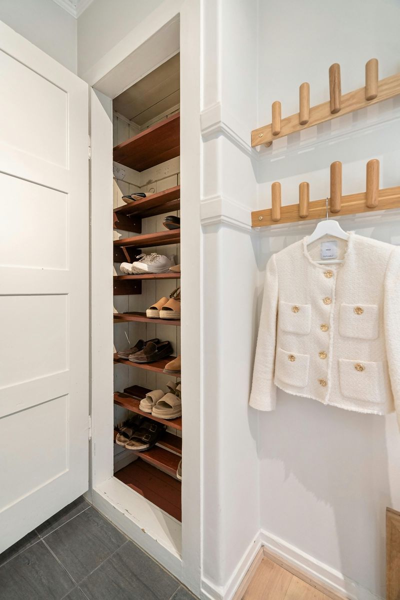
Walls in a hallway are prime real estate, and leaving them completely bare is a missed opportunity that designers find hard to overlook.
Hallways tend to be high-traffic zones where people drop bags, hang coats, and kick off shoes.
Treating the walls as purely decorative, or not treating them at all, means you are ignoring a chance to solve real daily problems.
A row of hooks, a floating shelf with a small basket, or a built-in bench with cubbies can transform a chaotic entryway into a genuinely functional space.
Style and practicality are not opposites.
In a hallway, the best designs always manage to deliver both at the same time.
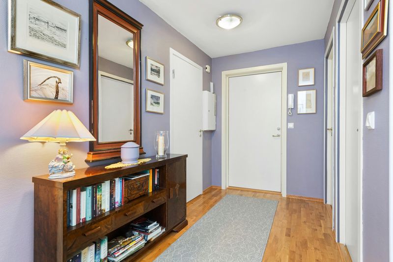
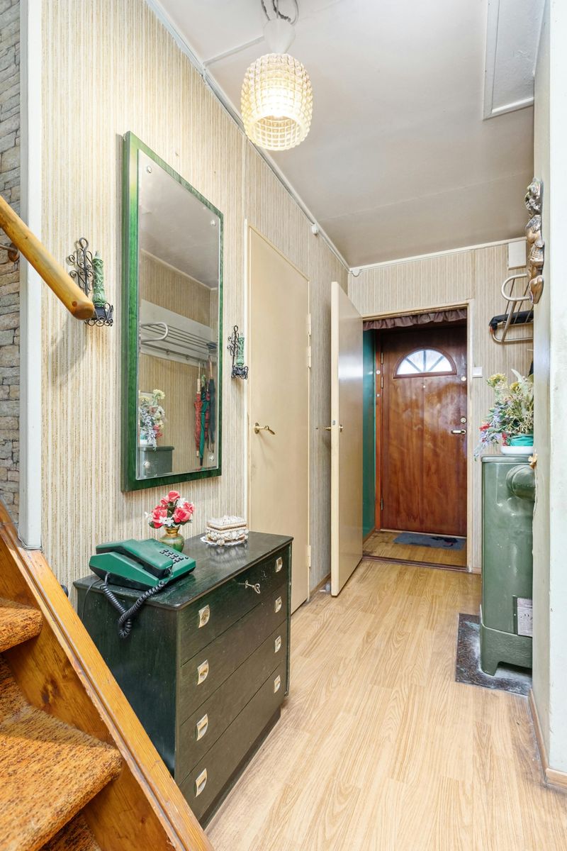
6. Not Hanging Mirrors and Art Properly
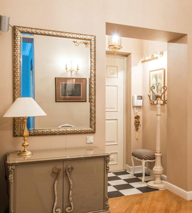
Crooked art, mirrors hung at the wrong height, and frames placed without any clear logic are things designers notice the second they walk in.
The general rule for hanging art is to place the center at eye level, roughly 57 to 60 inches from the floor.
Mirrors hung too high reflect the ceiling instead of the people standing beneath them, which defeats the whole purpose.
Groupings of art should feel intentional, not random.
Lay pieces out on the floor first to test arrangements before putting a single nail in the wall.
Getting the placement right costs nothing extra and makes an enormous difference in how polished your hallway actually looks.
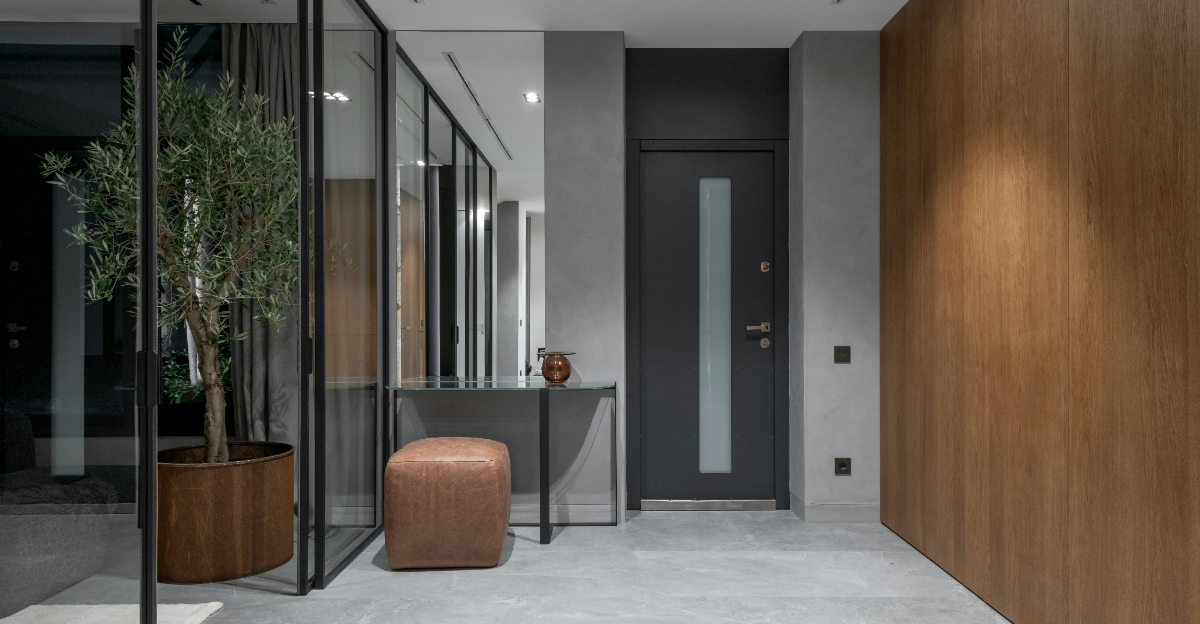
7. Overcrowding the Space With Furniture
More furniture does not equal more style.
In a hallway, it usually means less breathing room and a lot more frustration every time someone tries to walk through.
Designers see this mistake constantly.
A chunky console table, a full-size bench, a coat rack, and a stack of decorative baskets all crammed into a narrow corridor creates a space that feels more like an obstacle course than an entryway.
Choose one or two functional pieces and let them shine.
A slim console with clean lines, for example, gives you surface space without eating up precious floor area.
Restraint is a genuine design skill, and hallways reward it every single time.
8. Not Considering Scale and Flow
Scale is one of those things that is hard to define but immediately obvious when it is wrong.
An oversized mirror in a tiny hallway, or a miniature shelf in a grand foyer, both feel instantly off.
Flow matters just as much.
Designers think about how the eye moves through a space and whether the hallway guides you naturally into the rest of the home.
Furniture and decor that block sightlines or create visual clutter disrupt that flow completely.
Before buying anything for your hallway, measure carefully and consider how each piece relates to the ones around it.
A well-scaled hallway feels effortless to move through, both physically and visually.
9. Skipping Wall Art Entirely
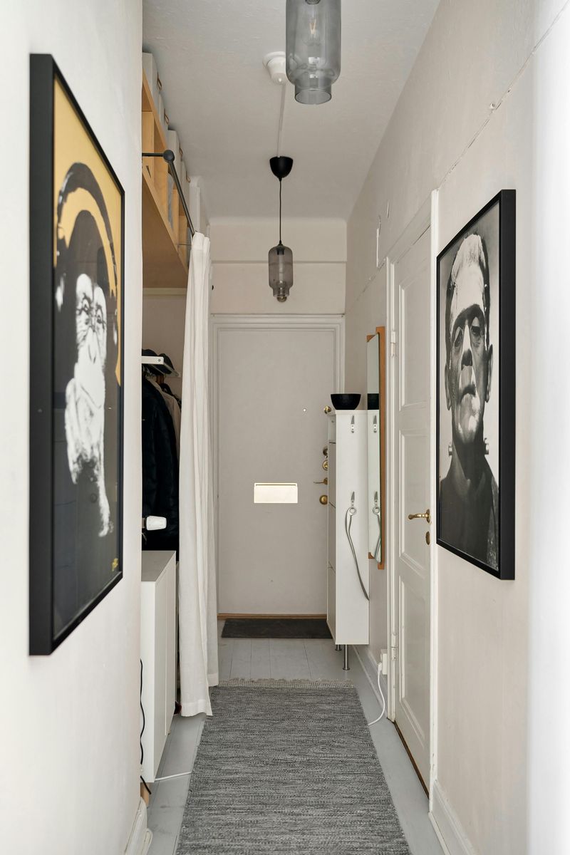
Bare walls in a hallway send one clear message: nobody lives here yet.
Art is one of the fastest ways to inject personality, warmth, and a sense of story into any space.
Designers often say that a hallway gallery wall is one of the most impactful design moves you can make in an entire home.
It does not need to be expensive.
A mix of thrifted frames, printed photographs, and small original pieces can look incredibly curated.
The key is consistency, whether that means matching frame colors, a unified color palette in the artwork, or a shared theme.
Even one well-chosen piece on a blank wall is better than leaving it empty.
10. Choosing the Wrong Rug Size
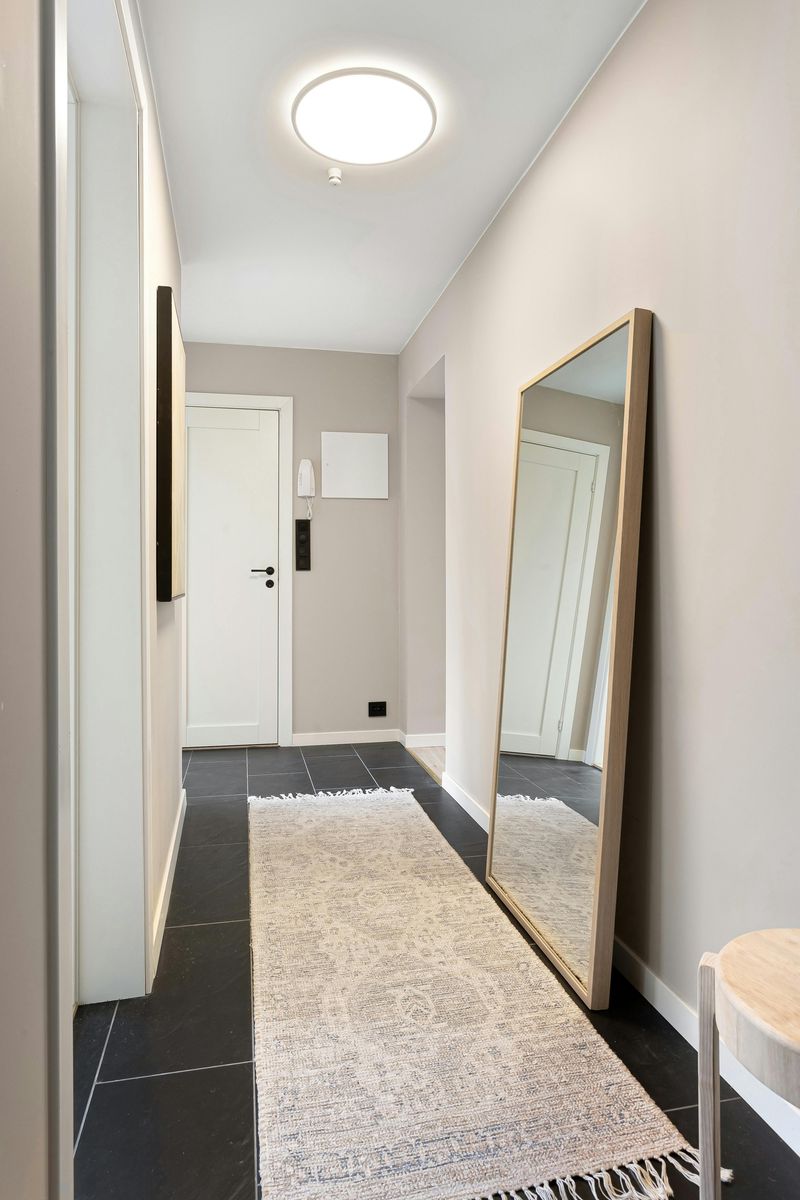
A rug that is too small for a hallway is one of those details that bugs designers more than almost anything else.
It ends up looking like a postage stamp floating in an ocean of floor.
The right size runner should extend most of the length of the hallway, leaving only a small border of floor visible on the sides.
Going too short or too narrow makes the space feel choppy and unresolved.
When shopping, always measure your hallway first and bring those numbers with you.
Standard runner sizes range from two by six feet up to three by twelve feet.
Finding the right fit makes the whole hallway look instantly more intentional and professionally styled.