Some colors look amazing on a hanger, then suddenly feel impossible once you try to build a real outfit around them. The truth is, a tricky shade does not mean a bad shade – it just asks for smarter pairing, better proportions, and more attention to tone.
If you have ever bought a bold piece and then let it sit untouched in your closet, you are not alone. These seven colors can absolutely work, but they tend to demand a little more strategy than the rest.
1. Mustard Yellow
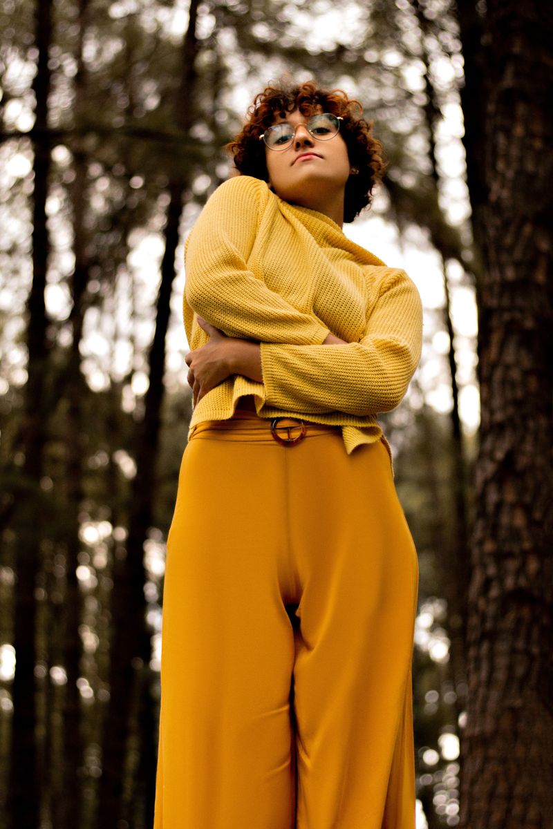
Mustard yellow can feel warm, artistic, and expensive, but it is one of those colors that can quickly overpower your natural coloring.
If the tone leans too muddy, it may make your skin look tired.
If it leans too bright, it can suddenly feel retro in the wrong way.
The easiest fix is pairing it with grounded neutrals like cream, camel, chocolate, or dark denim.
You also want clean silhouettes, because fussy shapes can make mustard look dated fast.
A simple knit, structured coat, or sleek bag usually works better than anything overly bohemian.
If you are unsure, keep mustard away from your face and wear it as a skirt, shoe, or handbag.
That lets you enjoy the richness without risking a washed-out look.
2. Lime Green
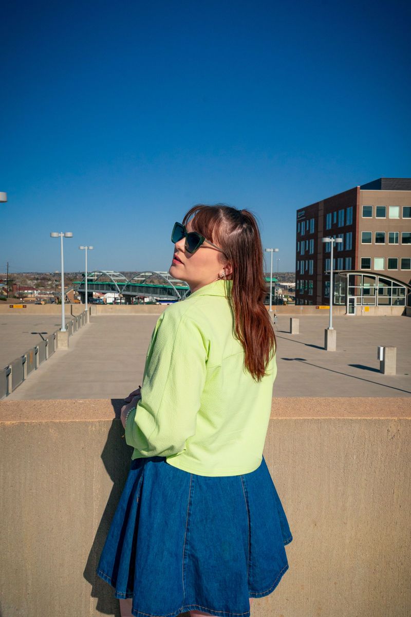
Lime green is playful, modern, and impossible to ignore, which is exactly why it can be so difficult to style well.
Its high saturation draws all the focus immediately.
That means every other part of your outfit needs to support it instead of competing for attention.
The smartest approach is to treat lime green like the statement, not the whole story.
Pair it with black, white, charcoal, or crisp denim to calm the intensity.
Sleek fabrics and simple cuts help too, because lime can look chaotic when mixed with too many bold details.
If a full garment feels intimidating, start with a mini bag, sneakers, or a single knit layered under a blazer.
You still get the energy, but the outfit stays controlled and wearable.
3. Orange
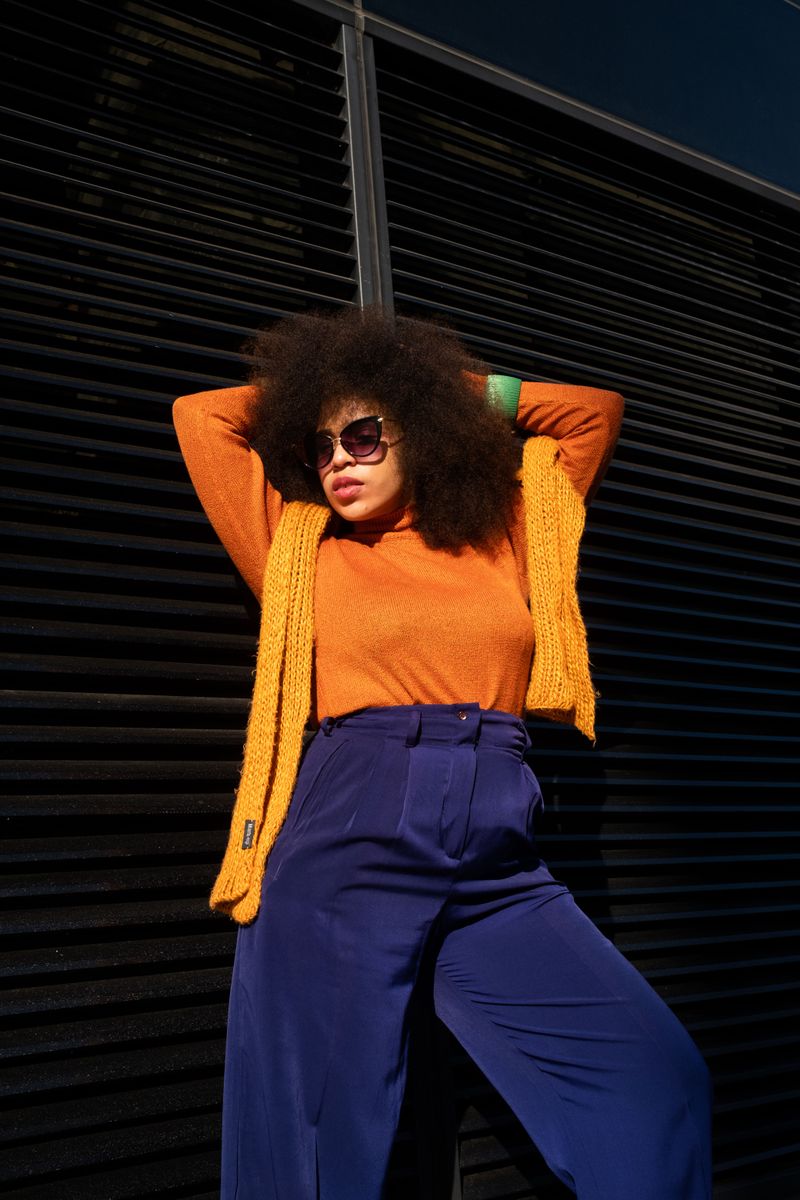
Orange brings energy, confidence, and creativity, but it is also one of the fastest ways to create an accidental color clash.
Some shades pull very warm, while others lean almost fluorescent.
If the undertone is off, orange can fight with your complexion instead of enhancing it.
To make it look intentional, pair orange with steady colors like navy, tan, cream, olive, or soft white.
Those combinations give it structure and keep the outfit from feeling loud for no reason.
Texture matters too, because orange often looks better in polished cotton, satin, or knit than in overly shiny synthetic fabrics.
If wearing it near your face feels harsh, choose orange on the lower half or in accessories.
A bag, sandal, or skirt can still add personality without overwhelming everything else.
4. Lavender
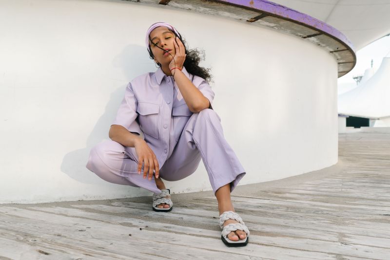
Lavender looks dreamy and refined in theory, yet it can be surprisingly hard to wear in real life.
On some people it reads fresh and elegant.
On others it can appear overly sweet, faded, or ashy, especially when the shade is too pale against the skin.
The key is giving lavender contrast so it does not float away.
Pair it with sharper colors like charcoal, white, deep denim, or even black if you want a cleaner edge.
Structured pieces also help, because a blazer, tailored trousers, or a sleek knit keeps the softness from turning sugary.
Jewelry can make a big difference too.
Silver usually sharpens lavender beautifully, while overly delicate styling may make the whole outfit feel too precious instead of polished and modern.
5. Burgundy

Burgundy is rich, flattering, and undeniably elegant, but it can become heavy if the rest of the outfit is equally dark or formal.
That is where people get stuck with it.
Instead of looking luxurious, it can start to feel severe, mature, or too dressed up for everyday wear.
The trick is contrast.
Burgundy looks best when you lighten it with cream, soft gray, blush, or even faded denim.
Mixing in casual textures like cotton, suede, or relaxed leather also helps take away that overly formal mood without losing the depth that makes the color beautiful.
If you love darker looks, break up burgundy with shape and shine.
A fitted tee, white sneaker, or gold jewelry can keep the outfit current instead of costume-like.
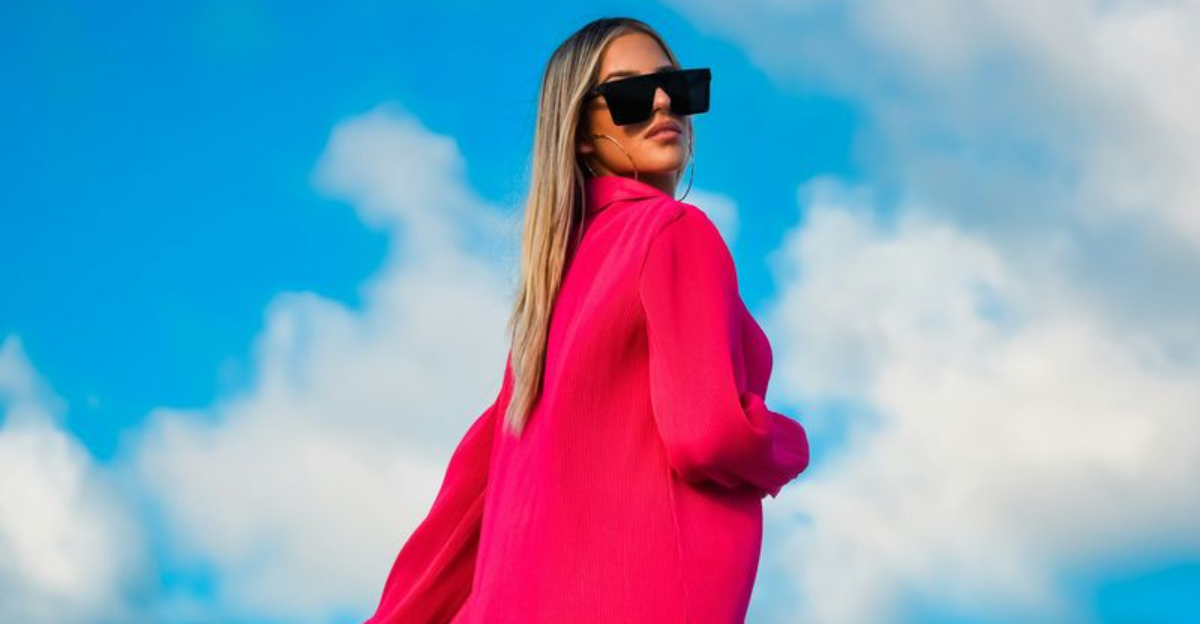
6. Neon Pink
Neon pink is fun, fearless, and instantly noticeable, but that same intensity makes it one of the least forgiving colors to style.
It does not blend quietly into an outfit.
It takes over.
If your accessories, makeup, or other colors are equally loud, the whole look can become exhausting fast.
The best way to wear neon pink is with restraint.
Clean lines, neutral shoes, and minimal jewelry give the color room to stand out without turning chaotic.
Black, white, gray, and even clear or metallic accents usually work better than trying to pair it with several other bright shades.
If a full dress or jacket feels too much, try a small hit first.
A heel, clutch, or sporty top can deliver the same energy in a way that feels much easier to pull off.
7. Olive Green
Olive green can be chic, grounded, and surprisingly versatile, yet it is one of those shades that changes dramatically depending on depth and undertone.
The wrong olive can drain your face and make your outfit feel flat.
Instead of sophisticated, it can read dull or tired.
To style it well, focus on contrast and finish.
Olive usually looks stronger with ivory, camel, black, crisp white, or warm gold jewelry.
It also benefits from fabrics with some structure or texture, because slouchy olive pieces in muted materials can start looking drab very quickly.
If olive near your face feels off, wear it as trousers, a skirt, or a jacket over a brighter top.
That way, you keep the earthy appeal while giving your complexion more life and clarity.