Transforming your living room doesn’t always require new furniture or major renovations. Sometimes, a fresh coat of paint in the right color can completely change the feel of your space. Professional designers know that certain shades have the power to elevate a room from ordinary to extraordinary. Ready to refresh your living space with a designer-worthy palette?
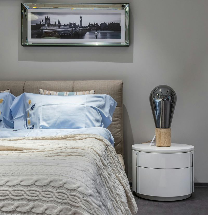
1. Charcoal Gray: The New Neutral
Sophisticated yet approachable, charcoal gray has dethroned beige as the go-to neutral in modern homes. This versatile shade creates a perfect backdrop for both vibrant accents and metallic finishes.
When paired with crisp white trim, charcoal walls create dramatic depth that makes artwork pop. The color works beautifully in both sun-drenched spaces and rooms with limited natural light.
Designers often use charcoal gray in smaller spaces because, contrary to popular belief, dark colors can actually make a room feel larger by blurring the boundaries between walls.
2. Deep Navy Blue: Timeless Elegance
Navy blue brings instant sophistication to any living space. Unlike trendy colors that come and go, this rich hue has maintained its status in designer portfolios for decades.
The magic of navy lies in its chameleon-like quality—it feels both classic and contemporary. Paired with brass or gold accents, it exudes luxury; combined with natural woods, it creates a casual, lived-in vibe.
Many homeowners worry dark colors shrink rooms, but navy actually creates depth. Try it on a single accent wall if you’re hesitant to commit to the full room treatment.
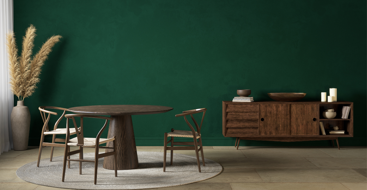
3. Emerald Green: Bold Statement Maker
Want to make guests stop in their tracks? Emerald green delivers jaw-dropping impact that feels both luxurious and alive. This jewel tone brings natural vibrancy indoors while maintaining a sophisticated edge.
The color works particularly well in rooms with abundant natural light, where it shifts beautifully throughout the day. For maximum effect, pair emerald with contrasting neutrals like cream or taupe.
Historical tidbit: Emerald green has ancient connections to wealth and prosperity in many cultures. The Egyptians associated it with fertility and rebirth—perfect symbolism for breathing new life into your living space!
4. Soft Greige: Subtle Sophistication
Neither fully gray nor beige, greige offers the best of both worlds. This chameleon-like neutral adapts to your décor, appearing warmer or cooler depending on your furnishings and lighting.
Designers love greige for its forgiveness—it hides imperfections while creating a soft, welcoming atmosphere. The color serves as an ideal foundation for layering textures and patterns without overwhelming the senses.
Greige particularly shines in open-concept spaces, creating visual continuity while allowing statement pieces to take center stage. Its versatility makes it a favorite for homeowners who like to switch up accessories seasonally.
5. Creamy Off-White: Luminous Foundation
Forget sterile, stark white walls! Creamy off-white creates a warm, luminous backdrop that makes everything look expensive. The subtle yellow undertones bring a sunlit quality to rooms even on gloomy days.
Professional decorators often choose this shade for its magical ability to make spaces feel larger and ceilings appear higher. The key is selecting the right creamy shade—too yellow and it reads dated; too white and it loses its cozy appeal.
Off-white excels in rooms with architectural details like crown molding or wainscoting, highlighting these features without competing for attention. It’s the ultimate canvas for showcasing art collections and statement furniture pieces.
6. Buttery Yellow: Sunshine Indoors
Happiness in a paint can! Buttery yellow instantly brightens moods and spaces without veering into overwhelming territory. Unlike harsh primary yellows, this mellow shade contains subtle hints of cream that keep it sophisticated.
Yellow living rooms foster conversation and creativity, making them perfect for families and entertainers. The color pairs beautifully with crisp whites, navy blues, and natural wood tones.
Studies show yellow environments can boost optimism and energy levels—no wonder designers recommend it for north-facing rooms that receive minimal natural light. Just one wall in this cheerful hue can transform a formerly dreary space into the heart of your home.
7. Rich Olive Green: Nature’s Neutral
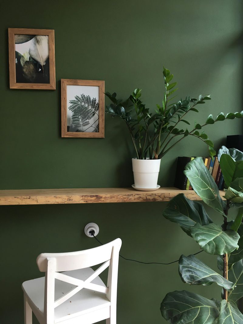
Bringing the outdoors inside, olive green creates a grounded, peaceful atmosphere that feels both on-trend and timeless. This earthy tone connects with nature while maintaining a sophisticated urban edge.
Olive walls make the perfect backdrop for both vintage and contemporary furnishings. The color’s natural undertones complement houseplants, making them appear more lush and vibrant against this backdrop.
Designers appreciate olive’s versatility across seasons—it feels cool and refreshing in summer months, yet warm and cozy when paired with amber lighting and textured throws in winter. For homes with open floor plans, olive provides a subtle transition between living spaces.