Ever walked into a room and felt something was off, but couldn’t quite put your finger on it? Small decorating choices can make a big difference in how expensive or cheap a space feels. Even with a limited budget, avoiding certain design pitfalls can help your home look more polished and put-together. Let’s explore the common decorating mistakes that might be making your rooms look less luxurious than they could.
1. Pushing Furniture Against Walls

Creating a moat of empty space in the middle of your room is a rookie mistake many homeowners make. When all your furniture hugs the walls, the room feels like a waiting area rather than a lived-in space.
Professional designers recommend pulling furniture away from walls to create conversation areas. This simple adjustment makes rooms feel more intentional and cozy. Try floating your sofa or placing your bed at an angle.
Even in small spaces, leaving just a few inches between furniture and walls can dramatically improve the room’s flow and sophistication. This technique creates depth and makes the space feel thoughtfully arranged rather than hastily assembled.
2. Mismatched Light Fixtures

Random light fixtures scattered throughout your home create visual chaos. Mixing ultra-modern pendants in the dining room with traditional chandeliers in the hallway tells a disconnected story.
Lighting should follow a cohesive theme that complements your overall design style. While fixtures don’t need to be identical, they should share common elements—similar finishes, complementary shapes, or consistent materials.
Coordinated lighting creates a sense of intention and harmony that elevates your space. Replace mismatched bargain lights with fixtures that speak the same design language, even if you need to install them gradually as your budget allows.
3. Exposed Electrical Cords

Nothing screams amateur decorator louder than a tangle of exposed cords snaking across your floor or dangling down walls. These electronic vines instantly downgrade even the most expensive room.
Cord management solutions are surprisingly affordable. Cable covers that match your wall color, cord clips, and decorative cord concealers can transform a messy electronic jungle into a clean, professional-looking space.
For a truly polished look, consider having an electrician install outlets in more convenient locations. Alternatively, furniture with built-in charging stations and cord management systems offers practical solutions while maintaining your room’s aesthetic appeal.
4. Cheap-Looking Window Treatments

Flimsy, ill-fitting curtains make even expensive rooms look shabby. Those standard-issue mini blinds or too-short curtains hanging awkwardly above your windows aren’t doing your space any favors.
Window treatments should be viewed as investment pieces rather than afterthoughts. Hang curtains high and wide to create the illusion of larger windows and taller ceilings. The fabric should just kiss the floor or puddle slightly for a luxurious feel.
Quality doesn’t always mean expensive. Simple panels in natural fabrics like cotton or linen look far more elegant than synthetic sheers with dated patterns. The right window coverings frame your view while adding texture and warmth to the entire room.
5. Oversized Furniture in Small Spaces

Jamming that massive sectional into your modest living room isn’t fooling anyone. Oversized furniture in small spaces creates an awkward, cramped feeling that cheapens the overall look.
Scale matters tremendously in design. Choose pieces proportional to your room size, leaving breathing space around each item. A smaller, well-made sofa paired with appropriately sized accent chairs creates a more sophisticated look than a bulky sectional that overwhelms the room.
Many furniture companies now offer apartment-scaled versions of popular styles. These right-sized pieces provide comfort without dominating the space, allowing for better traffic flow and a more balanced, intentional design.
6. Accent Walls Without Purpose

Random accent walls painted in jarring colors have become the calling card of hasty weekend DIY projects. Without consideration for the overall color scheme or architectural features, these walls often look disconnected and dated.
Successful accent walls highlight something worth emphasizing—a fireplace wall, an interesting architectural feature, or the wall behind a significant piece of furniture. The color should complement your existing palette rather than scream for attention.
Consider alternatives like textured wallpaper, wood paneling, or a gallery wall for more sophisticated accent options. When done thoughtfully, an accent wall adds depth and interest; when done haphazardly, it looks like you ran out of paint halfway through the job.
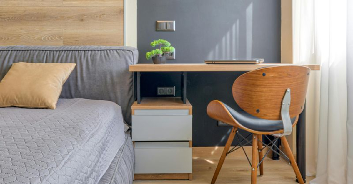
7. Excessive Fake Plants

Dusty, unrealistic artificial plants scattered throughout your home create an outdated, neglected atmosphere. Those plastic ferns with visible stems and obviously fake flowers aren’t bringing the natural element you’re hoping for.
If maintaining live plants seems daunting, invest in a few high-quality faux options rather than many cheap ones. Modern artificial plants have come a long way—realistic-looking succulents, fiddle leaf figs, and olive trees can actually enhance your space when selected carefully.
Place artificial greenery strategically rather than stuffing every corner. Mix with real, easy-care plants like pothos or snake plants for authenticity. Remember: one beautiful statement plant makes more impact than multiple mediocre ones.
8. Cluttered Open Shelving

Open shelving overflowing with mismatched items creates visual noise that cheapens your entire space. Those kitchen shelves crammed with random mugs, rarely-used appliances, and dusty decorative plates aren’t achieving the magazine-worthy look you envisioned.
Successful open shelving requires curation and restraint. Display a limited selection of attractive, functional items with breathing room between pieces. Group similar items by color or purpose for a more organized appearance.
Consider the practical aspects too—items on open shelves collect dust and grease, especially in kitchens. Reserve this storage style for frequently used pieces that won’t sit long enough to gather grime, or beautiful objects worthy of display.
9. Poorly Sized Area Rugs

Tiny area rugs floating in vast spaces create a postage-stamp effect that instantly diminishes your room’s appeal. That 5×7 rug barely reaching the coffee table legs makes your entire living area look awkward and unfinished.
Properly sized rugs should accommodate all or at least the front legs of your furniture. In living rooms, aim for rugs large enough to unify your seating arrangement. Dining room rugs should extend at least 24 inches beyond the table edge to accommodate chairs.
If budget constraints prevent purchasing the ideal size, consider layering a smaller statement rug over inexpensive larger options like jute or sisal. This creates the correct proportions while still allowing you to incorporate pattern and color.
10. Matching Furniture Sets

Walking into a room where every piece perfectly matches screams “showroom floor” rather than a thoughtfully designed space. Those identical end tables, coffee table, entertainment center, and bookcase create a flat, uninteresting look reminiscent of furniture store displays.
Designer spaces feature collected, coordinated pieces that complement each other without matching exactly. Mix wood tones, incorporate different textures, and blend furniture styles while maintaining a cohesive color palette.
Start by breaking up existing sets—perhaps keep the sofa but replace side tables with vintage finds or painted pieces. Add character through accessories in contrasting materials like metal, glass, or woven elements. This curated approach creates depth and personality lacking in matched sets.
11. Wall Art Hung Too High

Artwork floating near the ceiling creates an awkward, disconnected feeling throughout your space. When pictures hover too far above furniture, they lose their relationship to the room and appear randomly placed.
The center of framed pieces should generally hang at eye level (about 57-60 inches from the floor) in living areas. When hanging art above furniture, position it 4-8 inches above the piece, creating a visual connection between elements.
Gallery walls should feel unified despite containing multiple pieces. Treat the entire arrangement as one unit when determining height, rather than hanging each piece individually. This intentional placement makes rooms feel more polished and professionally designed.