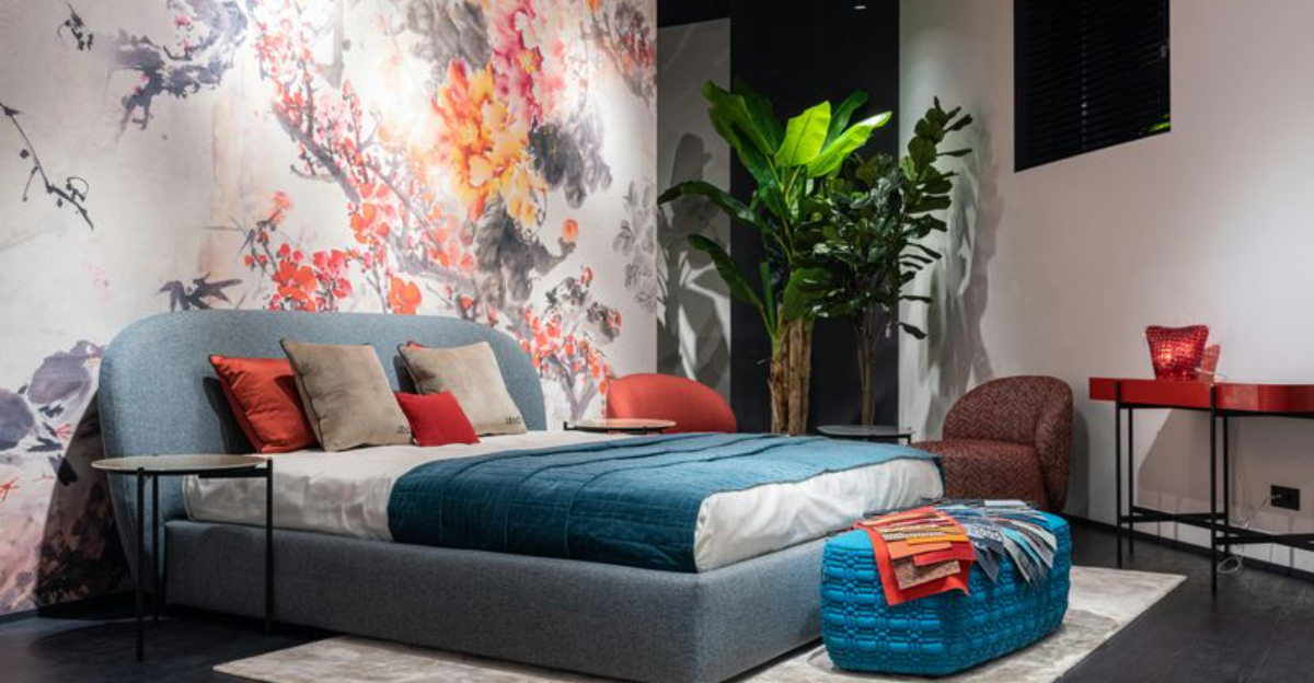
Colors have a powerful effect on how we feel in our spaces. The right paint shade can transform a chaotic room into a peaceful retreat where stress melts away. Whether you’re looking to create a relaxing bedroom or a serene living area, choosing calming colors is the first step toward a more peaceful home environment.
1. Soft Sage Green
Bringing nature indoors has never been easier than with this earthy hue. Soft sage green connects us to the outdoors, creating a grounding effect that helps reduce anxiety and tension.
This color works beautifully in bedrooms, bathrooms, and home offices where you need to stay focused yet relaxed. It pairs wonderfully with natural wood furniture and white trim.
Studies show that green shades help lower blood pressure and promote feelings of balance. Unlike brighter greens, sage has gray undertones that keep it subtle and sophisticated rather than overwhelming.
2. Warm Beige
Neutral doesn’t have to mean boring. Warm beige wraps rooms in a comforting embrace that feels like a gentle hug after a long day.
This timeless shade creates the perfect backdrop for almost any decor style, from modern minimalist to farmhouse chic. It reflects light beautifully, making even small spaces feel open and airy.
Beige tones contain hints of yellow and cream that add warmth without being too bold. They’re especially effective in living rooms and entryways where you want guests to immediately feel welcome and at ease.
3. Pale Blue
Think of clear skies and calm ocean waters. Pale blue brings those peaceful outdoor moments right into your home, creating an instant sense of serenity.
This shade slows down our heart rate and breathing, making it ideal for bedrooms where quality sleep is essential. It also works wonders in bathrooms, turning them into spa-like sanctuaries.
The key is choosing a blue with just enough color to feel present without being too vibrant. Look for shades with gray or green undertones for maximum calming power.
4. Lavender Gray
Purple meets practicality in this sophisticated shade. Lavender gray combines the calming properties of purple with the stability of gray, creating a color that feels both creative and grounding.
Perfect for meditation spaces or reading nooks, this hue encourages quiet reflection without feeling too feminine or childish. It has a subtle elegance that appeals to all ages.
Did you know? Lavender has been used for centuries in aromatherapy to promote relaxation, and the color carries similar soothing benefits for our visual senses and overall mood.
5. Creamy White
Clean slate, fresh start. Creamy white offers the purity of white without the harsh, clinical feel that stark white can sometimes create.
This shade reflects maximum light, making rooms feel spacious and open while maintaining a warm, inviting quality. It’s incredibly versatile, working in every room from kitchens to closets.
The slight cream undertone prevents that cold, sterile hospital feeling. Instead, you get a blank canvas that promotes mental clarity and gives your mind room to breathe without visual clutter or distraction.
6. Dusty Rose
Romance without the drama. Dusty rose delivers the warmth of pink toned down with gray for a mature, calming effect that doesn’t feel overly sweet.
This color creates nurturing spaces perfect for bedrooms or dressing rooms where you want to feel pampered and cared for. It flatters skin tones beautifully, making it popular in bathrooms.
Pink shades are known to reduce feelings of anger and aggression, which is why some detention centers actually use them. Dusty rose gives you those benefits while maintaining sophistication and style.
7. Soft Gray
Balance in a can. Soft gray sits perfectly between black and white, offering stability and calm without taking sides or demanding attention.
Gray has become incredibly popular because it creates peaceful environments while complementing virtually any accent color you choose. It’s the ultimate team player in interior design.
Choose warmer grays with beige undertones for cozy spaces, or cooler grays with blue hints for a more refreshing feel. Either way, you’ll create a neutral foundation that helps reduce visual stress and promotes relaxation throughout your day.
8. Pale Yellow
Sunshine without the intensity. Pale yellow brings gentle optimism into your home, lifting spirits while maintaining a peaceful, undemanding presence.
This shade works magic in spaces that lack natural light, creating the illusion of sunny warmth even on cloudy days. Kitchens and breakfast nooks especially benefit from this cheerful yet calm color.
Yellow stimulates mental activity and generates happiness, but in its palest form, it does so gently. The key is keeping it soft and buttery rather than bright and bold for maximum calming effects.
9. Seafoam Green
Coastal vibes meet everyday life. Seafoam green captures the refreshing essence of ocean waves meeting sandy shores, instantly transporting you to more peaceful places.
This blue-green hybrid combines the calming properties of both colors, making it exceptionally soothing for bathrooms and bedrooms. It feels clean and fresh without being cold.
The color contains enough personality to be interesting while remaining subtle enough to promote relaxation. Pair it with white trim and natural textures for a spa-like retreat that helps you unwind after stressful days.
10. Warm Taupe
Earthy sophistication at its finest. Warm taupe blends brown and gray with just a whisper of purple, creating depth and richness while remaining completely calming.
This color has serious staying power because it never goes out of style and works with countless decor choices. It makes spaces feel grounded and secure, like a reliable friend.
Taupe is particularly effective in living rooms and home offices where you need to feel both relaxed and focused. It provides visual interest without distraction, supporting productivity while keeping stress levels low throughout your space.


