
Choosing a paint color can feel like trying to find a needle in a rainbow-colored haystack. You stare at dozens of similar-looking swatches, second-guessing yourself with each sample. But don’t worry! Paint selection doesn’t have to be stressful or complicated. Professional designers have tricks that make choosing the perfect shade simple, even if you’ve been burned by ‘looks-great-in-the-store-but-terrible-on-my-walls’ syndrome before.
1. Start with Your Favorite Things
Look around your home for inspiration already hiding in plain sight. That beloved rug, treasured artwork, or even your go-to throw pillows can unlock your perfect palette. Colors you naturally surround yourself with reflect what makes you happy.
Professional designers often begin projects by identifying existing elements that must stay in the room. They pull subtle tones from these pieces to create harmony. This technique ensures your new paint coordinates perfectly with your belongings.
For bedrooms, consider the colors that help you relax. For kitchens, think about shades that energize or complement your cabinetry. Your personal preferences have already created a color story—your walls should simply continue the conversation.
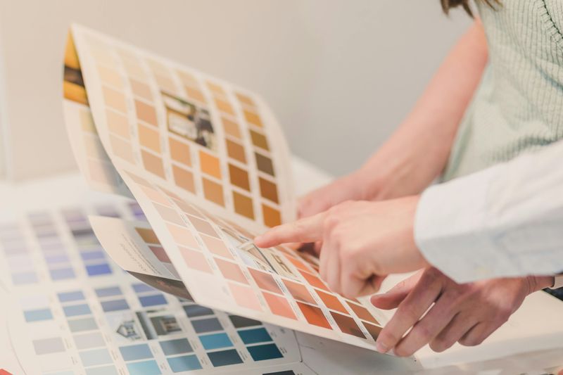
2. Never Judge a Swatch in the Store

Store lighting plays tricks on your eyes! Those fluorescent lights distort how colors truly appear, making that perfect gray look purple once you get home. Smart homeowners know to grab several sample cards and view them in their actual space.
Light changes dramatically throughout the day. Morning sunshine brings out warm undertones while evening light emphasizes cooler notes. Artificial lighting adds another layer of complexity.
Take those sample cards home and tape them to different walls. Check them during breakfast, lunch, and dinner. Notice how they transform throughout the day. This simple step prevents expensive mistakes and disappointment when your “perfect sage” suddenly looks like “muddy olive” in your living room.
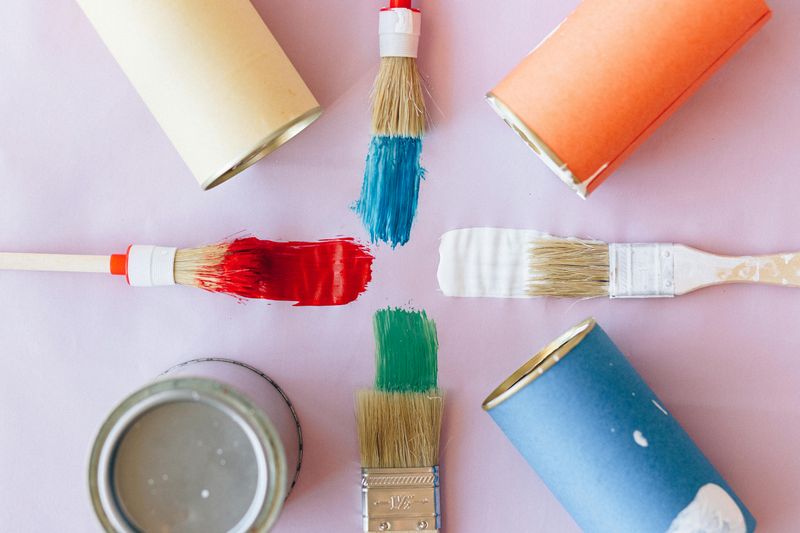
3. Sample Pots Save Heartache

Tiny paint samples might seem like an unnecessary expense, but they’re actually your best insurance policy against color regret. For about $5 each, these small pots let you test-drive colors before committing to gallons.
Paint at least a 2-foot square on your wall—small dabs won’t give you the true effect. Apply two coats for accuracy, since most rooms need multiple coats anyway. Position your samples on different walls to see how light affects them.
Many homeowners skip this crucial step, only to spend hundreds repainting entire rooms. Patient color-testers report much higher satisfaction with their final choices. The small upfront investment in sample pots prevents costly do-overs and disappointment.
4. Follow the Color Wheel Rules
Remember that basic color wheel from art class? It’s actually your secret weapon for foolproof color schemes. Adjacent colors (like blue and green) create harmonious, relaxing spaces perfect for bedrooms or reading nooks. Opposites (like blue and orange) generate energetic, vibrant rooms great for creative spaces.
Monochromatic schemes use various shades of one color for sophisticated, cohesive looks. Triadic schemes pull three equally-spaced colors for balanced but interesting combinations.
When in doubt, nature-inspired palettes rarely fail—think ocean blues with sandy beiges or forest greens with earthy browns. The color wheel provides time-tested formulas that designers rely on daily, taking the guesswork out of combining colors successfully.
5. Go Darker Than You Think
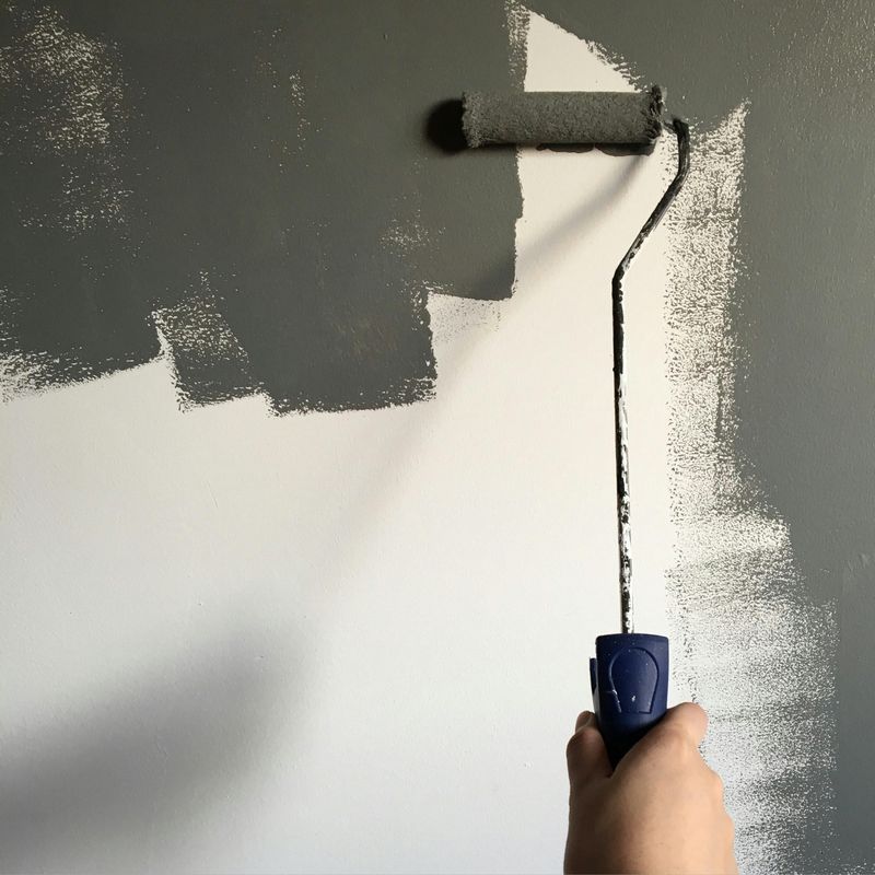
Most people chicken out when selecting paint colors, choosing paler versions of what they really want. Paint almost always dries lighter than it appears on the swatch. Designers often recommend going one or two shades darker than what initially feels comfortable.
Large walls and natural light dilute color intensity dramatically. That bold blue that seems overwhelming on a tiny card becomes much more subtle spread across an entire room. Rooms with abundant natural light further lighten colors.
Particularly with neutrals, deeper tones create richness and warmth that anemic lighter shades can’t achieve. That “greige” that looks perfect on the swatch might disappear entirely on your walls. When in doubt, take the bolder option—your future self will thank you.
6. Consider Your Home’s Flow

Your home tells a color story as visitors move from room to room. Jarring transitions between spaces create visual disconnection. Professional designers recommend choosing colors from the same color family or with similar undertones for connected spaces.
Open floor plans especially benefit from thoughtful color coordination. You don’t need identical colors everywhere—that’s boring! Instead, create a palette of 3-5 complementary colors that repeat throughout your home in different ways.
Try using a color wheel to select analogous colors (those sitting next to each other) for adjacent rooms. Another trick: use the same color in different intensities throughout your home. A full-strength color in one room can appear as a half-strength version in connecting spaces for subtle continuity.
7. Use the 60-30-10 Designer Rule
Professional designers swear by this simple formula for balanced rooms: 60% dominant color (usually walls), 30% secondary color (furniture/large accents), and 10% accent color (accessories/bold pops). This ratio creates visual interest without overwhelming the eye.
For wall colors, this means considering your existing furniture and floor colors first. If you have large dark furniture pieces, lighter walls provide necessary contrast. With light furniture, you have more flexibility to go bold on walls.
The 10% accent color brings rooms to life—think throw pillows, artwork, or decorative objects. This small percentage is where you can introduce that vibrant color you love but might be too intense for an entire wall. It’s the perfect place for seasonal color changes without repainting.
8. Embrace Historical Color Palettes
When all else fails, historical color collections offer pre-curated, time-tested combinations that always work together. Paint companies have done the hard work by researching authentic period colors and updating them for modern homes.
Colonial blues, greens, and reds create traditional, timeless atmospheres. Mid-century modern palettes feature warm neutrals with pops of avocado or orange for retro charm. Victorian collections showcase rich jewel tones that add drama and sophistication.
These collections eliminate guesswork since the colors within each palette are designed to coordinate perfectly. They’re particularly helpful for historic homes or those with architectural details from specific periods. Even in contemporary spaces, these carefully crafted palettes provide foolproof starting points for cohesive color schemes.