Interior design trends come and go like the seasons. What looked fresh and modern a few years ago might now feel tired or overdone. Designers across the country are speaking up about certain décor choices that have overstayed their welcome, and they’re encouraging homeowners to consider new directions that feel more current and personal.
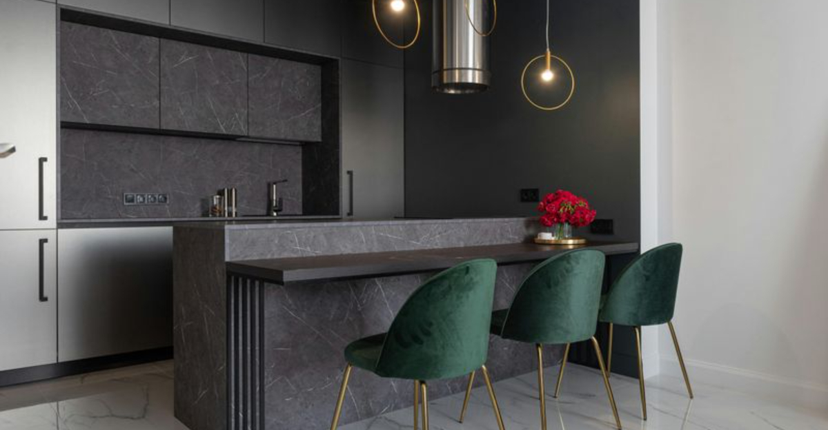
1. All-Gray Everything
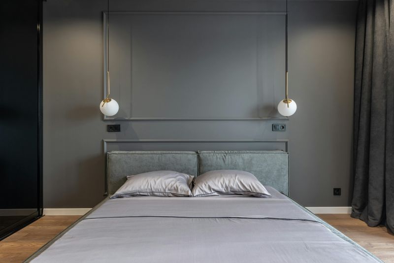
Gray walls, gray furniture, gray accents—this monochrome look dominated homes for nearly a decade.
While neutral tones create calm spaces, an overload of gray can make rooms feel cold and uninviting.
Designers now encourage homeowners to warm things up with earthy tones like terracotta, sage green, or soft beige.
These colors add personality without overwhelming a space.
Adding natural wood elements or textured fabrics can also break up the monotony.
Your home should feel welcoming, not like a stormy day.
Consider mixing in warmer neutrals or jewel tones to breathe life back into your rooms.
Small changes like colorful throw pillows or artwork can make a big difference.
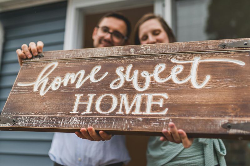
2. Farmhouse Signs with Cutesy Sayings
Wooden signs proclaiming “Gather” or “Blessed” became the hallmark of farmhouse style.
At first, they added charm and warmth to kitchens and living rooms.
However, these signs have become so common that they now feel generic rather than personal.
Your home should reflect your unique story, not mass-produced sentiments.
Instead of generic phrases, consider displaying meaningful artwork, family photos, or vintage finds that spark conversation.
Handmade pieces or items collected during travels tell a much richer story.
If you love words on your walls, choose quotes that genuinely resonate with you.
Authenticity beats trendy every time.
3. Excessive Open Shelving in Kitchens
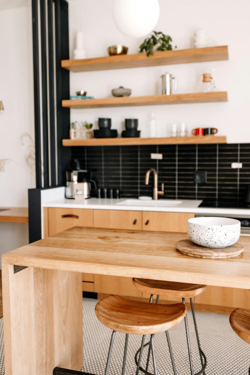
Open shelving promised a light, airy kitchen where everything stays within easy reach.
The reality?
Constant dusting, visual clutter, and the pressure to keep dishes perfectly arranged at all times.
While a few open shelves can showcase pretty dishware, an entire kitchen of them becomes exhausting to maintain.
Designers suggest mixing open shelves with traditional cabinets for balance.
This approach lets you display favorite pieces while hiding everyday items.
Closed storage reduces visual noise and makes cooking spaces more functional.
You want a kitchen that works for your lifestyle, not one that creates extra chores.
Practicality matters as much as aesthetics.
4. Shiplap on Every Surface
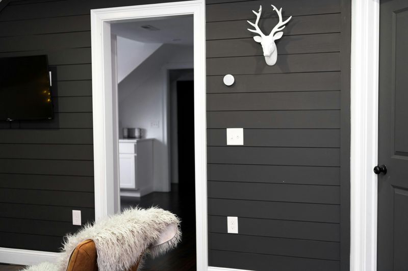
Thanks to certain home renovation shows, shiplap became the go-to wall treatment for everything.
Accent walls turned into entire rooms covered floor to ceiling in horizontal planks.
What started as a charming farmhouse detail became repetitive and predictable.
Designers recommend using shiplap sparingly, perhaps on a single feature wall or ceiling.
Too much creates a busy look that overwhelms rather than enhances.
Consider alternatives like textured wallpaper, board-and-batten, or smooth plaster finishes.
These options add visual interest without the overdone farmhouse vibe.
Sometimes less truly is more when it comes to architectural details.
Let other elements shine too.
5. Oversized Letter Marquee Lights
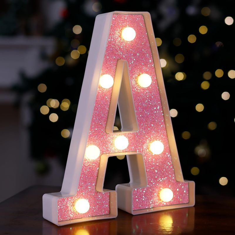
Giant illuminated letters spelling out LOVE or HOME seemed fun and whimsical at first.
They added a playful touch to bedrooms and living spaces.
But like many trends, these marquee lights lost their novelty as they appeared in every store and catalog.
They now feel more juvenile than sophisticated.
Designers suggest swapping them for more timeless lighting options like sculptural table lamps, Edison bulb fixtures, or elegant sconces.
These choices provide both function and style without the gimmick factor.
Good lighting should enhance your space, not dominate it.
Choose fixtures that complement your overall design rather than screaming for attention.
Subtlety often wins.
6. Chevron Patterns Everywhere
Zigzag chevron patterns exploded onto the design scene about ten years ago.
They appeared on rugs, pillows, curtains, and even wallpaper.
The bold geometric design felt modern and energetic initially.
However, chevron quickly became overwhelming when used in multiple places within one room.
The busy pattern can make spaces feel chaotic rather than cohesive.
Designers now favor subtler geometric patterns or organic shapes that feel less dated.
Think abstract prints, watercolor patterns, or classic stripes instead.
These alternatives provide visual interest without the dizzying effect.
Your eyes need places to rest, not constant stimulation.
Balance is key to comfortable living spaces.
7. Live Laugh Love Wall Art
Few phrases became as synonymous with generic home décor as Live Laugh Love.
This trio of words appeared in every possible format: metal signs, canvas prints, vinyl decals, and wooden plaques.
While the sentiment is positive, the phrase has become a punchline rather than inspiration.
Your wall art should express something meaningful about who you are.
Consider displaying original artwork, family heirlooms, or photographs from memorable experiences.
Even abstract pieces or botanical prints feel more personal than mass-produced motivational phrases.
Designers encourage clients to curate collections that tell their unique stories.
What makes you laugh?
What makes you feel alive?
Show that instead.
8. Mason Jar Everything
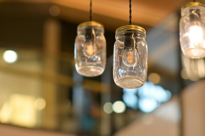
Mason jars transformed from practical kitchen storage to trendy décor items used for absolutely everything.
They became soap dispensers, vases, candle holders, drinking glasses, and light fixtures.
While one or two mason jars can add rustic charm, entire homes dedicated to this trend feel stuck in 2015.
The look has become predictable and lacks sophistication.
Designers recommend using a variety of vessels and containers that suit their purpose.
A beautiful ceramic vase, elegant glassware, or vintage bottles add more character.
Mixing different styles and materials creates visual depth.
Function matters, but so does variety.
Your home deserves more than one-note décor.
9. Distressed Furniture Everything
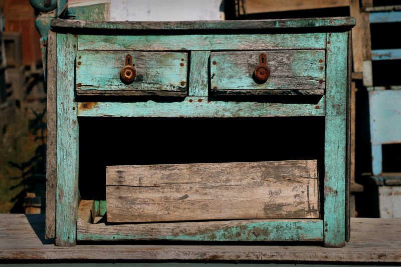
Shabby chic brought us furniture that looked deliberately worn and weathered.
Every piece got the distressed treatment—scraped, sanded, and painted to look antique.
A single distressed piece can add character, but rooms full of artificially aged furniture feel forced.
Real vintage pieces have authentic stories; manufactured distressing often looks fake.
Designers suggest mixing furniture finishes for a collected-over-time appearance.
Pair a genuinely old piece with something sleek and modern.
Contrast creates interest and prevents your home from looking like a staged set.
Quality craftsmanship in any finish beats faux aging.
Let your furniture have its own identity.
Authenticity shines through.
10. Faux Succulent Arrangements
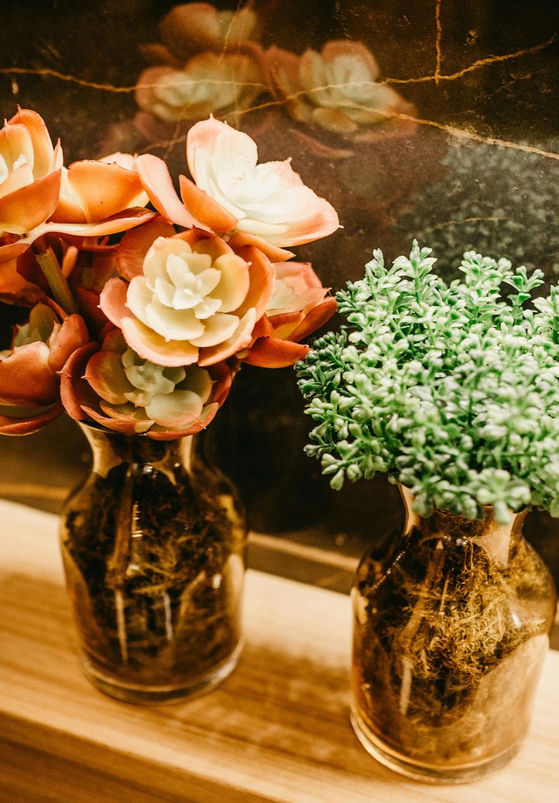
Real succulents require minimal care, yet fake versions flooded home décor stores.
These plastic plants promised zero maintenance while adding greenery to spaces.
The problem?
Most artificial succulents look obviously fake, collecting dust rather than bringing life to rooms.
They lack the texture, color variation, and organic beauty of living plants.
Designers encourage investing in real plants appropriate for your lighting and lifestyle.
Pothos, snake plants, and actual succulents thrive with little attention.
Real plants improve air quality and add genuine life to your environment.
If you truly cannot keep plants alive, choose high-quality artificial ones that look realistic.
Better yet, embrace other décor elements instead.
11. Overly Themed Coastal Decor
Coastal style can be calming, but going full beach rental risks looking kitschy.
When every surface shows rope, anchors, and seashells, your room loses depth and maturity.
Keep the breezy vibe with texture, not tourist trinkets.
Swap motif-heavy art for abstract seascapes, sandy linens, and bleached woods.
Layer natural fibers, matte ceramics, and soft blues instead of literal tokens.
You will still feel the ocean, just without the costume.
Introduce contrast through charcoal accents, aged metals, and grounded silhouettes.
Edit down novelty items to one favorite.
Your space will read curated, not themed.