When an interior designer walks into a room, they immediately start spotting things that don’t belong. Before picking out paint colors or new furniture, they clear out what’s holding the space back.
Some of these items might surprise you because they seem perfectly normal to most homeowners. Knowing what designers remove first can help you transform any room quickly and with confidence.
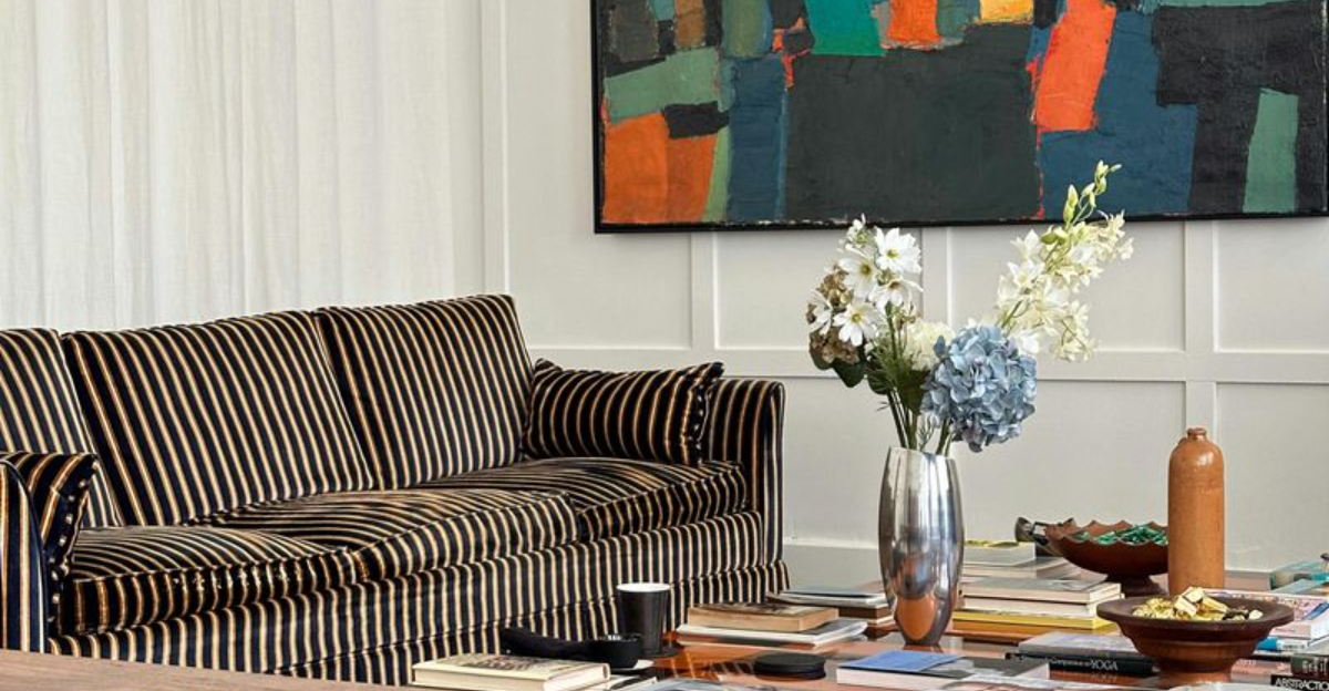
1. Excess Throw Pillows
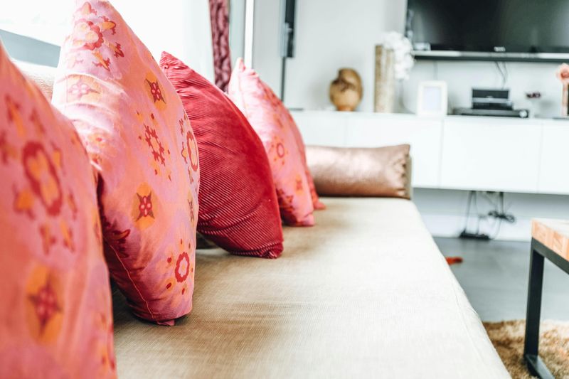
More pillows does not always mean more comfort.
In fact, a sofa buried under a mountain of cushions is one of the first things a designer will tackle.
Too many pillows make a space feel chaotic and hard to use.
Designers typically recommend keeping just two to four pillows per sofa.
This creates a clean, intentional look without sacrificing coziness.
The ones that stay should share a color palette or complementary pattern.
Clearing the excess instantly opens up the furniture and makes the room breathe.
You will be amazed at how much bigger your sofa looks with fewer pillows on it.
2. Outdated Family Photo Galleries
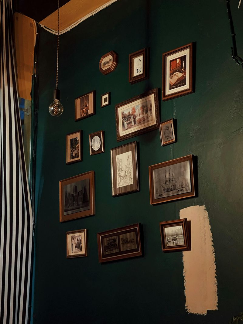
A wall packed with dozens of mismatched photo frames is a common sight in many homes.
Designers love personal touches, but an overwhelming gallery wall can make a room feel more like a scrapbook than a living space.
The fix is surprisingly simple: edit down to just a few meaningful photos in matching or complementary frames.
Groupings of three to five pieces tend to look the most polished and intentional.
Rotating your favorite shots seasonally keeps things fresh without adding clutter.
Your memories still get displayed, just in a way that feels curated rather than collected over twenty years without a plan.
3. Bulky Entertainment Centers
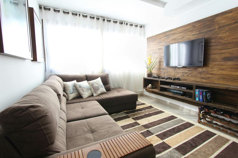
That massive, dark wood entertainment center from the early 2000s?
Designers spot it the moment they walk in.
These hulking pieces eat up floor space and visually weigh down an entire room, making even large living areas feel cramped and dated.
Modern flat-screen TVs are slim enough to mount directly on the wall, freeing up valuable floor real estate.
A sleek floating shelf or a low media console is all you really need underneath.
Removing the old unit can feel dramatic at first, but the result is a room that suddenly feels twice as open and ten years more current.
4. Worn-Out Area Rugs
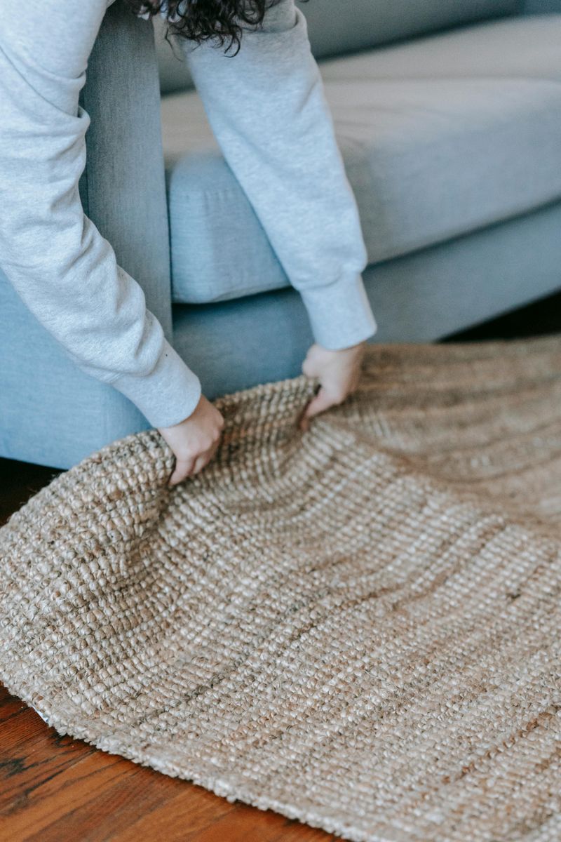
A rug that has seen better days can quietly drag down an entire room’s appearance.
Even if the furniture around it is beautiful, a faded or frayed rug sends the message that the space is neglected.
Designers notice rugs immediately because they anchor everything else in the room.
The right rug should be large enough to sit under the front legs of all major furniture pieces.
A too-small rug is one of the most common mistakes designers see in homes.
Swapping out a tired rug for a fresh one is one of the highest-impact changes you can make without a full renovation.
5. Knickknack Collections on Every Surface
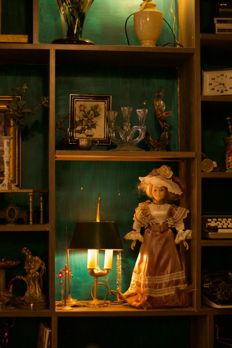
Collectibles, figurines, tiny candles, and random trinkets scattered across every surface are a designer’s biggest challenge.
Each item might be meaningful on its own, but grouped together without intention, they create visual noise that exhausts the eye.
The golden rule in design is to group items in odd numbers, usually threes, and leave plenty of empty space around them.
Empty space is not wasted space; it is breathing room that lets your favorite pieces actually shine.
Try boxing up three-quarters of your decorative items and see how the room transforms.
You might find that less truly is more when it comes to styling your shelves.
6. Mismatched Window Treatments
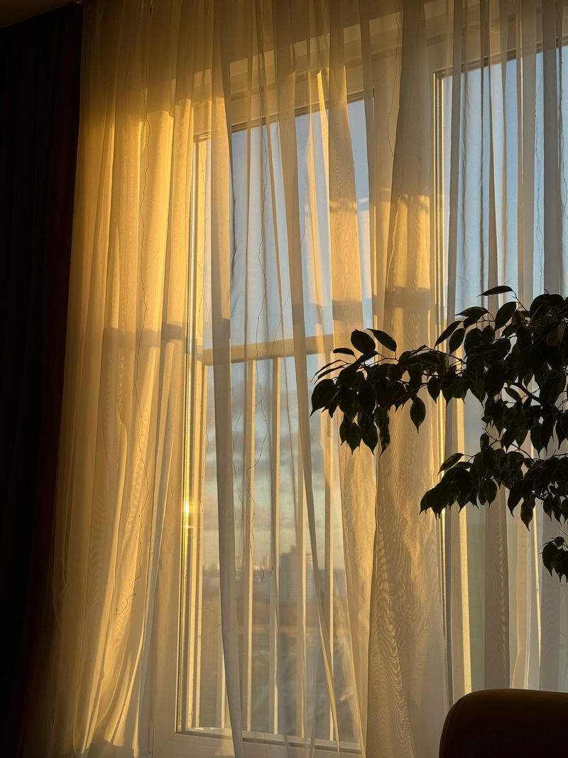
Did you know that window treatments are one of the most overlooked elements in home design?
Many homeowners mix blinds in one room with sheer curtains in another, creating a disjointed look from both inside and outside the house.
Designers almost always start by pulling down whatever patchwork of curtains and shades has built up over the years.
Replacing them with a consistent style throughout the home creates instant cohesion.
Even a simple white linen curtain hung high and wide above each window can make ceilings look taller and rooms feel more polished.
Consistency here pays off more than most people expect.
7. Unused Exercise Equipment
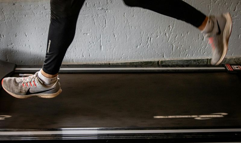
There is something almost universal about the treadmill that becomes a very expensive clothes hanger.
Exercise equipment that never gets used is one of the first things a designer will flag in any home walkthrough.
It takes up significant space while contributing nothing to the room’s atmosphere or function.
If you genuinely use it daily, a dedicated home gym space makes sense.
But if it has been collecting dust since January, it is time to let it go or relocate it to a more appropriate area.
Reclaiming that square footage for a reading nook or a proper seating area can completely redefine how a room feels and functions.
8. Outdated Light Fixtures
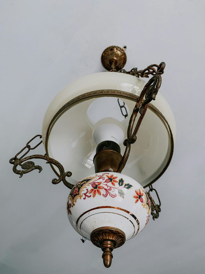
Lighting is the jewelry of a room, and outdated fixtures are like wearing a wristwatch from 1987 with a modern outfit.
Brass-toned chandeliers, boob lights on the ceiling, and fluorescent kitchen fixtures are among the top items designers swap out immediately.
Updating a light fixture is one of the most affordable ways to modernize a space.
A new pendant light or flush-mount fixture in a matte black or brushed nickel finish can shift a room’s entire personality.
Beyond style, better lighting also improves how colors and textures appear in a space.
Good light makes everything else in the room look more intentional and well-designed.
9. Too Many Floor Lamps and Cords
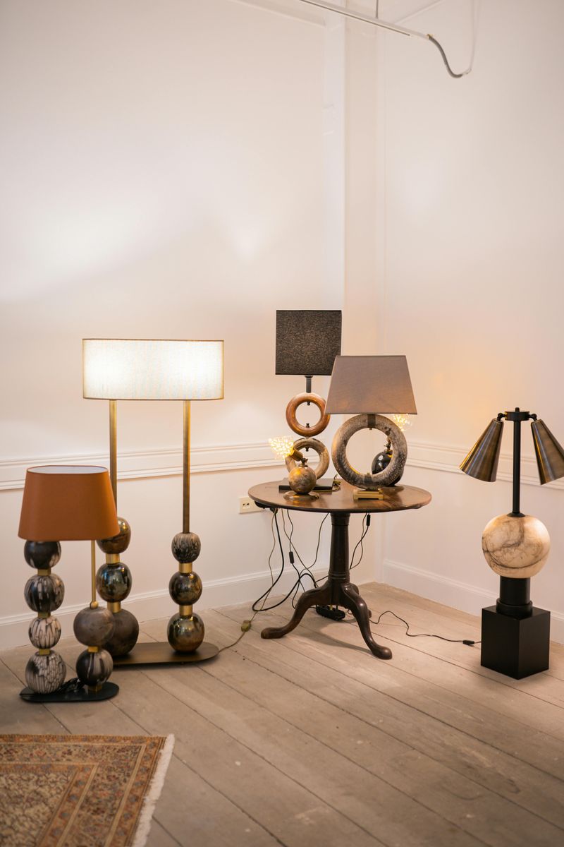
A tangle of visible cords snaking across the floor is a designer’s nightmare.
Multiple floor lamps clustered in corners not only eat up precious floor space but also create a chaotic energy that no amount of nice furniture can fix.
Cord management is one of those unsexy details that makes an enormous difference.
Designers prefer wall sconces, recessed lighting, or table lamps with hidden cord management over freestanding lamps that crowd the floor.
Each lamp should serve a clear purpose, not just fill an empty corner.
Eliminating one or two redundant floor lamps and tucking away cords can make a room feel immediately cleaner, calmer, and more professionally styled.