Color has the power to completely transform your home, making rooms feel bigger, cozier, or more exciting. As we look ahead to 2026, interior designers are buzzing about fresh palettes that blend natural inspiration with bold creativity.
These trending shades promise to bring personality and style into every corner of your living space. Get ready to discover the hues that will define homes in the coming year.
1. Nature-Inspired Yellow
Sunshine finds its way indoors with this cheerful shade that brings warmth without overwhelming your senses.
Think of buttery tones found in wildflower meadows or the soft glow of morning light filtering through trees.
This yellow works beautifully in kitchens and breakfast nooks where you want to start your day with positive energy.
Pair it with natural wood accents and woven textures to enhance the organic feel.
Unlike bright neon yellows, this gentler version creates a cozy atmosphere that feels both modern and timeless.
Designers love how it makes small spaces feel larger and more open.
Consider using it on an accent wall or through decorative pillows and artwork.
2. Cloudy White
Forget stark white walls that feel cold and clinical.
Cloudy white brings in subtle gray and blue undertones that mimic overcast skies, creating depth and sophistication.
This shade serves as the perfect backdrop for colorful furniture and bold artwork, letting your personality shine through.
Bathrooms become spa-like retreats when painted in this calming hue.
Bedrooms feel more restful and peaceful, encouraging better sleep and relaxation.
The beauty lies in how it changes throughout the day as natural light shifts.
Morning brings cool freshness while evening creates warmth.
It pairs wonderfully with metals like brushed nickel and matte black fixtures.
3. Playful Green
Bringing the outdoors inside has never looked this fun.
Playful green captures the lively spirit of spring leaves and fresh grass, injecting energy into any room.
Home offices benefit tremendously from this shade since green promotes focus and reduces eye strain during long work sessions.
Kids’ rooms come alive with this color, sparking imagination and creativity.
Unlike darker forest greens, this brighter version feels youthful and optimistic.
Combine it with white trim and natural materials like rattan or bamboo for balance.
Accent pieces in coral or mustard yellow create unexpected but delightful contrasts.
Even small doses through throw blankets make big impacts.
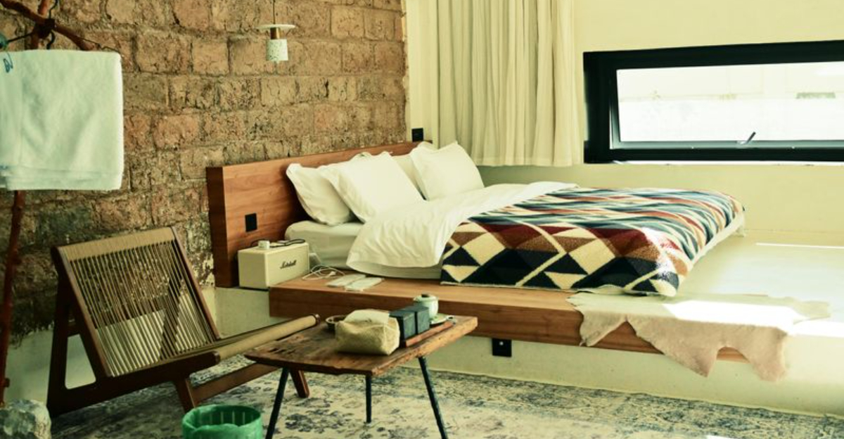
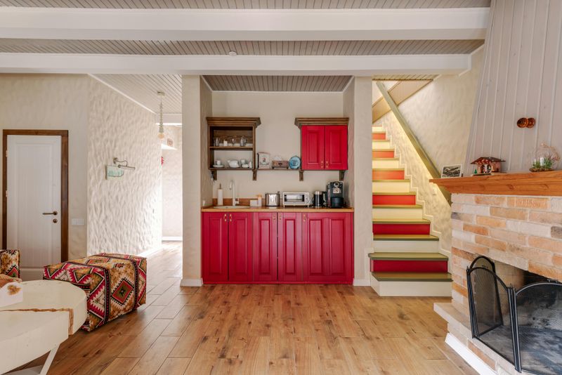
4. Reddish Brown
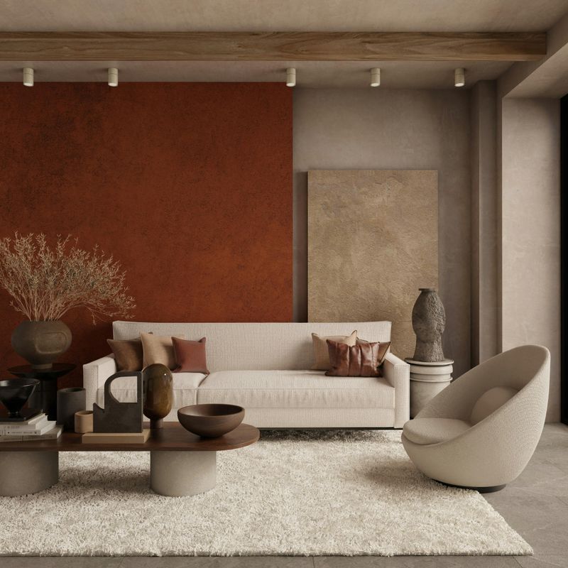
Earthy and grounding, reddish brown evokes the rich tones of terracotta pots and clay soil after rain.
This color adds instant warmth to dining rooms and living spaces where you gather with loved ones.
It creates an intimate atmosphere perfect for evening conversations and family meals.
Designers appreciate how it complements both modern and traditional furniture styles effortlessly.
The slight red undertone prevents it from feeling too heavy or dark.
Pair with cream-colored textiles and brass lighting fixtures for sophisticated elegance.
Plants with deep green foliage pop beautifully against this backdrop.
Consider using it in entryways to make memorable first impressions.
5. Icy Pastel
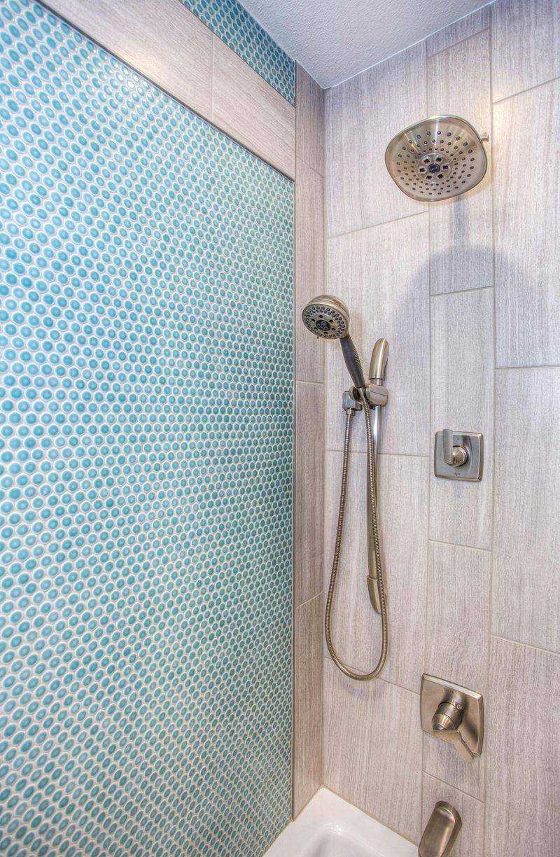
Cool and refreshing, icy pastel shades remind us of frozen lakes and winter morning skies.
These soft blues and mints bring tranquility to bathrooms and bedrooms where relaxation is essential.
The color feels crisp without being cold, maintaining a welcoming quality that harsh whites lack.
Powder rooms become jewel boxes when dressed in these delicate hues.
They reflect light beautifully, making even windowless spaces feel brighter and more spacious.
Pair with chrome or silver hardware for a cohesive, polished look.
White marble or subway tiles enhance the fresh, clean aesthetic.
This shade works year-round but feels especially perfect during warmer months.
6. Warm Terracotta
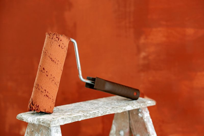
Desert sunsets and ancient pottery inspire this rich, earthy orange that feels both nostalgic and contemporary.
Terracotta brings instant character to spaces that might otherwise feel bland or forgettable.
Living rooms gain personality and depth when one wall features this bold choice.
The color works surprisingly well with cool blues and grays, creating balanced visual interest.
Southwestern and bohemian design styles naturally embrace this warm shade.
Even modern minimalist spaces benefit from terracotta accents through vases or cushions.
It makes white furniture pop while grounding darker wood pieces.
Natural fibers like jute rugs and linen curtains complete the organic aesthetic beautifully.
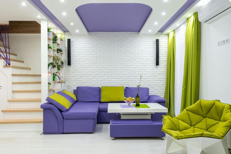
7. Surprising Purple
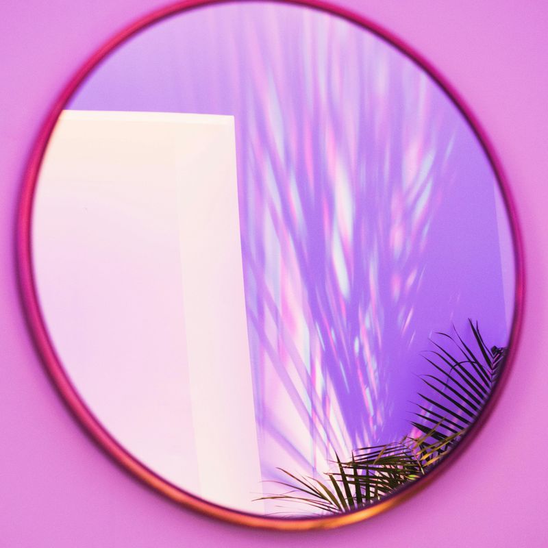
Who says purple is just for kids’ rooms?
Designers are embracing sophisticated lavender and deep plum tones that add drama without feeling overwhelming.
This unexpected choice makes bedrooms feel luxurious and special, like sleeping in a boutique hotel.
Purple has long been associated with creativity and spirituality, making it ideal for meditation spaces or art studios.
The key is choosing the right shade—dusty mauves feel vintage while vibrant violets bring modern edge.
Pair with gold or rose gold accents for glamorous appeal.
Gray and white balance the boldness, preventing the space from feeling too intense.
Even purple-haters might convert after seeing these refined versions.
8. Sultry Red
Bold homeowners are embracing deep, wine-inspired reds that create moody, romantic environments.
Dining rooms become instantly more formal and special when wrapped in these rich tones.
The color encourages lingering conversations and makes every meal feel like an occasion.
Libraries and home bars also benefit from sultry red, evoking classic gentlemen’s clubs.
Despite its intensity, this shade can make large rooms feel cozier and more intimate.
Balance the drama with plenty of warm lighting—think dimmer switches and candles.
Metallic gold frames and mirrors reflect light and prevent the space from feeling cave-like.
Not for the timid, but absolutely stunning when done right.
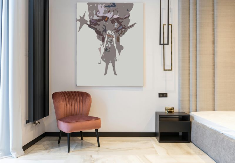
9. Pink-Leaning Neutral
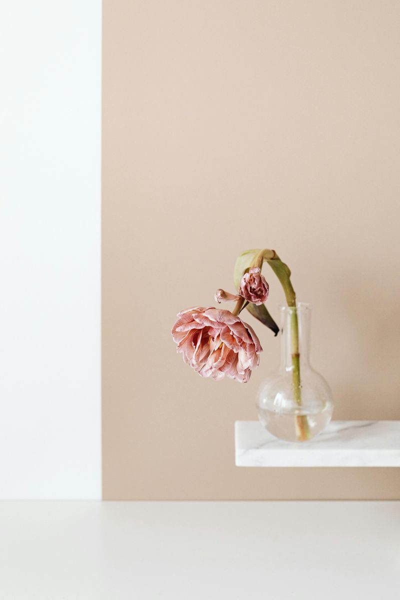
Beige gets a modern update with subtle pink undertones that feel fresh and current.
This sophisticated neutral works everywhere, from living rooms to hallways, creating flow throughout your home.
Unlike traditional beige that can appear dull, pink-leaning versions add warmth and dimension.
The color flatters skin tones beautifully, making it perfect for bathrooms where you apply makeup.
It serves as an excellent base that allows furniture and artwork to stand out.
Pair with deeper dusty rose accents or crisp white trim for definition.
Natural wood tones and greenery complement this shade wonderfully.
Both modern and traditional homes embrace this versatile, timeless option that never feels dated.