Transforming your living room into a luxurious space doesn’t always require a complete renovation or designer furniture. Sometimes, the secret lies in choosing the right paint color.
Professional interior designers know that certain shades instantly elevate a room, making it look polished, sophisticated, and far more expensive than the budget might suggest. Ready to discover which colors can give your living room that high-end feel?
1. Warm White / Cream
Picture walking into a five-star hotel lobby where everything feels fresh, bright, and impossibly elegant.
That’s exactly what warm white or cream brings to your living room.
Unlike stark white that can feel cold and sterile, these softer shades create an inviting atmosphere while maintaining that upscale vibe designers love.
Warm whites work beautifully because they reflect light without harsh glare, making your space feel larger and more open.
They pair effortlessly with both modern and traditional furniture styles.
Whether you choose Benjamin Moore’s Swiss Coffee or Sherwin-Williams’ Alabaster, these colors provide a timeless foundation.
Best of all, cream tones hide imperfections better than bright white while still keeping rooms feeling airy and clean.
They’re forgiving with different lighting conditions throughout the day, always looking refined and intentional.
2. Greige (Gray + Beige)
When gray and beige had a sophisticated baby, greige was born—and interior designers couldn’t be happier.
This hybrid neutral has taken over high-end homes because it offers depth and complexity that single-tone colors simply can’t match.
It reads warmer than gray but more contemporary than traditional beige.
Greige works magic in living rooms by creating visual interest without demanding attention.
It serves as the perfect backdrop for colorful artwork, metallic accents, and varied textures.
The subtle undertones shift beautifully depending on your lighting, appearing slightly warmer in morning sun and cooler under evening lamps.
Designers love greige because it feels current and timeless simultaneously.
It complements both warm wood tones and cool metal finishes, making furniture shopping easier.
This versatile shade elevates any space instantly, giving that curated look magazines feature constantly.
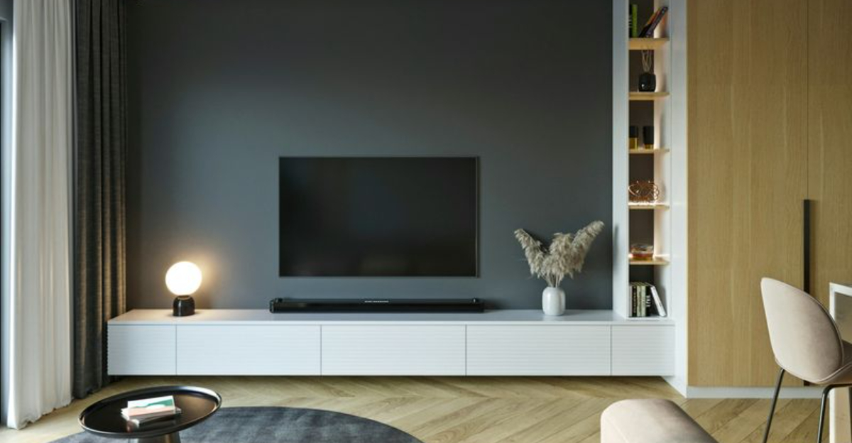
3. Charcoal Gray
Bold yet refined, charcoal gray makes a statement without screaming for attention.
Think of it as the little black dress of interior paint colors—always appropriate, eternally chic, and effortlessly elegant.
This deep shade adds architectural drama to walls, creating dimension that lighter colors can’t achieve.
Charcoal works particularly well in living rooms with plenty of natural light, where it can showcase its richness without making the space feel cave-like.
It creates stunning contrast against white trim, crown molding, and built-in shelving.
Pair it with brass fixtures, velvet upholstery, or marble accents for maximum luxury.
Many homeowners worry dark colors will shrink their space, but designers know better.
When used correctly, charcoal actually adds depth and sophistication, making rooms feel intentionally cozy rather than cramped.
It’s a confident choice that pays dividends in style.
4. Navy Blue
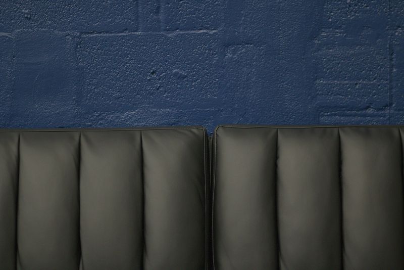
Few colors command respect quite like navy blue.
This classic shade has graced everything from presidential offices to yacht club lounges, and for good reason—it exudes confidence, tradition, and understated wealth.
Navy brings richness to living rooms while remaining surprisingly versatile and easy to decorate around.
Unlike lighter blues that can feel casual or beachy, navy reads formal and intentional.
It creates a cocooning effect that makes large rooms feel more intimate without sacrificing sophistication.
The color pairs beautifully with gold hardware, leather furniture, and crisp white accents for that timeless preppy-luxe aesthetic.
Designers appreciate navy’s ability to hide wall imperfections while adding visual weight to a space.
It photographs beautifully and never goes out of style, making it a smart long-term investment for your home’s most public gathering space.
5. Deep Green (Forest or Olive)
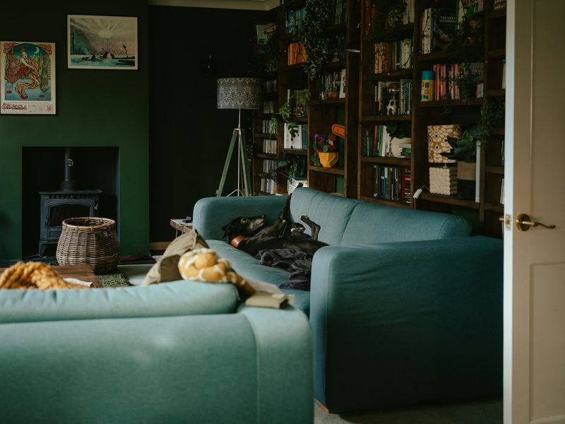
Nature’s most luxurious hue has moved from English manor houses straight into modern design magazines.
Deep forest or olive green evokes heritage, stability, and connection to the natural world—all qualities associated with expensive, thoughtful interiors.
It’s organic yet opulent, grounding yet glamorous.
Green works psychological magic in living spaces, promoting relaxation while maintaining visual interest.
Unlike trendy colors that feel dated within years, deep greens have centuries of design history backing their staying power.
They complement natural materials like wood, stone, and leather beautifully, creating layered, collected-over-time aesthetics.
Designers often use deep green as an accent wall behind built-ins or as an all-over color in rooms with high ceilings and good lighting.
Pair it with brass, cognac leather, or warm woods for maximum richness and depth.
6. Soft Taupe
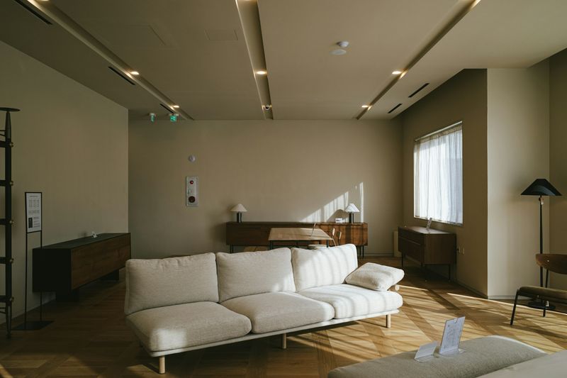
Whisper-quiet yet impossibly chic, soft taupe is the color equivalent of cashmere—luxurious without being flashy.
This understated neutral sits somewhere between gray and brown, offering warmth without going full beige.
It creates calm, polished atmospheres that feel expensive precisely because they’re so effortlessly refined.
Taupe’s superpower is its ability to make everything around it look better.
Furniture pops against it, artwork gains prominence, and architectural details become more noticeable.
It’s particularly flattering in rooms with mixed lighting, maintaining its elegant character from dawn to dusk without looking washed out or muddy.
Interior designers favor soft taupe for clients seeking sophistication without drama.
It works across design styles from minimalist modern to traditional elegance, serving as a chameleon that adapts while always maintaining that high-end sensibility.
7. Muted Beige / Sand
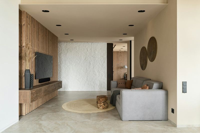
Not all beiges are created equal, and that’s where muted beige or sand tones shine.
These aren’t the flat, builder-grade tans of decades past—they’re complex neutrals with subtle undertones that add dimension and warmth.
Think sun-bleached linen, desert landscapes, or European plaster walls rather than cookie-cutter contractor beige.
What makes these shades read expensive is their nuance.
Quality muted beiges contain hints of pink, gray, or yellow that create depth and respond beautifully to changing light.
They provide warmth without feeling dated, working seamlessly with natural materials like jute, rattan, and linen that dominate high-end design.
Designers recommend testing several samples because undertones matter tremendously.
The right muted beige creates an effortlessly elegant backdrop that makes your living room feel collected, curated, and unmistakably upscale.