Ever wonder what catches a professional designer’s eye the moment they step through your front door? Interior designers have a trained ability to spot details most people overlook, from lighting issues to furniture placement problems.
Understanding what they notice can help you see your home through fresh eyes and make improvements that truly matter. Here are the key elements that interior designers always spot first when entering any home.
1. The Entryway’s Overall Impression
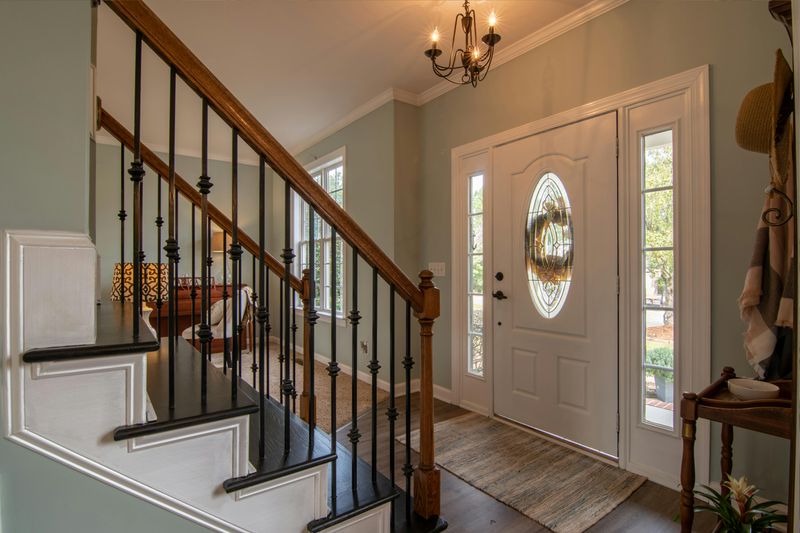
Your entryway sets the tone for the entire home, and designers know this better than anyone.
A cluttered or dark entrance immediately signals missed opportunities for creating a welcoming atmosphere.
Designers look for functional elements like a place to drop keys, hang coats, or remove shoes.
The flooring material matters too, since it needs to withstand daily traffic and weather conditions.
Lighting plays a crucial role in making guests feel comfortable from the first step inside.
Even small entryways can feel spacious with the right mirror placement and color choices.
A well-designed entry creates anticipation for what lies beyond.
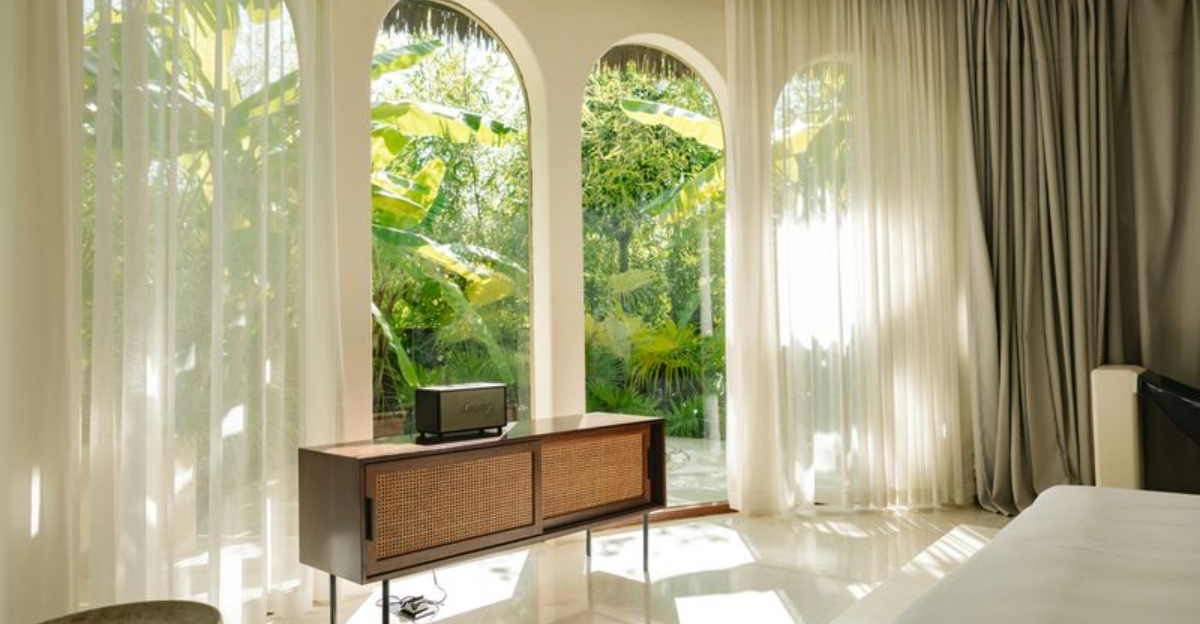
2. Natural Light Sources and Quality
Sunlight streaming through windows can make or break a room’s ambiance instantly.
Designers immediately assess which direction windows face and how much daylight enters throughout the day.
North-facing windows provide consistent but cooler light, while southern exposures bring warmth and brightness.
Heavy curtains blocking beautiful natural light often frustrate professionals who understand its value.
Window treatments should enhance rather than completely obstruct incoming sunlight.
Rooms with limited natural light require strategic artificial lighting solutions to feel inviting.
Positioning mirrors opposite windows amplifies available daylight beautifully.
Good natural lighting reduces energy costs and improves mood significantly.
3. Paint Color Choices and Condition
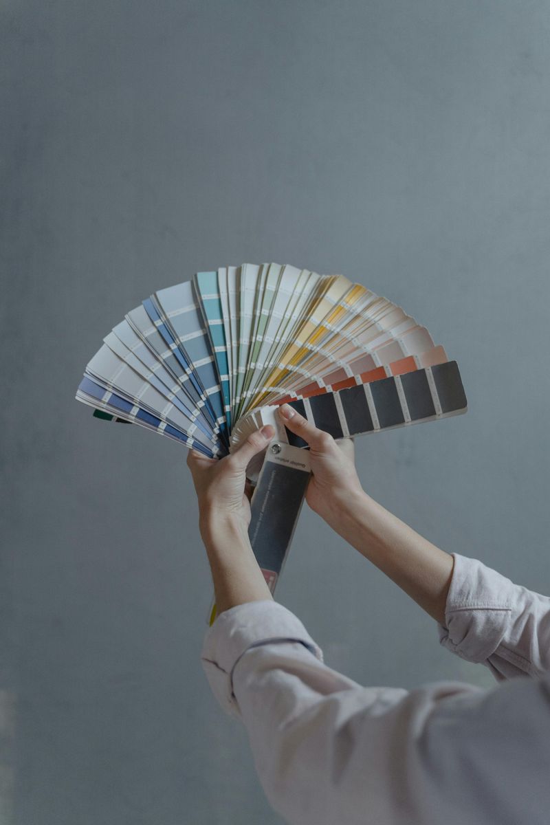
Wall colors reveal much about a homeowner’s style and maintenance habits.
Designers notice whether paint looks fresh or shows years of scuffs and fading.
Dated color schemes like excessive beige or builder-grade white feel uninspired to trained eyes.
Bold accent walls work wonderfully when done thoughtfully, but can overwhelm small spaces.
Inconsistent paint sheens between rooms create a disjointed feeling throughout the home.
Professionals appreciate when homeowners choose cohesive color palettes that flow room to room.
Trim and molding painted in contrasting colors add architectural interest effortlessly.
Fresh paint remains one of the most affordable updates available.
4. Furniture Scale and Proportion
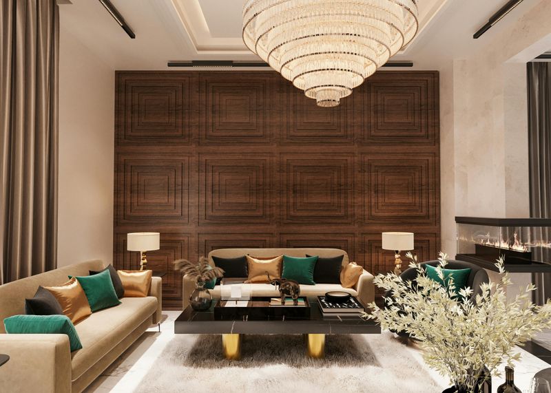
Oversized sofas crammed into tiny living rooms immediately catch a designer’s attention.
Proper furniture scale ensures people can move comfortably without bumping into corners constantly.
Coffee tables should sit about eighteen inches from seating for ideal functionality.
Dining tables need adequate clearance around them so chairs can pull out easily.
Bedroom furniture that blocks windows or crowds doorways disrupts natural traffic flow.
Designers measure spaces mentally, instantly knowing when pieces feel too large or oddly small.
Mixing furniture heights creates visual interest rather than everything sitting at one level.
Appropriately sized pieces make rooms feel larger and more intentional.
5. Traffic Flow and Layout Functionality
Walking through a home reveals whether the layout works for daily living or creates constant obstacles.
Designers notice if they must squeeze past furniture or take awkward routes between rooms.
Major pathways should measure at least thirty-six inches wide for comfortable passage.
Furniture arranged in conversation groupings encourages social interaction naturally.
Rooms with multiple entry points need careful planning to avoid blocking doorways.
Kitchen work triangles between sink, stove, and refrigerator impact cooking efficiency dramatically.
Open floor plans require intentional furniture placement to define separate zones clearly.
Good traffic flow feels effortless, while poor layouts cause daily frustration.
6. Lighting Layers and Fixture Quality
Relying solely on harsh overhead lighting creates an unflattering, institutional atmosphere.
Designers look for three lighting types: ambient, task, and accent layers working together harmoniously.
Dimmer switches allow flexibility for different times of day and various activities.
Outdated brass fixtures or mismatched styles throughout rooms signal missed cohesion opportunities.
Table lamps and floor lamps add warmth that ceiling fixtures alone cannot provide.
Under-cabinet lighting in kitchens improves functionality while creating appealing ambiance.
Light bulb color temperature affects mood, with warmer tones feeling more inviting.
Strategic lighting placement highlights architectural features and artwork beautifully.
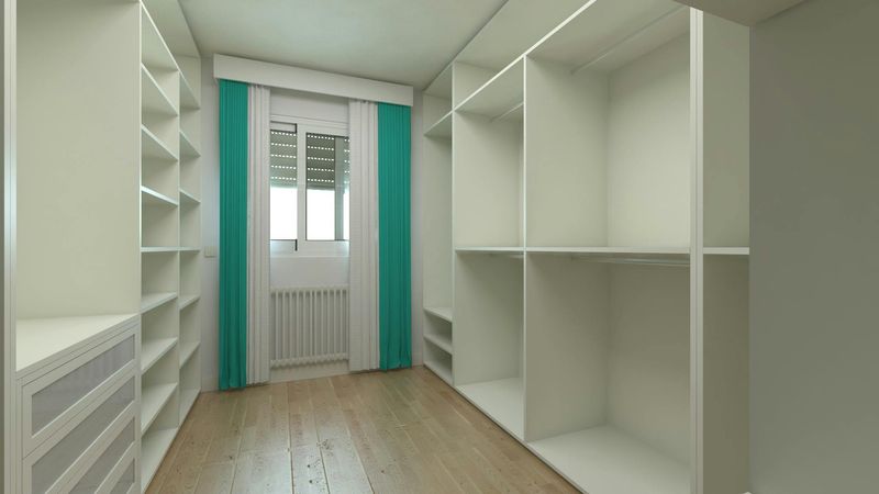
7. Window Treatments and Hardware

Curtains hung too low or too narrow make ceilings appear lower and windows seem smaller.
Designers prefer mounting rods close to the ceiling and extending beyond window frames.
Cheap plastic hardware detracts from otherwise beautiful fabric choices instantly.
Properly hemmed curtains should either kiss the floor or puddle slightly for elegance.
Matching window treatments throughout visible sightlines creates a polished, cohesive appearance.
Blackout linings serve practical purposes in bedrooms without sacrificing style.
Roman shades offer a tailored look while blinds provide adjustable light control.
Well-chosen window treatments frame views like artwork and soften hard architectural lines.
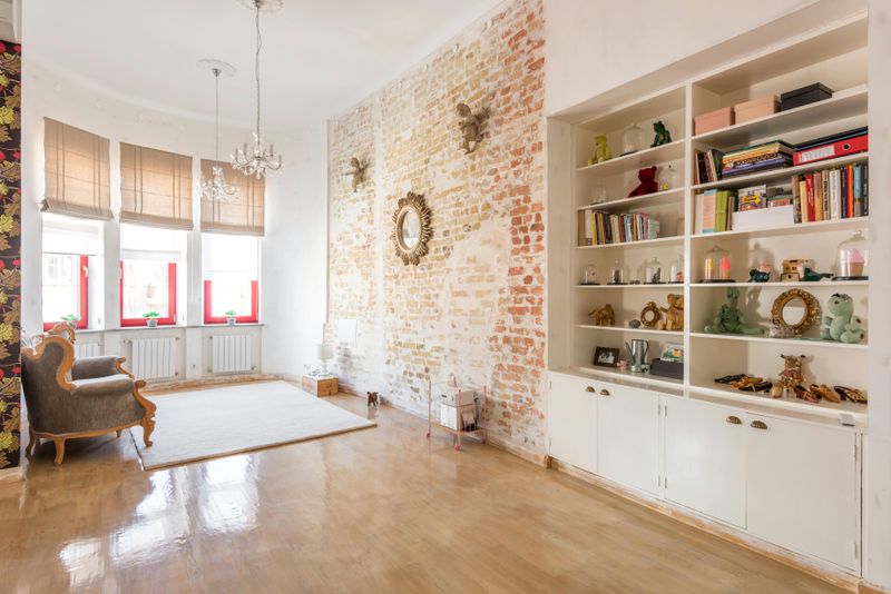
8. Flooring Transitions and Materials
Awkward transitions between different flooring materials disrupt visual flow throughout the home.
Designers notice whether hardwood runs consistently or changes direction randomly between rooms.
Mismatched wood tones in adjacent spaces create a disjointed, unplanned appearance.
Transition strips should be minimal and match flooring colors as closely as possible.
Area rugs help define spaces in open floor plans while adding texture and warmth.
Flooring choices affect acoustics, with hard surfaces amplifying noise more than carpet.
Durable materials in high-traffic areas prevent premature wear and costly replacements.
Consistent flooring throughout main living areas makes spaces feel larger and more unified.
9. Clutter and Surface Management
Countertops covered with mail, keys, and random items immediately signal a lack of organizational systems.
Designers understand that homes need designated spots for everyday belongings to function smoothly.
Coffee tables shouldn’t overflow with magazines, remotes, and miscellaneous objects competing for attention.
Open shelving works beautifully when styled intentionally but becomes chaotic when overloaded.
Hidden storage solutions like ottomans with interior space help maintain clean surfaces effortlessly.
Kitchen counters benefit from keeping only frequently used appliances visible daily.
Decorative trays corral smaller items while adding visual interest to surfaces.
Less clutter allows architectural features and intentional decor to shine properly.
10. Architectural Details and Molding
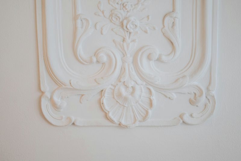
Crown molding and baseboards add character that distinguishes custom homes from basic builder models.
Missing or damaged trim pieces catch a designer’s eye immediately upon entering.
Painting molding in crisp white creates contrast that highlights these architectural investments.
Door casings and window trim should match throughout visible areas for consistency.
Adding molding to plain walls creates the illusion of higher ceilings and more expensive construction.
Wainscoting or board-and-batten treatments protect walls while adding dimensional interest.
Even rental homes can benefit from peel-and-stick molding options available today.
Architectural details provide visual breaks that prevent walls from feeling flat and boring.
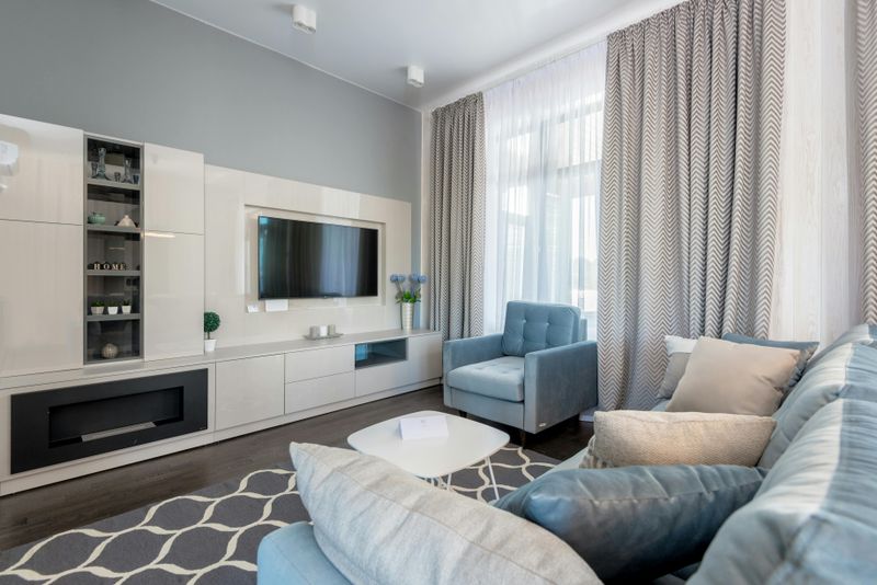
11. Color Palette Cohesion

Rooms decorated in completely different color families create a jarring experience moving through the home.
Designers appreciate when homeowners select a main color palette that flows throughout connected spaces.
Accent colors can vary by room while maintaining a thread of consistency.
Viewing colors in different lighting conditions prevents unfortunate surprises after painting.
Warm and cool tones mixed thoughtlessly can make spaces feel confused and unintentional.
Neutral bases allow flexibility for changing accent colors through accessories seasonally.
Color psychology affects mood, with blues calming and yellows energizing spaces naturally.
A cohesive palette makes homes feel professionally designed rather than randomly assembled.
12. Art and Decor Placement
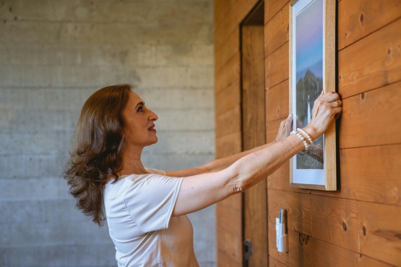
Artwork hung too high remains a common mistake that designers spot from across the room.
The center of art pieces should align at eye level, approximately fifty-seven to sixty inches high.
Gallery walls require planning so spacing between frames appears intentional rather than random.
Oversized art makes bold statements while tiny pieces get lost on expansive walls.
Leaning artwork on mantels or shelves creates a relaxed, collected-over-time aesthetic.
Personal photographs tell stories but work best when frames coordinate in finish and style.
Blank walls represent missed opportunities to add personality and visual interest.
Properly placed art draws eyes upward, making ceilings feel higher than actual measurements.
13. Rug Size and Positioning
Tiny rugs floating in the middle of large rooms look like afterthoughts rather than intentional choices.
Designers prefer rugs large enough for furniture front legs to rest on comfortably.
Living room rugs should extend at least eighteen inches beyond furniture on all sides ideally.
Dining room rugs need enough space for chairs to pull out without catching edges.
Bedroom rugs work best when they extend beyond nightstands, creating a soft landing for feet.
Layering rugs adds texture and visual interest in eclectic or bohemian design styles.
Rug patterns should complement rather than compete with other busy patterns nearby.
Properly sized rugs anchor furniture groupings and define separate zones effectively.