After a hectic day filled with noise, stress, and endless tasks, your home should feel like a peaceful sanctuary. The colors surrounding you play a bigger role in your mood than you might think.
Choosing the right color palette can transform any room into a calming retreat that helps you unwind, relax, and recharge for tomorrow.
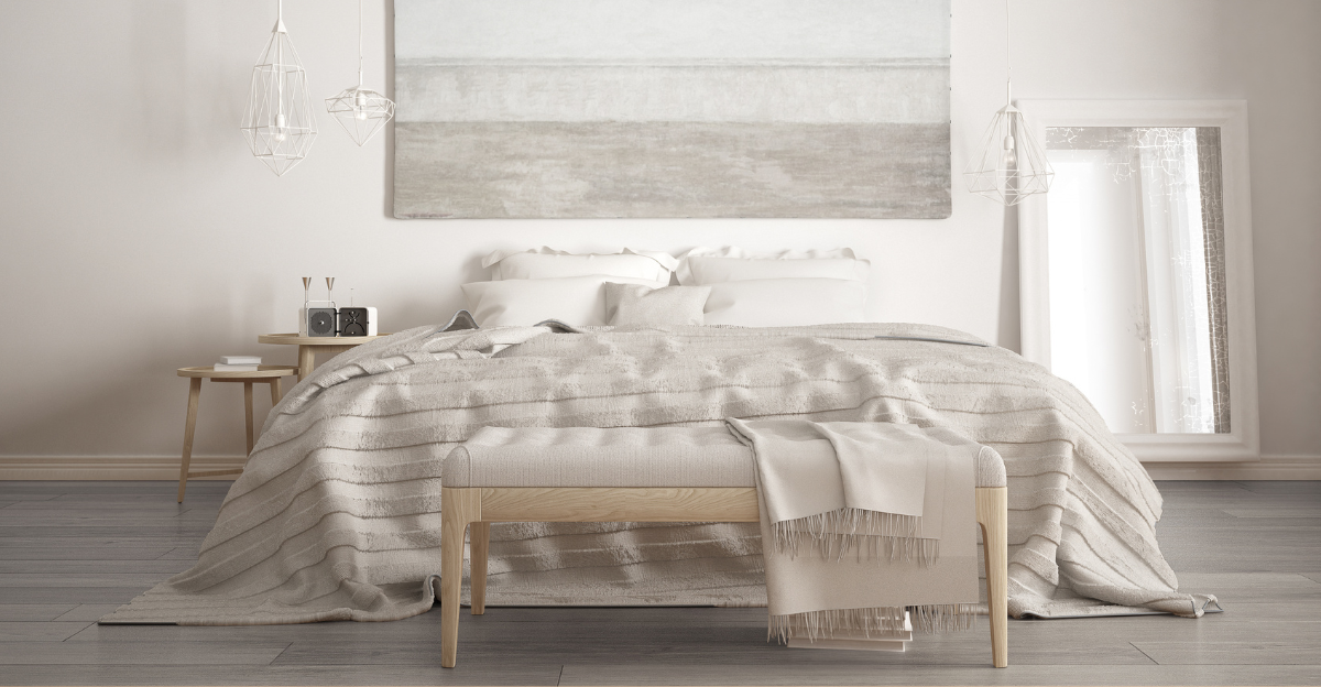
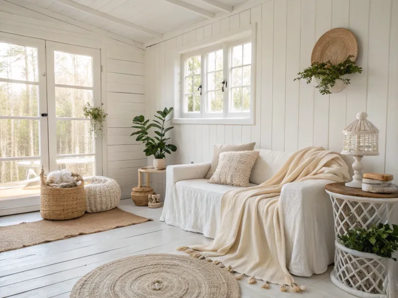
1. Soft Neutrals – Cream, Beige, Sand, Ivory, and Light Taupe
Imagine walking into a room that feels like a warm hug. Soft neutrals create that exact sensation by wrapping your space in gentle, undemanding shades that never overwhelm the senses. Cream walls paired with beige furniture invite relaxation without any visual noise.
Sand-colored rugs and ivory pillows add layers of comfort while keeping everything harmonious. Light taupe accents tie the palette together beautifully. This combination works wonderfully in bedrooms, reading nooks, or any space where you need to decompress after facing the world all day.
The beauty of these shades lies in their timeless simplicity and ability to make any room feel instantly bigger and brighter.
2. Muted Blues – Sky Blue, Powder Blue, Slate, and Misty Gray
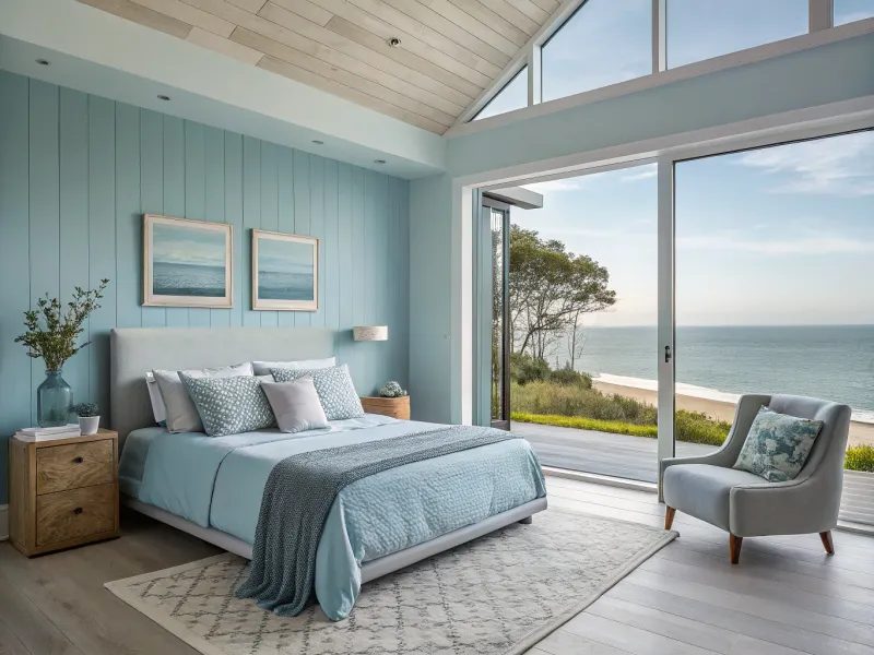
There is something undeniably soothing about gazing at a clear sky or calm water. Muted blues bring that same peaceful energy indoors, creating spaces that feel open and breathable. Sky blue walls can make even small rooms feel airy and spacious.
Powder blue bedding adds a soft, dreamy quality that encourages restful sleep. Slate tones ground the palette with subtle sophistication, while misty gray acts as the perfect neutral companion. Together, these shades mimic the quiet moments just before dawn or dusk.
If you often feel mentally cluttered, surrounding yourself with these colors can help clear your mind and restore inner calm.
3. Earthy Greens – Sage, Olive, Moss, and Eucalyptus
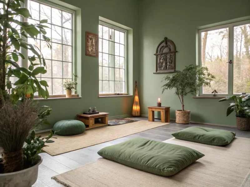
Nature has always been our greatest teacher when it comes to relaxation. Earthy greens channel the tranquility of forests, gardens, and meadows directly into your home. Sage green walls provide a soft backdrop that feels both modern and timeless.
Olive tones add depth without feeling heavy or dark. Moss-colored accents bring in texture and richness, while eucalyptus shades offer a fresh, clean vibe. This palette works especially well in spaces where you practice yoga, meditate, or simply enjoy quiet hobbies.
Studies show that green shades can actually lower stress hormones and help your body shift into relaxation mode naturally.
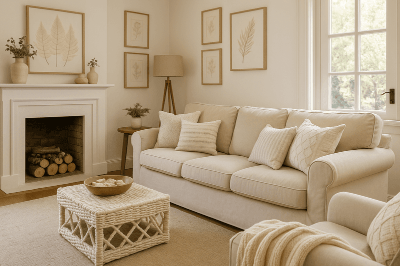
4. Warm Whites – Linen, Alabaster, Pearl, and Vanilla
White does not have to feel cold or sterile. Warm whites bring softness and comfort while maintaining that clean, uncluttered aesthetic many people crave. Linen shades have a gentle, natural quality that feels cozy rather than clinical.
Alabaster walls reflect light beautifully, making any room feel more spacious and welcoming. Pearl tones add subtle elegance without shouting for attention. Vanilla accents introduce just enough warmth to keep the space from feeling too stark or impersonal.
This palette is ideal for anyone who loves simplicity but still wants their home to feel inviting and lived-in rather than like a showroom.
5. Blush & Clay – Blush Pink, Terracotta, Warm Gray, and Soft Rose
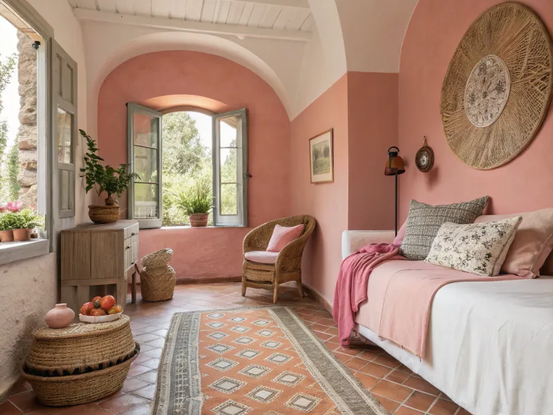
Who says calming colors cannot have personality? Blush and clay tones create a nurturing environment that feels both sophisticated and comforting. Blush pink adds a gentle, romantic touch without being overly sweet or childish.
Terracotta brings earthy warmth and a connection to ancient pottery and sun-baked landscapes. Warm gray provides balance and keeps the palette grounded. Soft rose accents tie everything together with understated elegance.
This combination works beautifully in bedrooms, bathrooms, or creative spaces where you want to feel inspired yet relaxed. The warmth of these shades can literally feel like a visual embrace after a draining day.
6. Coastal Cool – Seafoam, Driftwood, White Sand, and Pale Aqua
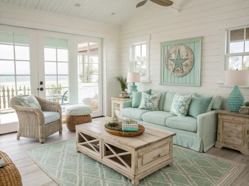
Close your eyes and picture standing on a quiet beach with gentle waves lapping at your feet. Coastal cool colors recreate that exact feeling of escape and tranquility. Seafoam green brings the refreshing quality of ocean spray into your space.
Driftwood tones add natural texture and a weathered, organic feel. White sand shades keep everything light and bright, mimicking sun-bleached shores. Pale aqua accents provide pops of color that feel refreshing rather than overwhelming.
This palette transports you mentally to vacation mode, making it perfect for bathrooms, sunrooms, or anywhere you need a daily dose of seaside serenity without leaving home.
7. Lavender Serenity – Lavender, Lilac, Dusty Mauve, and Dove Gray
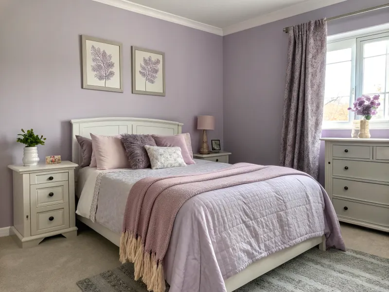
Lavender has been used for centuries to promote relaxation and better sleep. This palette captures that calming essence in visual form. Lavender walls create a dreamy backdrop that feels almost meditative in its softness.
Lilac accents add a lighter, more playful touch without disrupting the peaceful vibe. Dusty mauve brings depth and sophistication to prevent the space from feeling too pastel or juvenile. Dove gray grounds the entire palette with quiet elegance.
If you struggle with racing thoughts at bedtime, surrounding yourself with these gentle purple-gray tones can help signal to your brain that it is time to wind down and rest.
8. Forest Retreat – Deep Pine, Fern, Mushroom Beige, and Charcoal
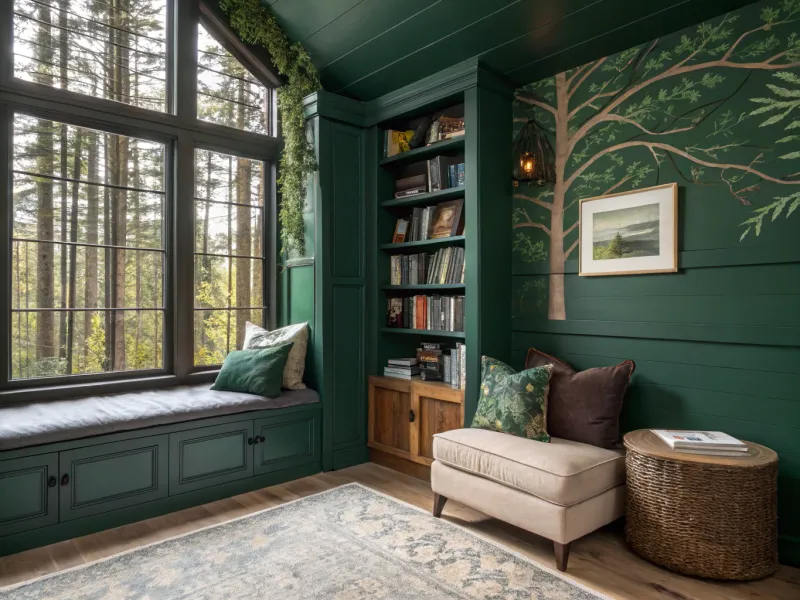
Sometimes you need colors that feel like a protective cocoon rather than an airy escape. Forest retreat tones offer that grounding, sheltering quality. Deep pine green creates a rich, enveloping atmosphere that feels both luxurious and natural.
Fern shades add lighter green accents that keep the palette from feeling too dark. Mushroom beige introduces warmth and softness, like sunlight filtering through tree branches. Charcoal adds dramatic contrast and modern sophistication.
This palette works wonderfully in home offices, libraries, or dens where you want to feel focused yet comfortable, surrounded by the quiet strength of the forest itself.
9. Sunset Pastels – Peach, Apricot, Coral Blush, and Warm Cream
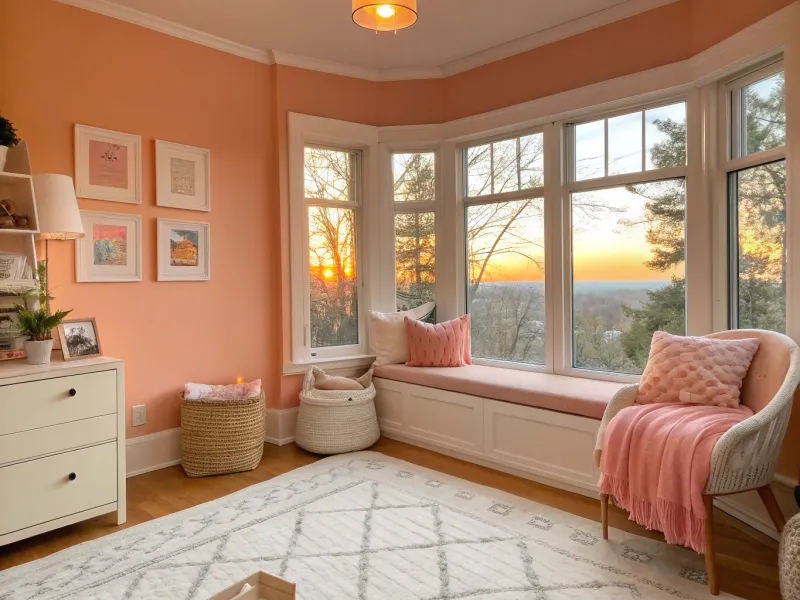
Few things feel more peaceful than watching the sun slowly set after a long day. Sunset pastels capture that magical golden hour glow in your home. Peach walls radiate warmth and optimism without being too bold or energetic.
Apricot accents add fruity sweetness and a touch of playfulness. Coral blush brings in subtle vibrancy that feels cheerful yet soothing. Warm cream ties everything together with a soft, neutral base.
This palette is perfect for spaces where you want to feel gently uplifted rather than completely subdued, like breakfast nooks, creative studios, or cozy reading corners that get beautiful afternoon light.
10. Stone & Smoke – Charcoal, Slate, Pebble Gray, and Off-White
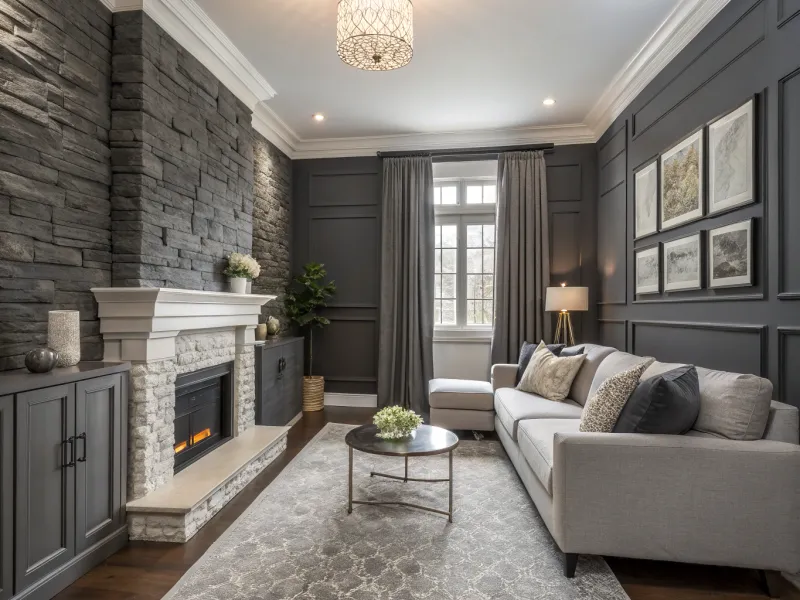
Sophistication and serenity merge beautifully in this monochromatic palette inspired by natural stone. Charcoal walls or accents create dramatic focal points that feel powerful yet peaceful. Slate gray furniture adds substance without overwhelming the senses.
Pebble gray textiles introduce softness and variety within the gray family. Off-white keeps the palette from feeling too dark or cave-like, allowing light to bounce around the room. Together, these shades create a cocoon of calm that feels both modern and timeless.
This palette suits minimalists and anyone who finds visual clutter stressful, offering a clean slate where your mind can finally rest and reset.