Dark, rich colors can transform your home into a sophisticated sanctuary, but many people worry these bold choices will make their spaces feel gloomy or cramped. The good news is you don’t have to sacrifice style for brightness. With some clever design tricks, you can enjoy those delicious navy blues, forest greens, and charcoal grays while keeping your space feeling open and inviting. Here’s how to harness the power of deep, moody colors without turning your home into a cave.
1. Create a Statement Accent Wall
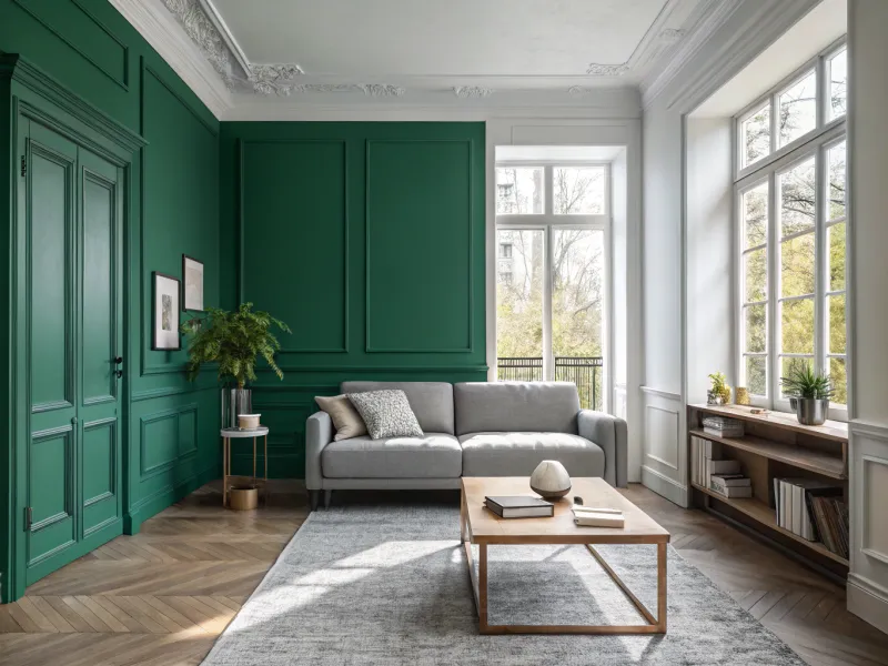
Painting just one wall in a rich hue creates dramatic impact without overwhelming the space. The remaining lighter walls reflect natural light, maintaining brightness while the accent wall adds depth and character.
Choose the wall that gets the most attention—often behind a bed or sofa. Keep furniture and decor simple against this backdrop to let the color shine. A deep emerald green or burgundy can anchor a room while still feeling airy.
The contrast between light and dark creates visual interest and actually makes the room feel larger, not smaller, by adding dimension to what might otherwise be a flat space.
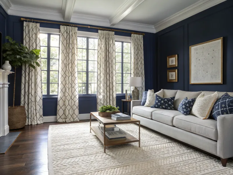
2. Balance with Lighter Neutrals
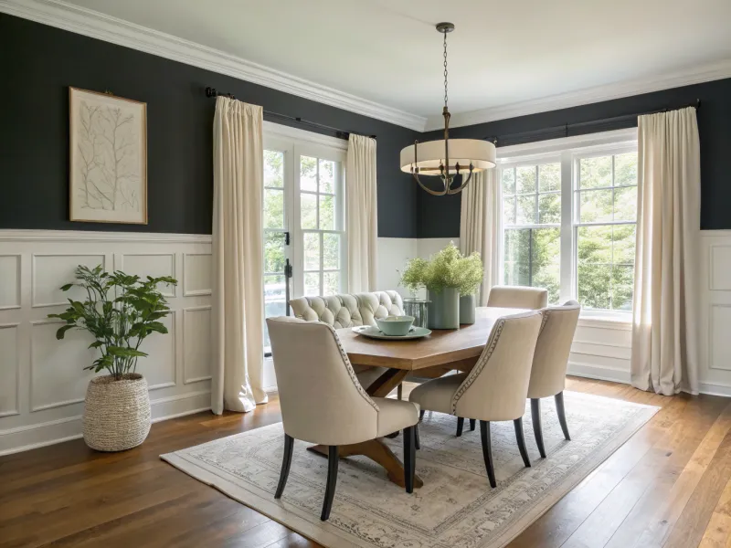
Moody colors need breathing room. Crisp white trim, light oak flooring, or cream-colored furniture creates necessary contrast against deep-toned walls. This balancing act prevents the rich colors from feeling oppressive.
Consider the 60-30-10 rule: use your bold color for just 30% of the space, neutrals for 60%, and accent colors for the remaining 10%. A charcoal wall looks stunning when paired with ivory curtains and natural wood elements.
The key is creating harmony between light and dark. Without this balance, even the most beautiful deep color can feel overwhelming rather than elegant.
3. Layer Multiple Light Sources
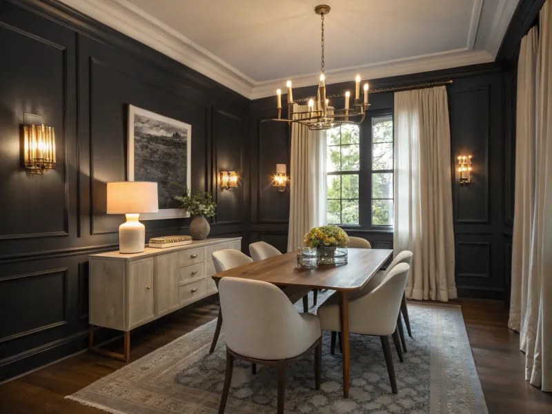
Strategic lighting transforms how we perceive color. In rooms with deep-toned walls, layer at least three types of lighting: ambient (overall illumination), task (focused light for activities), and accent (highlighting architectural features or art).
Wall sconces cast a gentle glow against dark walls, while floor lamps brighten corners. Table lamps add mid-level illumination. Consider installing dimmer switches to adjust the mood throughout the day.
Remember that warm-toned bulbs (2700-3000K) enhance rich colors better than cool white lighting, making deep hues feel cozy rather than cold or stark.
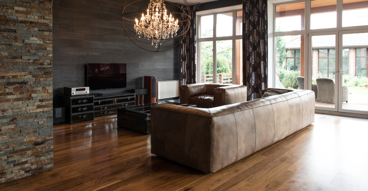
4. Add Reflective Surfaces
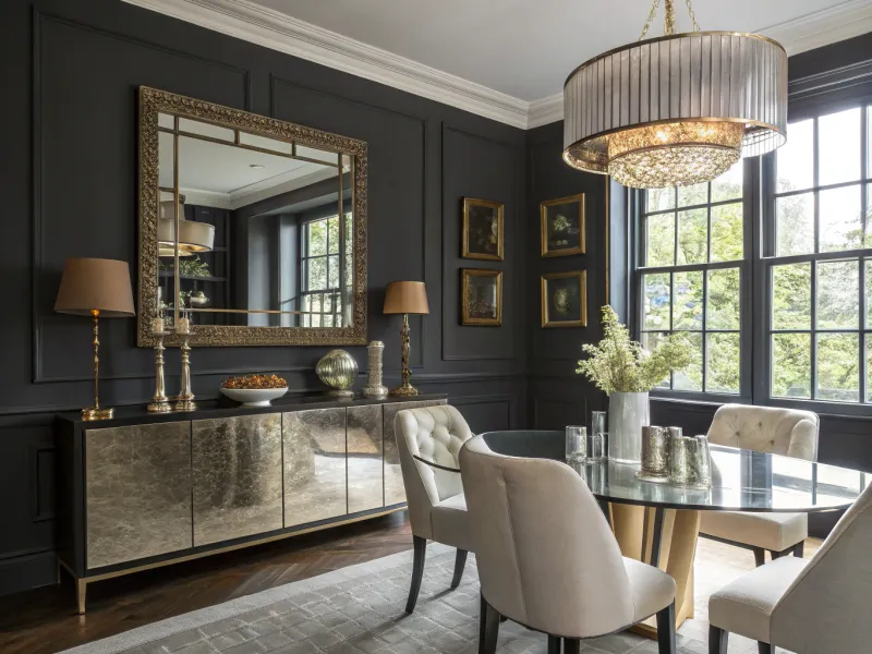
Mirrors perform magic in dark-hued spaces. A large mirror positioned opposite a window doubles the natural light and visually expands the room. But mirrors aren’t your only reflective allies.
Metallic accents—brass picture frames, copper pendant lights, or silver candlesticks—bounce light around the room. Glass tables allow light to pass through rather than being absorbed. Even glossy ceramic vases contribute to the brightness.
The contrast between matte dark walls and shiny surfaces creates a sophisticated interplay of light and shadow. This juxtaposition keeps the eye moving around the space, preventing any feeling of heaviness.
5. Embrace Rich Textures
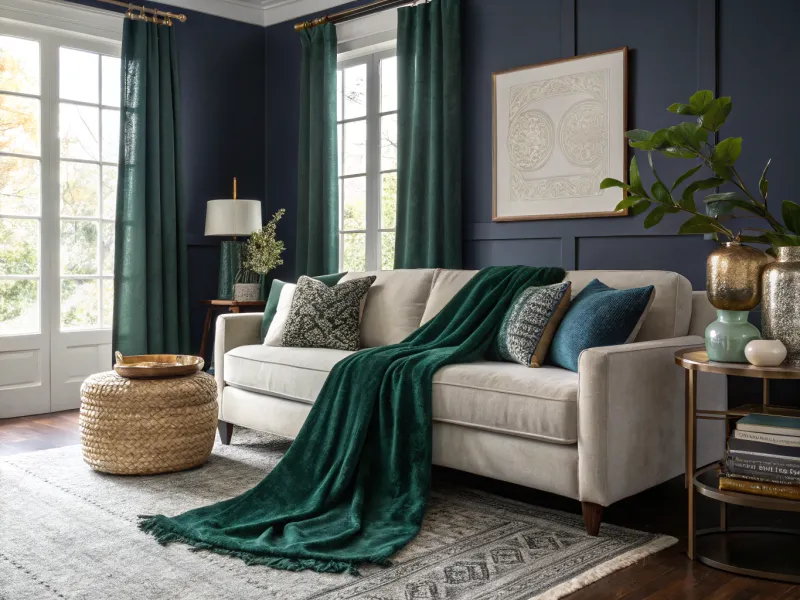
Texture brings dark colors to life. Velvet throws in jewel tones add dimension against a navy wall, while nubby wool rugs create softness underfoot. These varied textures catch light differently, creating subtle variations even within a monochromatic palette.
Mix materials thoughtfully—leather ottoman, linen curtains, woven baskets. Each texture reflects light uniquely, adding visual complexity that keeps dark colors from feeling flat or oppressive.
The tactile quality of these elements makes a room feel inviting rather than austere. Even in the deepest-hued room, plush textures signal comfort and warmth, encouraging people to linger.
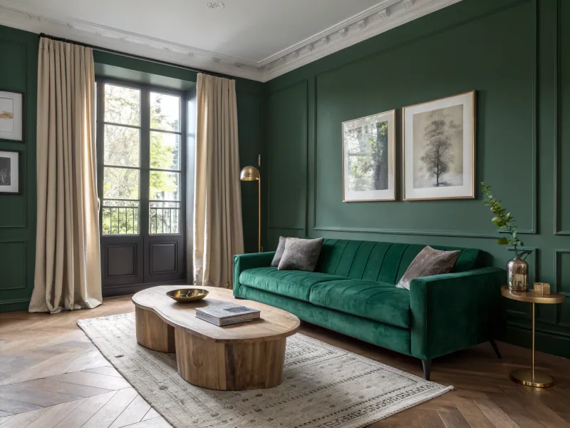
6. Incorporate Natural Elements
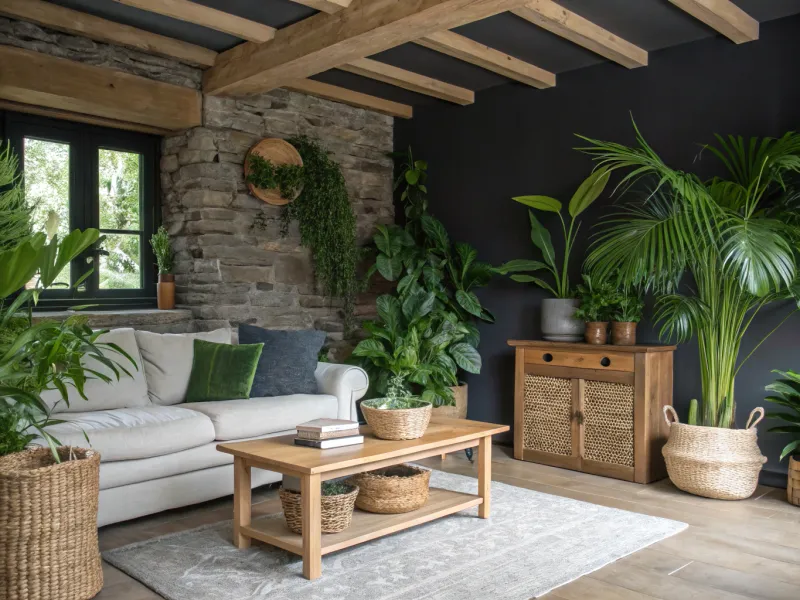
Plants thrive against dark backgrounds, creating dramatic contrast while literally bringing life into the space. The vibrant greens of houseplants pop against deep blues or charcoals, instantly brightening the room.
Natural wood elements—exposed beams, furniture, or decorative objects—add warmth to cool-toned dark walls. The organic patterns in wood grain create visual interest and prevent the space from feeling too severe or monolithic.
Stone, rattan, and other natural materials complement moody colors beautifully. They ground the space in something authentic and timeless, making even the boldest color choices feel connected to the natural world.
7. Paint Ceiling and Walls the Same Color
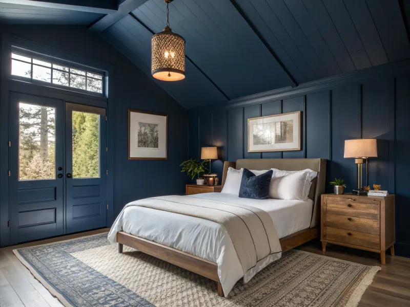
Contrary to popular belief, painting both walls and ceiling in the same deep color can actually make a space feel larger, not smaller. This technique blurs the boundaries of the room, creating a cocoon-like effect that feels expansive rather than confining.
The continuous color eliminates harsh transitions that can chop up visual space. In bedrooms or studies, this approach creates a serene, enveloping atmosphere perfect for relaxation or concentration.
To prevent the room from feeling too dark, ensure ample lighting and incorporate lighter furniture and textiles. The result is sophisticated and unexpected—a room that feels both cozy and boundless.
8. Highlight Architectural Features
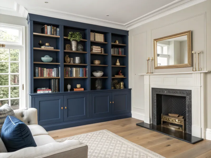
Built-ins painted in deep colors create focal points without overwhelming the entire room. A bookshelf in midnight blue or built-in cabinets in forest green draw the eye while containing the bold color to specific areas.
Window frames, door casings, or fireplace surrounds painted in rich hues add architectural interest. These elements feel intentional and grounding rather than simply dark for darkness’ sake.
This targeted approach allows you to enjoy dramatic colors without committing entire walls to them. The contrast between these painted features and lighter surrounding areas creates a pleasing rhythm throughout the space.
9. Start with Dark Neutrals
Deep neutrals like charcoal, espresso, or slate gray provide sophistication without the intensity of saturated colors. These shades create depth while remaining versatile enough to pair with almost anything.
Begin with these dark neutrals as your foundation, then layer in richer jewel tones through furniture and accessories. A charcoal wall provides the perfect backdrop for emerald velvet pillows or sapphire blue art.
The beauty of this approach is its flexibility—you can change accent colors seasonally without repainting. Dark neutrals deliver the moody aesthetic you crave while providing a timeless foundation that works with evolving tastes.
10. Use Statement Textiles
Bold fabrics and rugs with light patterns create balance in dark-colored rooms. A cream rug with subtle pattern grounds a space with navy walls, while patterned curtains draw the eye upward and outward.
Choose textiles with light backgrounds and darker accents that echo your wall color. This creates cohesion while preventing the space from feeling bottom-heavy. Throw pillows in varying patterns but coordinating colors add dimension without chaos.
The contrast between deep wall colors and lighter textiles creates visual breathing room. These fabric elements soften the intensity of dark walls while adding personality and warmth to the overall design.
11. Embrace Minimalism
Dark colors demand space to breathe. Cluttered rooms with deep-colored walls quickly feel cramped and chaotic, so embrace minimalism when using moody hues. Select fewer, more impactful pieces rather than many small items.
A deep green living room might feature just one striking sofa, a substantial coffee table, and a bold piece of art. The negative space around these elements allows the eye to rest and the color to make its statement without competition.
Quality over quantity becomes especially important with dark colors. Each piece should earn its place through beauty or function—preferably both—creating a curated space that feels intentional rather than overwhelming.