Choosing the right color combinations can transform your home from ordinary to extraordinary. While classic pairings like black and white never go out of style, some unexpected duos create even more visual interest and elegance. These surprising color matches bring personality and sophistication to any room, proving that taking risks with your palette can lead to stunning results.
1. Lavender + Bright Orange
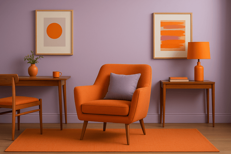
Picture walking into a room where soft purple meets energetic citrus tones. This pairing might sound bold, but it creates an unexpectedly refined atmosphere that feels both playful and grown-up. The coolness of lavender calms down orange’s intensity, while the orange prevents lavender from feeling too sleepy or boring.
This combination works beautifully in creative spaces like home offices or craft rooms. Try painting walls in a muted lavender shade and adding orange through artwork, cushions, or even a statement chair. The contrast between warm and cool tones adds depth without overwhelming your senses.
For best results, choose a dusty lavender rather than bright purple, and pair it with a true orange instead of neon.
2. Olive Green + Blush Pink
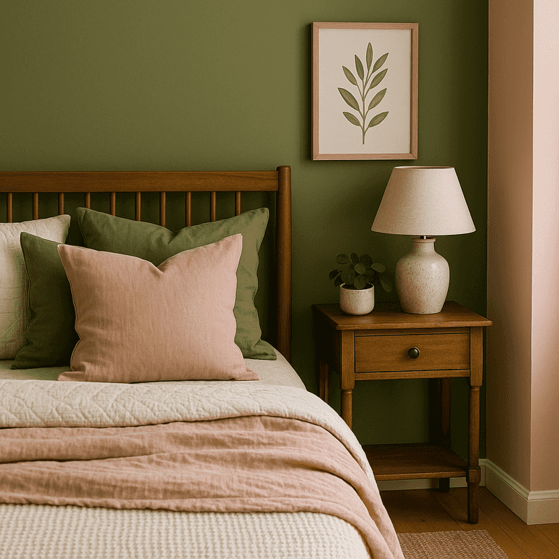
Nature lovers will appreciate how this earthy pairing brings the outdoors inside. Olive green carries a grounded, military-inspired vibe that gets softened beautifully by blush pink’s gentle warmth. Together, they create a balanced look that feels both modern and timeless.
This duo shines in bedrooms and dining rooms where you want a calming yet interesting environment. The green adds maturity and richness, while the pink keeps things from feeling too serious or masculine. Consider olive green for larger furniture pieces and blush for textiles like curtains or throw blankets.
Adding natural materials like wood, rattan, or stone enhances this combination even further, creating layers of texture and visual interest throughout your space.
3. Navy + Mustard Yellow
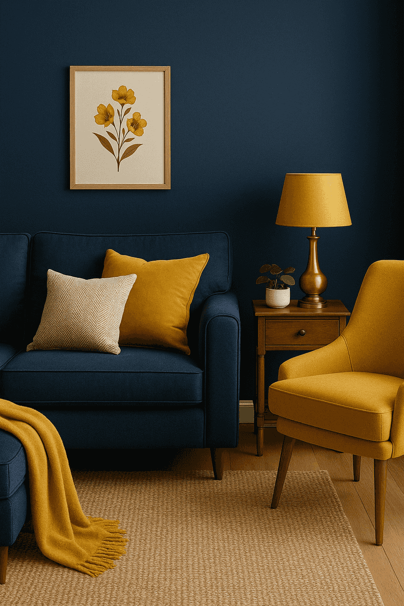
Few combinations feel as instantly polished as this classic pairing. Navy serves as a neutral foundation that’s richer than black or gray, while mustard yellow adds warmth and vintage charm. This match has been popular for decades because it simply works in almost any setting.
Living rooms and kitchens benefit most from this sophisticated duo. Navy can anchor the space through larger elements like sofas or cabinets, while mustard pops through smaller accents like bar stools, lamp shades, or decorative bowls. The contrast creates visual drama without feeling chaotic.
Brass or gold metallic finishes complement this pairing perfectly, adding an extra layer of elegance that ties both colors together beautifully.
4. Charcoal Gray + Sage Green
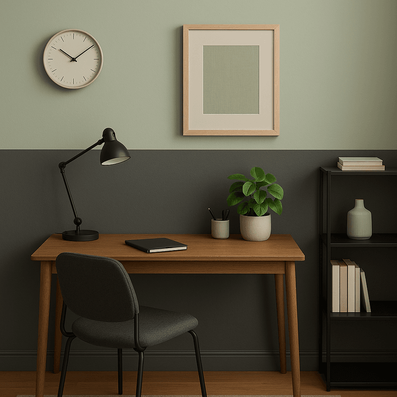
When you want sophistication without drama, this understated combination delivers. Charcoal provides a strong, masculine base that feels contemporary and sleek. Sage green lightens the mood with its soft, herbal quality that references nature without being overly literal about it.
Bathrooms and home offices become instantly more refined with this pairing. The gray works well on walls or larger furniture, while sage can appear in towels, desk accessories, or upholstered chairs. Both colors have a calming effect that promotes focus and relaxation.
White or cream accents help brighten this combination and prevent it from feeling too dark, especially in rooms with limited natural light throughout the day.
5. Burgundy + Dusty Blue
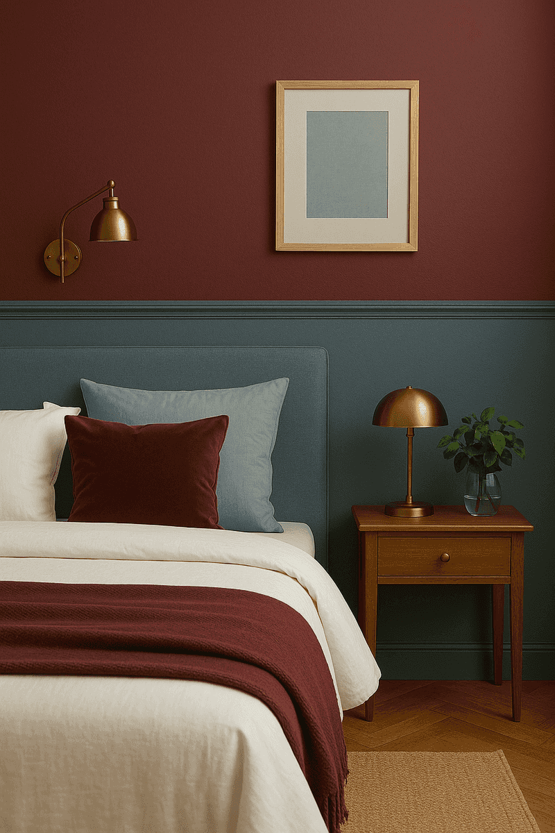
Rich and romantic, this pairing feels like it belongs in a European chateau. Burgundy brings depth and luxury with its wine-inspired richness, while dusty blue adds a soft, vintage quality that keeps things from feeling too heavy. Together, they create an atmosphere of timeless elegance.
Dining rooms and master bedrooms become instantly more luxurious with these colors. Use burgundy for velvet cushions, curtains, or accent walls, and let dusty blue appear in larger areas like painted furniture or bedding. The combination feels expensive without actually costing a fortune.
Gold or bronze accents enhance this pairing beautifully, adding warmth and a touch of glamour that complements both colors perfectly.
6. Chocolate Brown + Powder Blue
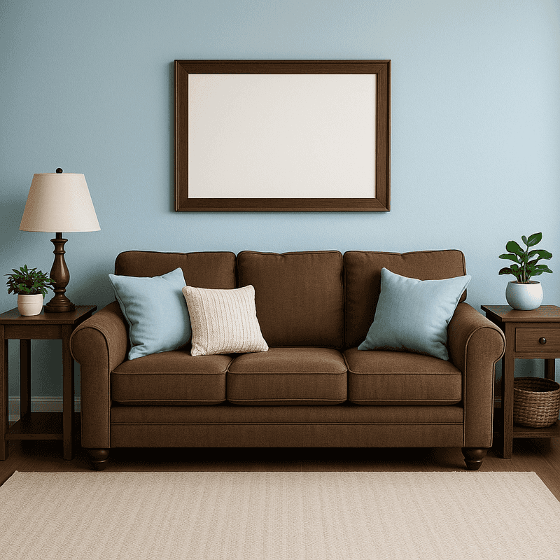
Something magical happens when rich chocolate meets delicate sky blue. Brown provides warmth and stability, creating a cozy foundation that feels welcoming and secure. Powder blue adds airiness and light, preventing the brown from feeling too heavy or cave-like in your space.
Family rooms and nurseries benefit greatly from this comforting combination. Chocolate works beautifully in leather furniture, wooden frames, or woven baskets, while powder blue can cover walls, rugs, or soft furnishings. The pairing feels both sophisticated and approachable at the same time.
Cream or ivory accents bridge these two colors nicely, while natural textures like jute or linen add dimension and keep the look feeling fresh and current.
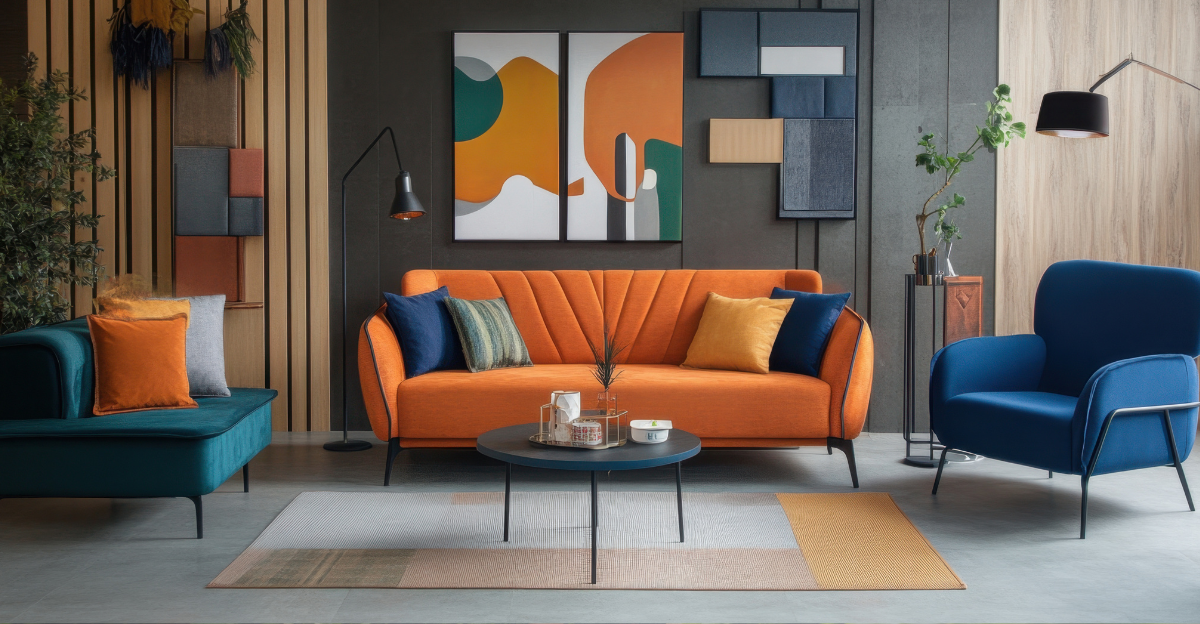
7. Teal + Rust
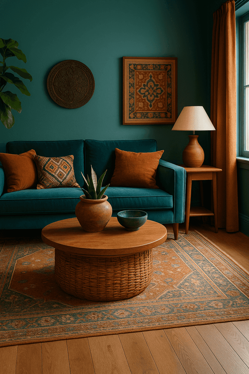
Bold yet balanced, this combination channels a global, well-traveled aesthetic. Teal brings a jewel-tone richness that feels both oceanic and luxurious, while rust adds an earthy, terracotta warmth that grounds the space. The result is a look that feels collected over time rather than bought all at once.
This pairing works wonderfully in eclectic living rooms or sunrooms where personality matters most. Teal can dominate through painted furniture or feature walls, while rust appears in textiles, pottery, or leather accents. The combination creates energy without feeling overwhelming or childish.
Natural wood tones and woven textures complement this duo perfectly, enhancing the organic, worldly vibe that makes this pairing so special and unique.
8. Peach + Olive Green
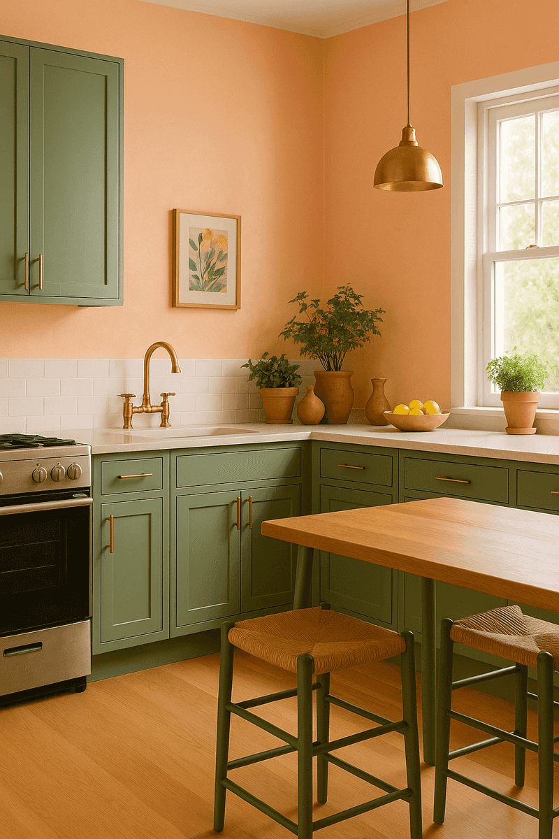
Unexpectedly fresh, this combination feels like a summer garden brought indoors. Peach offers a gentle warmth that’s more sophisticated than pink and less predictable than orange. Olive green provides an earthy contrast that makes the peach feel grounded rather than too sweet or candy-like.
Kitchens and breakfast nooks come alive with this cheerful yet refined pairing. Consider peach for painted cabinets or walls, and introduce olive through bar stools, potted herbs, or decorative tiles. The combination feels optimistic and welcoming without being overly trendy or juvenile.
White countertops and natural wood elements help balance these colors, while brass fixtures add a touch of warmth that ties everything together beautifully and cohesively.