As we age, our skin tone and complexion naturally change, and so does the way certain colors work together on us. What looked vibrant and stylish in our twenties might now make us appear tired or washed out.
Understanding which color pairings can be unflattering after 50 helps you make smarter wardrobe choices that enhance your natural glow. These eight combinations are worth avoiding if you want to look fresh, vibrant, and confident every day.
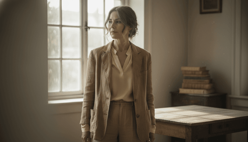
1. Beige + Pale Pastels
Soft tones might seem safe, but pairing beige with pale pastels often backfires on mature skin.
These colors lack the punch needed to bring life to your complexion, making you look washed out instead of radiant.
When both shades are equally muted, they emphasize sallowness and any uneven patches on your skin.
The absence of contrast means your face blends into your outfit rather than standing out in a flattering way.
Consider adding a pop of deeper color near your face—like a rich scarf or bold necklace—to create definition.
This simple trick helps your features shine without abandoning softer hues entirely in your wardrobe choices.
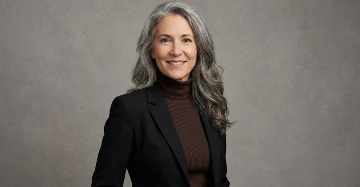
2. Black + Dark Brown
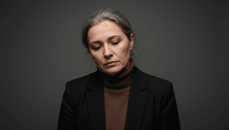
Combining black and dark brown creates a heavy, dull effect that drains warmth from your face.
While both colors are wardrobe staples on their own, together they form a murky combination that lacks visual interest.
This pairing sits too close in value, meaning there’s not enough contrast to create dimension.
Near the face especially, it can make your complexion appear flat and lifeless, emphasizing shadows rather than highlighting your best features.
If you love darker neutrals, try pairing black with camel or chocolate brown with charcoal gray instead.
These alternatives provide enough contrast to keep your look sophisticated while maintaining the warmth your skin needs to glow beautifully.
3. Gray + Beige (Greige-on-Greige)
Greige became trendy for good reason—it’s modern and neutral.
But wearing gray and beige together, especially in similar tones, creates a monochromatic look that drains vitality from your appearance.
Without sufficient contrast, this combination makes your entire outfit look tired and lifeless.
Your face gets lost in the sea of neutral tones, and any natural rosiness or warmth in your complexion disappears completely.
Break up the monotony by introducing a third color with more personality—perhaps a burgundy accessory or emerald green statement piece.
You can still enjoy neutrals while ensuring your overall look has the energy and contrast needed to make you appear vibrant and youthful at any age.
4. Neon Colors + Black
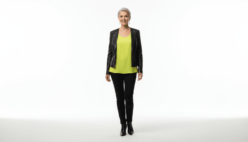
Neon shades paired with black create a jarring contrast that’s too harsh for mature skin.
Instead of looking trendy and bold, this combination draws unwanted attention to fine lines and skin texture.
The stark difference between electric brights and deep black creates visual tension that competes with your face.
Your eyes are drawn to the harsh color block rather than your natural features, making the overall effect unflattering.
If you crave bright colors, soften the impact by choosing jewel tones or saturated brights paired with softer neutrals like navy or charcoal.
This approach gives you color without the aggressive contrast that can age your appearance unnecessarily and distract from your best assets.
5. Olive Green + Mustard Yellow
Both olive green and mustard yellow carry strong, earthy undertones that can clash dramatically with mature skin.
When worn together, they create a sallow effect that makes your complexion look dull and tired.
These colors share similar warmth levels but in competing ways, creating visual confusion.
The result is that neither color flatters, and your skin tone suffers as the undertones emphasize any yellowish or uneven areas on your face.
Choose one of these colors and pair it with a clearer neutral like cream or soft white instead.
This strategy allows you to wear trendy earth tones while maintaining the brightness and clarity your complexion needs to look healthy, fresh, and naturally radiant every single day.
6. Dusty Rose + Mauve
Dusty rose and mauve seem like a romantic, feminine combination, but together they’re too similar and muted.
This pairing often emphasizes redness or dullness in your complexion rather than providing a flattering glow.
When colors sit too close together on the color wheel without enough variation, they create a flat, monotonous appearance.
Your face needs contrast to look vibrant, and these soft, dusty tones simply don’t provide it.
Try pairing dusty rose with cream or soft gray, or choose mauve with navy for better definition.
These alternatives maintain the softness you love while introducing enough contrast to make your features pop and your overall look appear more polished, intentional, and beautifully put together.
7. Cool Gray + Icy Blue
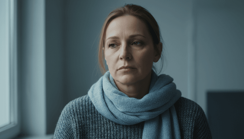
Cool gray paired with icy blue creates an ultra-cool color scheme that can make mature skin appear flat and lifeless.
This combination accentuates under-eye shadows and drains warmth from your complexion entirely.
Without any warm tones to balance the coolness, your face takes on a tired, almost grayish cast.
The icy quality of these colors emphasizes any dullness or discoloration, making you look older than you actually are.
Warm up your cool-toned wardrobe by adding touches of cream, soft peach, or warm taupe near your face.
Even a small amount of warmth makes a significant difference, helping your skin look brighter and healthier while still enjoying the sophisticated elegance of cooler shades throughout your outfit.
8. Tan + Soft Yellow
Tan and soft yellow together create a warmth overload with dangerously low contrast.
This combination makes your skin look faded, uneven, and lacking in definition, especially around the face.
Both colors share similar undertones and intensity levels, which means they blend together rather than complement each other.
The lack of visual separation between the colors causes your complexion to disappear into your clothing, creating an overall washed-out effect.
If you love warm neutrals, pair tan with crisp white or soft yellow with denim blue instead.
These combinations provide the contrast your features need to stand out while maintaining the warm, approachable feeling you’re going for in your everyday style choices and wardrobe selections.