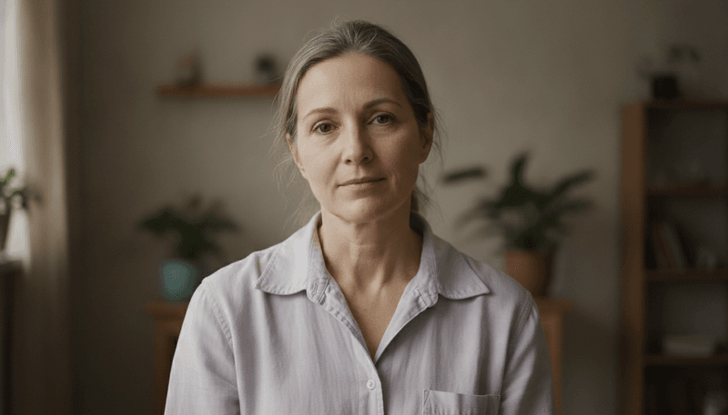
The colors you wear can do a lot more than just match your outfit — they can actually affect how old or young you look. Some shades pull energy away from your face, making your skin appear dull, tired, or washed out.
Knowing which colors to skip can make a surprisingly big difference in your overall appearance. Here are nine clothing colors that might be aging you without you even realizing it.
1. Dull Beige
Ever notice how some outfits seem to make a person disappear?
Dull beige is one of those sneaky colors that can blend right into your skin tone, making your face look flat and lifeless.
Instead of framing your features, it erases contrast — and contrast is what gives your face definition and energy.
Beige can be especially tricky for people with light or warm complexions.
The similarity between the color and natural skin tones creates a washed-out look that adds years rather than subtracting them.
Your face needs a backdrop that makes it pop, not one that fades into the background.
Try swapping beige for a crisp ivory or a warm camel tone, which offer more contrast and bring a fresher glow to the face.
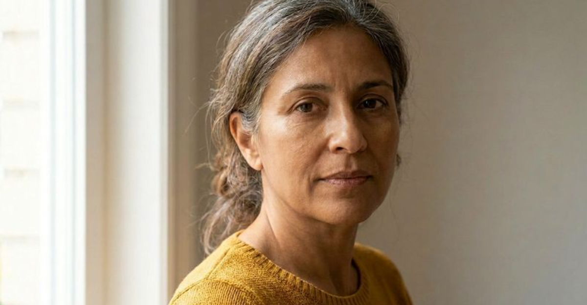
2. Mustard Yellow
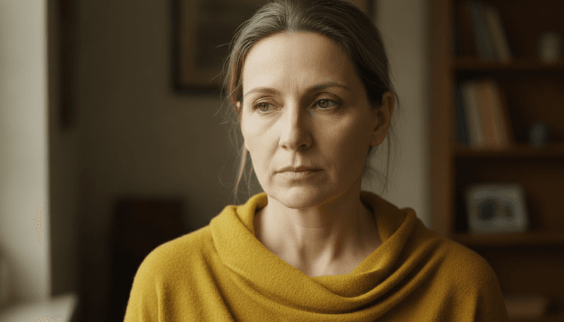
Mustard yellow might look bold on the hanger, but it has a habit of turning on you once it is near your face.
This deep, golden-tinged yellow tends to reflect warm undertones back onto the skin, which can make a complexion look sallow, jaundiced, or just plain tired.
It is one of those colors that looks great in a magazine but can be unkind in real life.
The problem is that as skin naturally loses its brightness with age, wearing a color that amplifies yellow tones only speeds up that effect visually.
Your skin ends up competing with the shirt — and losing.
Brighter, cleaner yellows like lemon or sunshine yellow are far more flattering alternatives that bring warmth without dragging down your skin tone.
3. Olive Green
Olive green has a cool, earthy reputation, but certain muddy olive shades can be surprisingly harsh on the skin.
The murky, brownish-green tone tends to pull the life out of a complexion, especially for people with cool or neutral undertones.
Rather than adding depth, it creates a kind of visual heaviness that settles on the face like a shadow.
People with cool undertones may find that olive green clashes with the natural pink or blue hues in their skin, making redness or uneven tone more visible.
That combination can make someone look older or under the weather.
Fresher greens like sage, mint, or emerald are much kinder choices.
They carry the earthy spirit of olive without the muddiness that robs your face of its natural radiance.
4. Dusty Brown
Brown is a classic wardrobe staple, but not all browns are created equal.
Dusty, flat brown shades — the kind that look slightly faded or chalky — are particularly draining.
They lack the richness and depth of chocolate or mahogany, offering little in the way of contrast or warmth.
The result is a complexion that looks dull and drawn.
Think of dusty brown as the color equivalent of a cloudy day — it dims everything around it.
When worn near the face, it can make skin look sallow, tired, and older than it really is.
It simply does not give your features anything bright or vivid to bounce off of.
Rich, deep browns or warm cognac tones are much better options.
They add sophistication and warmth without stealing the glow from your complexion.
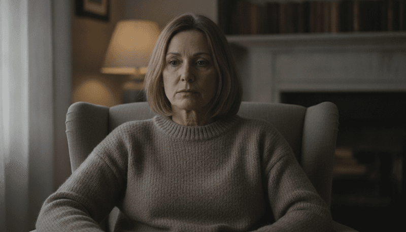
5. Charcoal Gray
Charcoal gray is a go-to for many wardrobes, and it is easy to see why — it is versatile, professional, and easy to style.
But wearing it close to your face can backfire, especially as you get older.
Dark grays near the neckline tend to cast shadows upward, drawing attention to under-eye circles, hollows, and fine lines.
The deeper the gray, the stronger this shadowing effect becomes.
It creates a stark contrast that actually highlights the signs of aging rather than minimizing them.
Ironically, a color meant to look polished can end up making you look more tired than put-together.
Lighter grays like silver or dove gray are softer alternatives that still feel elegant.
Pairing charcoal gray with a brighter top closer to the face is another easy workaround that keeps the look fresh.
6. Muted Taupe
Taupe sits in a tricky in-between zone — not quite gray, not quite beige, and not quite brown.
In its most muted form, it is one of the least flattering neutrals a person can wear near their face.
The low contrast it creates with most skin tones makes features look undefined and blurry, like a photo that is slightly out of focus.
As skin naturally loses contrast and pigment with age, wearing a low-contrast color nearby only amplifies that effect.
Your eyes, lips, and cheekbones need a backdrop that highlights them, not one that blends them away.
Swapping muted taupe for warmer neutrals like terracotta, blush, or even a soft coral can instantly lift the face.
A little contrast goes a long way when it comes to looking vibrant and youthful.
7. Rust Orange
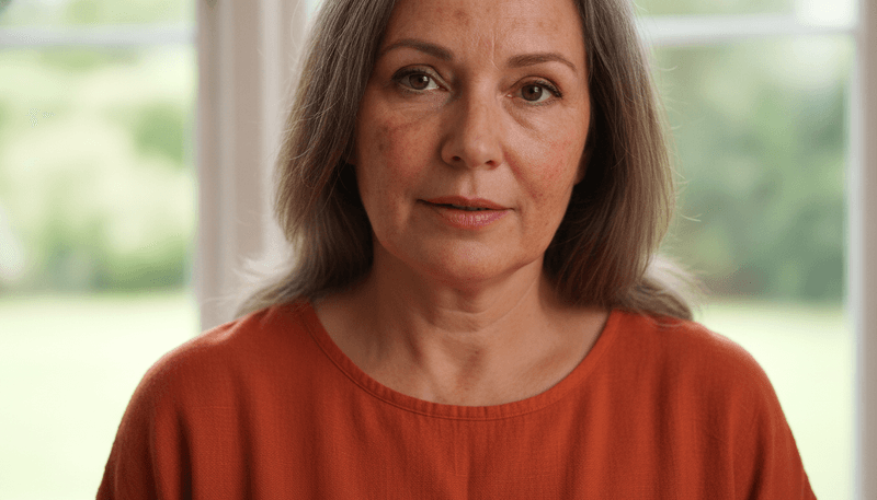
Rust orange is one of those colors that looks stunning in autumn landscapes but can be genuinely unkind to certain skin tones.
The reddish-brown warmth of rust tends to reflect back onto the face, amplifying redness, blotchiness, and uneven pigmentation.
If your skin already has some natural redness or sun damage, rust orange will put it on full display.
It is a bold color with a lot of personality, but that boldness can work against you by pulling focus to imperfections rather than your best features.
For mature skin that has seen some sun exposure over the years, this shade can feel particularly unforgiving.
A brighter, cleaner orange like tangerine or a burnt sienna with more depth can be far more flattering.
They bring warmth and energy without the skin-tone conflict that rust creates.
8. Faded Pastel Lavender
Pastel lavender might sound like a fresh, youthful choice, but the faded version of this shade can do the opposite of what you want.
Very pale lavenders are extremely low in contrast and saturation, which means they offer almost nothing to brighten or define the face.
On mature or naturally low-contrast complexions, the result can look ghostly or drained.
The irony is that lavender in richer, more saturated forms can actually be quite flattering.
The problem is specifically the washed-out, almost-white version that lacks the depth needed to complement the face.
It ends up looking less like a color choice and more like a mistake.
A deeper amethyst or a vibrant lilac can deliver all the charm of purple tones with the added benefit of actually making your complexion look alive and radiant.
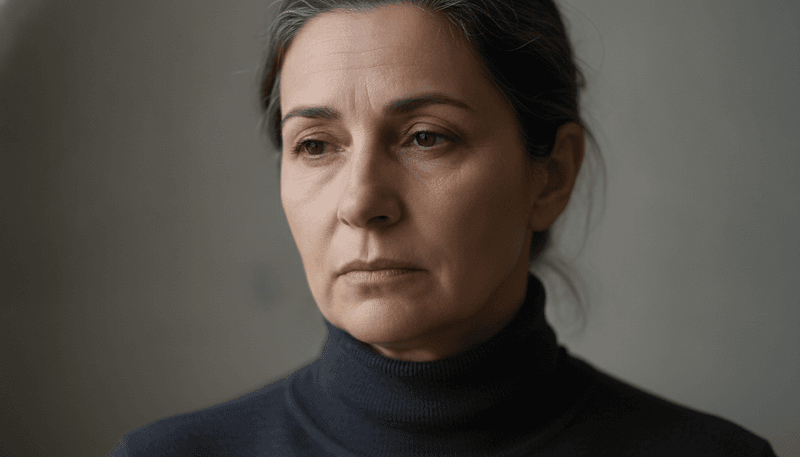
9. Harsh Black
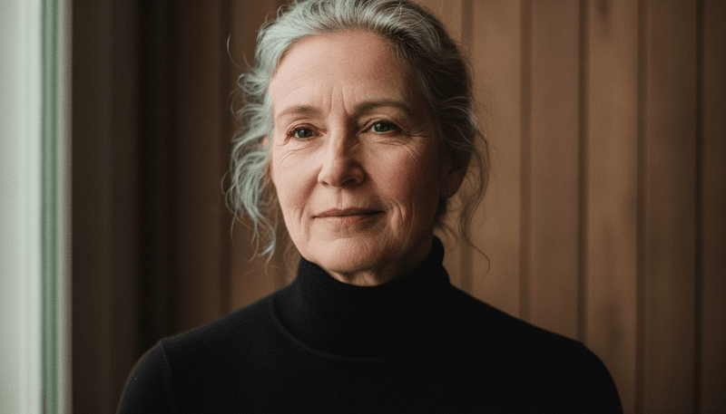
Black is the ultimate wardrobe classic, and many people swear by it as the most slimming, elegant option available.
But here is the catch — pure, harsh black worn close to the face can actually age you, particularly as skin loses its natural pigment and brightness over time.
The sharp contrast between deep black and a lighter complexion makes every line, shadow, and wrinkle stand out in high definition.
It is not that black is bad — it is just that the face needs a softer transition.
A stark black neckline essentially creates a spotlight effect, and not the flattering kind.
Softening the look with a scarf, jewelry, or a lighter layer near the face can make a huge difference.
Off-black, charcoal in lighter shades, or navy are gentler alternatives that still feel polished and put-together.