Color has amazing power to transform a space. When you commit to a single hue throughout a room, something magical happens – the space gains depth, character, and unexpected dimension.
Monochromatic doesn’t mean boring; it means playing with different shades, textures, and materials within the same color family to create a sophisticated, cohesive look that feels intentional and bold.
1. Forest Green Sanctuary
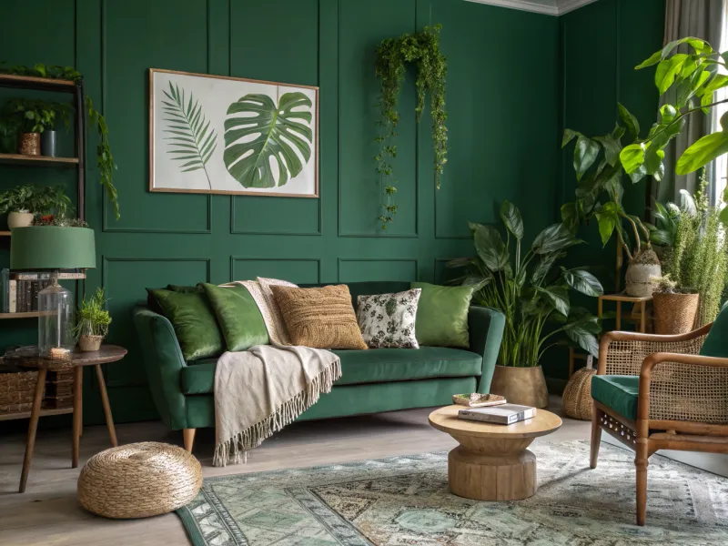
Lush and grounding, forest green creates a nature-inspired retreat that brings the outdoors in. Walls painted in this rich hue establish an immediate connection to the natural world, while varying shades of green in furniture and accessories add dimension.
Velvet pillows, leafy plants, and woven textures prevent the space from feeling flat despite the single-color approach. The key is incorporating both lighter sage accents and deeper emerald touches to create visual interest.
A forest green room works particularly well in spaces where you want to encourage relaxation, like bedrooms or reading nooks, as the color has been shown to reduce stress and promote feelings of harmony.
2. Warm Sand Oasis
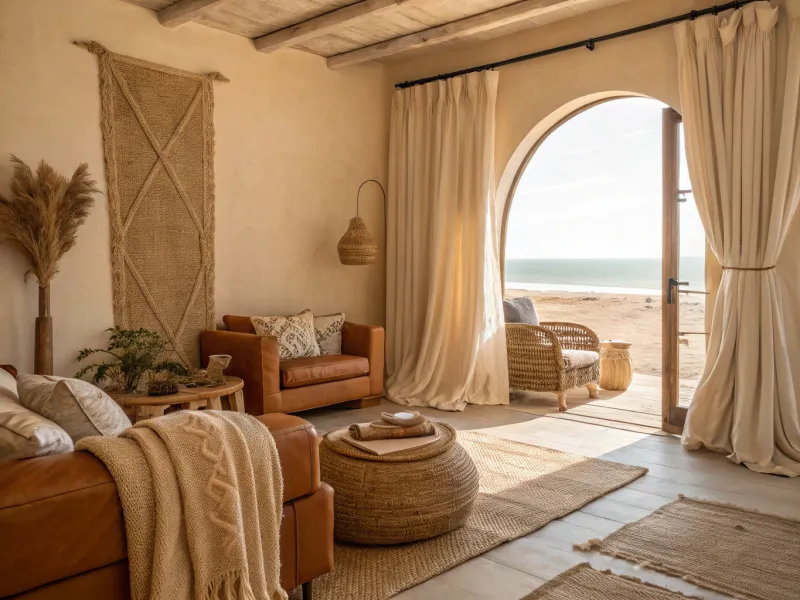
Neutral doesn’t mean boring! A room bathed in warm sand tones creates a calming backdrop that feels like a gentle hug. The magic happens when you layer different textures – think nubby linen curtains against smooth leather furniture and chunky knit throws.
The beauty of this palette lies in its subtlety. Light bounces differently off each surface, creating a dynamic space despite the limited color range. Natural materials like jute, rattan, and unfinished wood enhance the organic feel.
This approach works wonders in open-concept spaces where you want a cohesive flow without visual interruptions. It’s also incredibly forgiving with everyday life and changing design trends.
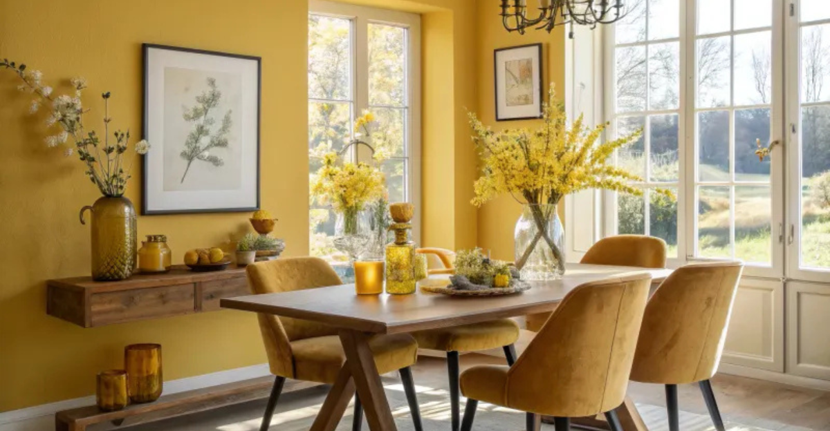
3. Golden Yellow Sunshine
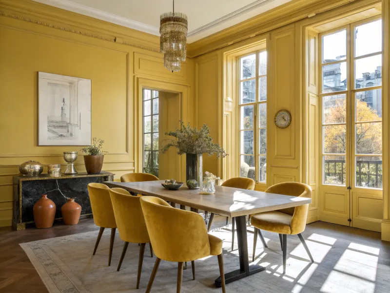
Walking into a golden yellow room feels like stepping into permanent sunshine! This vibrant hue radiates warmth and optimism, making it perfect for spaces that need energy – kitchens, dining rooms, or home offices.
The trick to pulling off this bold choice lies in variety. Mustard velvet chairs pop against buttery walls, while amber glass accessories catch light in surprising ways. Metallic gold accents add sophistication that prevents the space from feeling childish.
Yellow stimulates creativity and conversation, which explains why people tend to linger longer in yellow rooms. Historical fun fact: In Victorian times, yellow dining rooms were considered the height of hospitality, believed to promote lively dinner discussions.
4. Dusty Mauve Dream
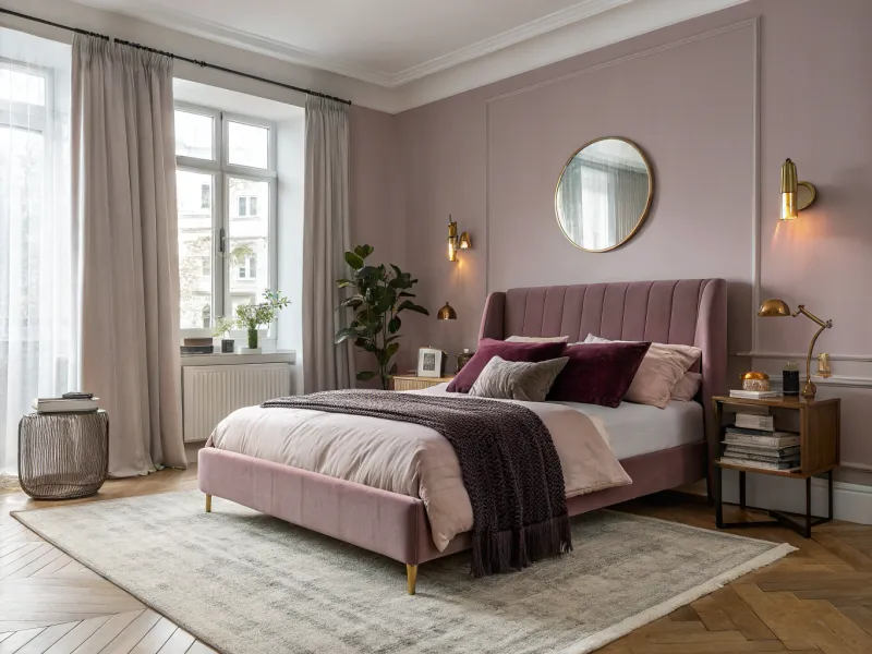
Sophisticated yet approachable, dusty mauve creates spaces that feel both contemporary and timeless. This muted purple-pink hybrid has quietly become a new neutral in design circles, offering warmth without overwhelming a space.
Mauve magic happens through layering – blush pink velvet against deeper aubergine accents creates a visual journey through the color family. Matte and shiny finishes play together beautifully here, with brass or copper accents adding complementary warmth.
Particularly flattering in bedrooms and powder rooms where the color casts a gentle glow on skin tones, mauve creates spaces that feel feminine without being frilly. Ancient Romans actually considered mauve a symbol of prosperity and used it in important buildings.
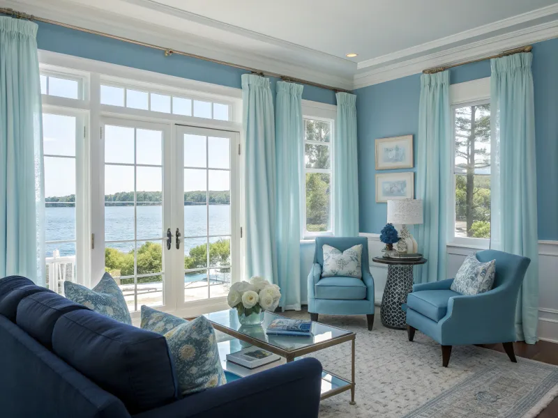
5. Powder Blue Serenity
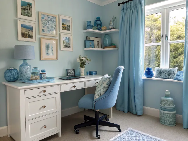
Powder blue rooms capture the peaceful feeling of gazing at a clear sky. This gentle hue creates spaces that feel open, airy, and impossibly clean without seeming sterile or cold.
The success of a powder blue room lies in embracing both the palest sky blue tones and deeper cornflower accents. Incorporating different materials – watery glass, matte painted furniture, glossy ceramic – creates a multidimensional effect that keeps the eye moving through the space.
Historically considered a color that promotes concentration and clarity, powder blue works beautifully in home offices and children’s rooms. Studies suggest blue environments may actually lower blood pressure and heart rate, making this a truly calming choice.
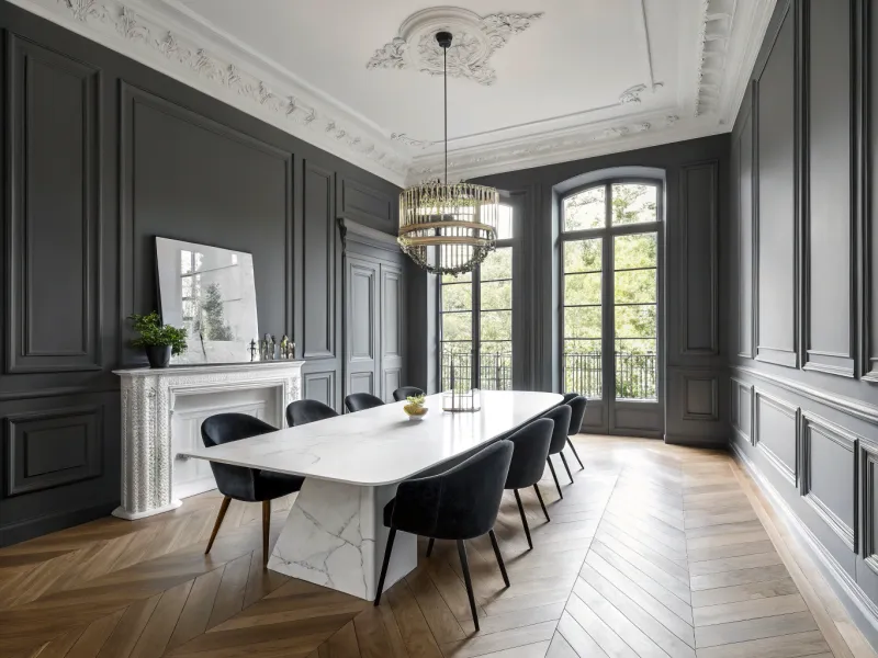
6. Matte Black Sophistication
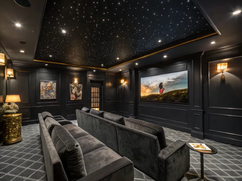
Bold and dramatic, a matte black room makes an unforgettable statement. Contrary to popular belief, black spaces don’t have to feel small or cave-like – they can actually feel incredibly expansive, like gazing into the night sky.
The secret lies in texture variation. Charcoal velvet against glossy black tile against matte painted walls creates depth that draws you in. Lighting becomes crucial here – strategic fixtures create pools of warmth that highlight architectural features and prevent the space from feeling flat.
Black rooms excel at showcasing art and statement pieces, as the dark backdrop makes colors pop dramatically. They also hide technology beautifully, making them perfect for media rooms where you want equipment to disappear when not in use.
7. Chestnut Brown Comfort
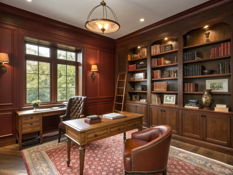
Warm and enveloping, chestnut brown creates spaces that feel like a cozy embrace on a cool evening. This rich, red-tinged brown has a natural elegance that connects to earth and wood, making rooms feel grounded and timeless.
The beauty of brown comes alive when you play with its many personalities – from cinnamon and cognac to coffee and chocolate. Leather furniture, wooden beams, and woven textiles create a layered look that’s rich without feeling heavy.
Brown rooms excel in spaces where you want to encourage conversation and relaxation. They create a perfect backdrop for collections and personal mementos, as the warm tone enhances almost every other color that appears against it, making even simple objects look curated and intentional.
8. Graphite & White Drama
The ultimate high-contrast duo, graphite and white create spaces with architectural precision and graphic impact. While not strictly monochromatic, this pairing works as a unified concept because the stark contrast becomes the defining characteristic.
Success comes from commitment to the extremes – true white against deep charcoal creates the most striking effect. Introducing subtle patterns like herringbone or geometric designs adds sophistication without disrupting the clean aesthetic.
This approach works brilliantly in spaces with great natural light or architectural features worth highlighting. The contrast naturally draws attention to form and silhouette, making even simple furniture pieces look like sculptural statements. Fashion designers have long used this contrast to create timeless, sophisticated looks.
9. Smoky Plum Richness
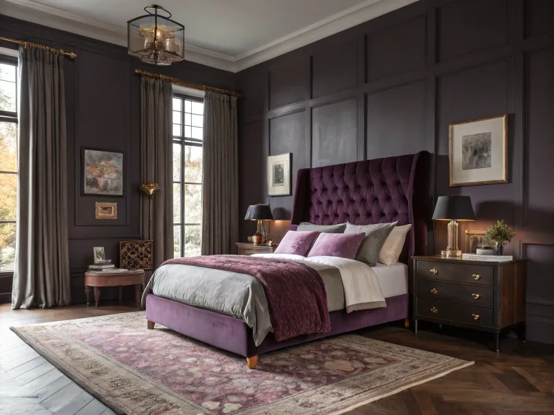
Mysterious and sophisticated, smoky plum creates rooms with undeniable depth and character. This complex purple-gray hybrid feels both contemporary and timeless, with an unexpected versatility that works across design styles.
The key to plum’s success lies in embracing its full spectrum – from pale lilac to deep aubergine. Velvet upholstery absorbs light while silk pillows reflect it, creating a dynamic interplay that keeps the eye engaged.
Plum particularly shines in spaces used primarily in evening hours, as it looks increasingly rich and complex under lamplight. Ancient civilizations considered purple the color of royalty because the dye was so difficult to produce – even today, these rooms maintain that sense of luxury and exclusivity.
10. Hunter Green Elegance
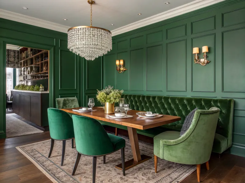
Regal and refined, hunter green creates spaces with old-world charm and natural sophistication. This deep, blue-tinged green has made a massive comeback in interior design, appreciated for its ability to feel both classic and current.
The richness of hunter green comes alive when paired with varying shades from its family – olive accents and emerald touches create depth while maintaining cohesion. Brass or gold hardware adds warmth that prevents the space from feeling too cool or formal.
Hunter green works beautifully in rooms where you entertain guests, as it creates an atmosphere of established elegance. The color has historical significance in libraries and studies of grand homes, where it symbolized wealth and stability – qualities it still brings to spaces today.
11. Cerulean Blue Escape
Vibrant and uplifting, cerulean blue creates spaces that feel like a Mediterranean getaway. This clear, bright blue instantly transports you to coastal vistas and endless summer skies, making it perfect for creating vacation vibes at home.
The energy of cerulean comes from embracing both its vivid personality and its softer sides. Mixing intense blue furniture with paler blue walls creates depth without overwhelming the senses. White accents provide necessary breathing room.
Cerulean works wonders in spaces where you want to promote positive energy and creativity. Color psychologists note that this particular blue stimulates clear thinking and communication, making it excellent for home offices or creative studios where fresh ideas are essential.
12. Lavender Mist Tranquility
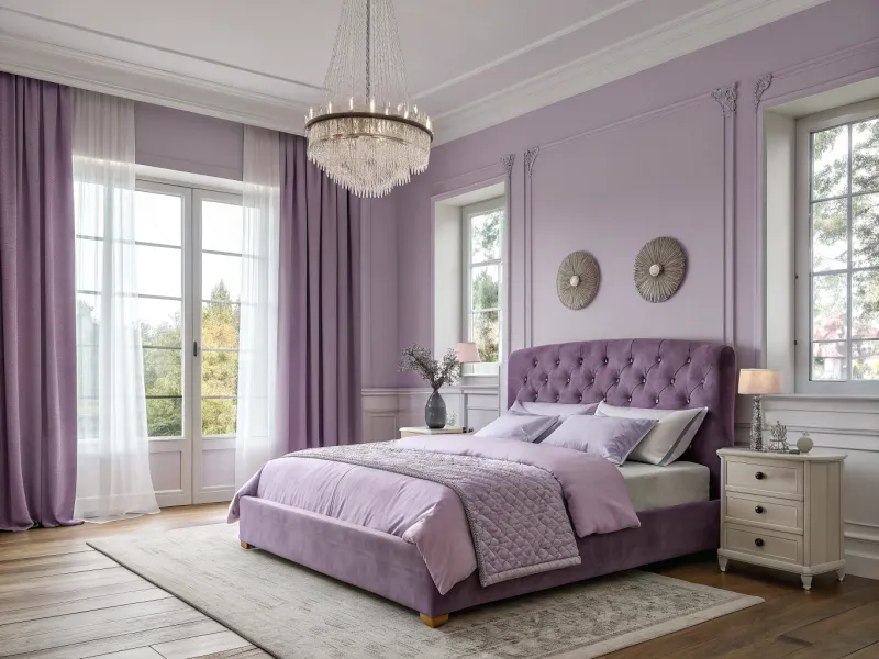
Ethereal and dreamy, lavender creates spaces that feel like they exist between reality and imagination. This soft purple hue has a unique quality of appearing to glow from within, especially in changing light conditions throughout the day.
Lavender’s magic lies in its chameleon nature – sometimes appearing more blue, sometimes more pink. Layering different purple tones creates a watercolor effect that feels artistic and intentional. Silver or crystal accents enhance the magical quality.
This color creates particularly beautiful bedrooms and meditation spaces, as it promotes relaxation and peaceful sleep. Lavender has been used for centuries in aromatherapy for its calming properties – the visual effect of the color appears to have similar benefits.
13. Slate Gray Sophistication
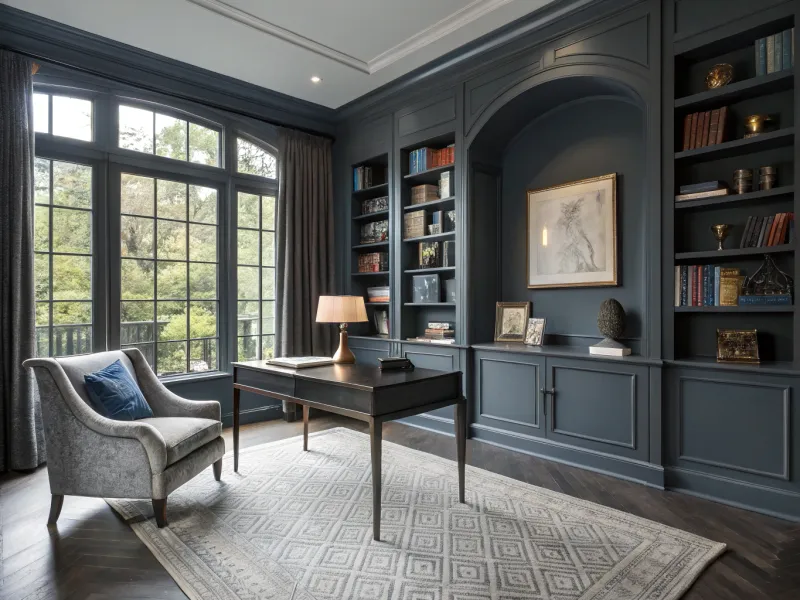
Urbane and adaptable, slate gray with blue undertones creates spaces with architectural presence and quiet confidence. This sophisticated neutral has the unique ability to feel both cool and warm simultaneously, making it incredibly versatile.
Gray’s depth comes from layering – charcoal velvet against heathered wool against matte painted surfaces creates a rich tapestry of texture. The blue undertones add complexity that keeps the space from feeling flat or industrial.
Particularly effective in spaces with great natural light, slate gray creates a perfect backdrop for both colorful art and minimalist aesthetics. Fun fact: gray has become the dominant neutral in contemporary design because it works with virtually every design style, from industrial to Scandinavian to traditional.
14. Electric Cobalt Boldness
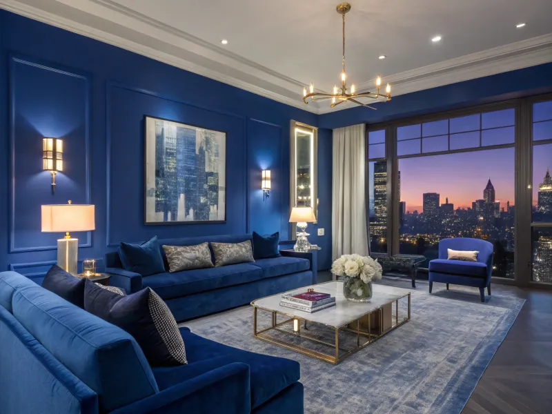
Fearless and energizing, electric cobalt creates spaces that pulse with confidence and creative energy. This intense, saturated blue makes an unforgettable statement that’s impossible to ignore.
The key to making cobalt work lies in commitment – go bold with major elements like walls and furniture rather than just accessories. Adding touches of navy and periwinkle creates dimension that prevents the space from feeling flat or overwhelming.
Cobalt works brilliantly in spaces where you entertain or want to stimulate conversation, as the color naturally energizes and excites. Many cultures associate this intense blue with protection and strength – Moroccan blue doors and Greek blue evil eyes both use this powerful hue to guard against negative energy.
15. Bright Lilac Joy
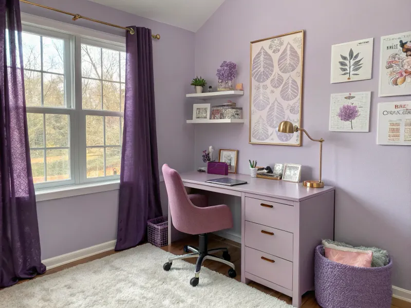
Playful and unexpected, bright lilac creates spaces that radiate happiness and creative energy. This vibrant purple-pink hybrid brings a contemporary edge to rooms while maintaining an approachable warmth.
Lilac shines when allowed to express its full personality – from soft lavender to punchy violet. Mixing matte and glossy finishes creates depth, while metallic accents in silver or rose gold add sophisticated sparkle.
Perfect for spaces where you want to encourage creativity and positive emotions, bright lilac creates rooms that feel youthful without being childish. Artists have long been drawn to purple hues for their creative properties – Monet’s famous garden featured numerous lilac varieties that appeared in his paintings, showing the color’s enduring appeal.