Choosing the right paint color can completely transform how your home feels and looks. As we approach 2026, interior designers are pointing to a fresh palette of shades that blend comfort with style, bringing warmth and personality into every room. Whether you’re planning a full makeover or just want to refresh a single wall, these trending colors offer something for everyone.
1. Windham Cream
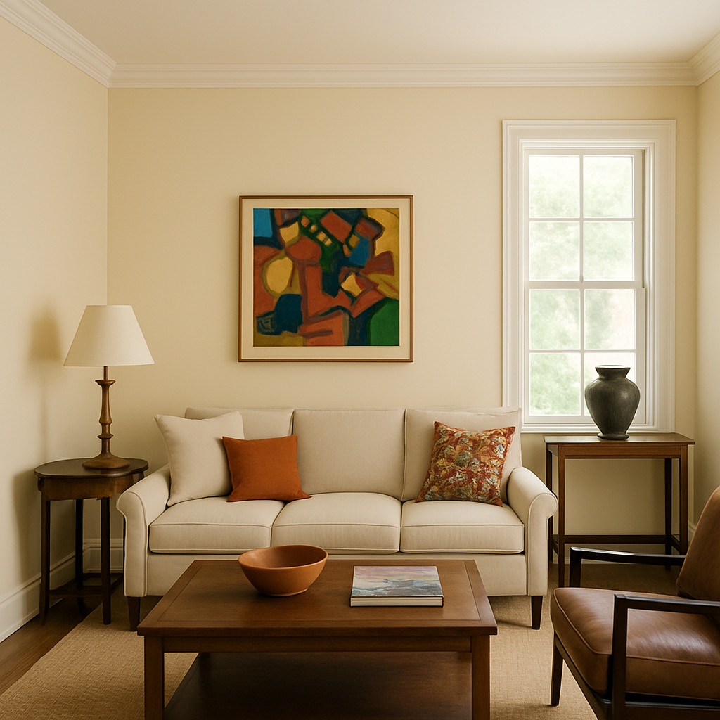
Warm neutrals never go out of style, and Windham Cream proves exactly why. This soft, creamy beige brings instant coziness to any space without feeling too yellow or too gray.
Designers love how it works beautifully in both modern and traditional homes. It reflects light wonderfully, making smaller rooms feel more spacious and welcoming.
Pair this shade with white trim for a classic look, or combine it with darker woods and metals for contrast. Windham Cream creates the perfect backdrop for colorful artwork and furniture while keeping your space feeling calm and collected.
2. Reddish Brown
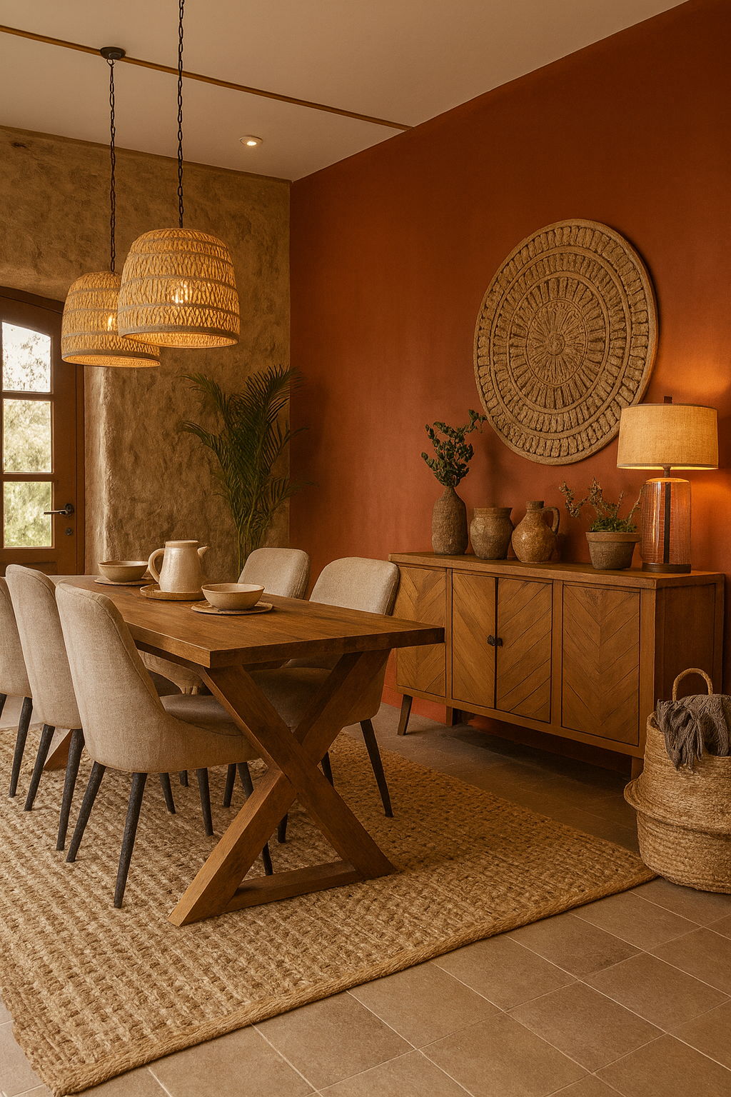
Earthy tones are making a major comeback, with reddish brown leading the charge. Think terracotta meets chocolate, creating a rich, grounding color that adds depth and character to your walls.
This shade works especially well in dining rooms and bedrooms where you want to create an intimate, cozy atmosphere. It pairs beautifully with natural materials like wood, leather, and linen.
Reddish brown hues have been used in homes for centuries across different cultures. Today’s versions feel fresh and modern while still honoring that timeless appeal that makes spaces feel lived-in and loved.
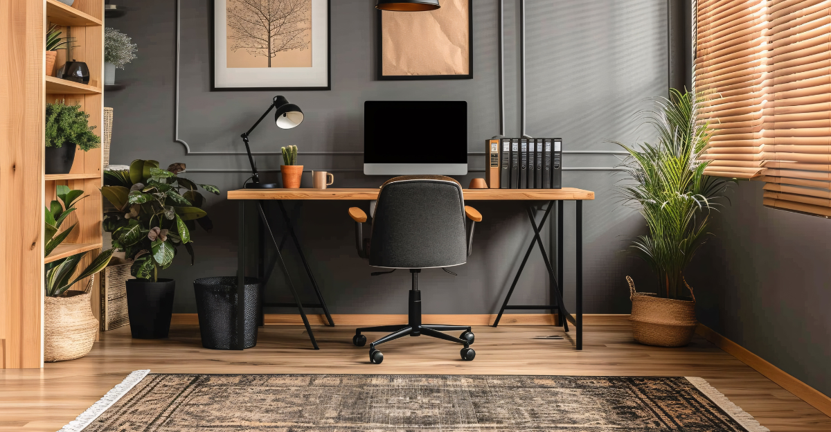
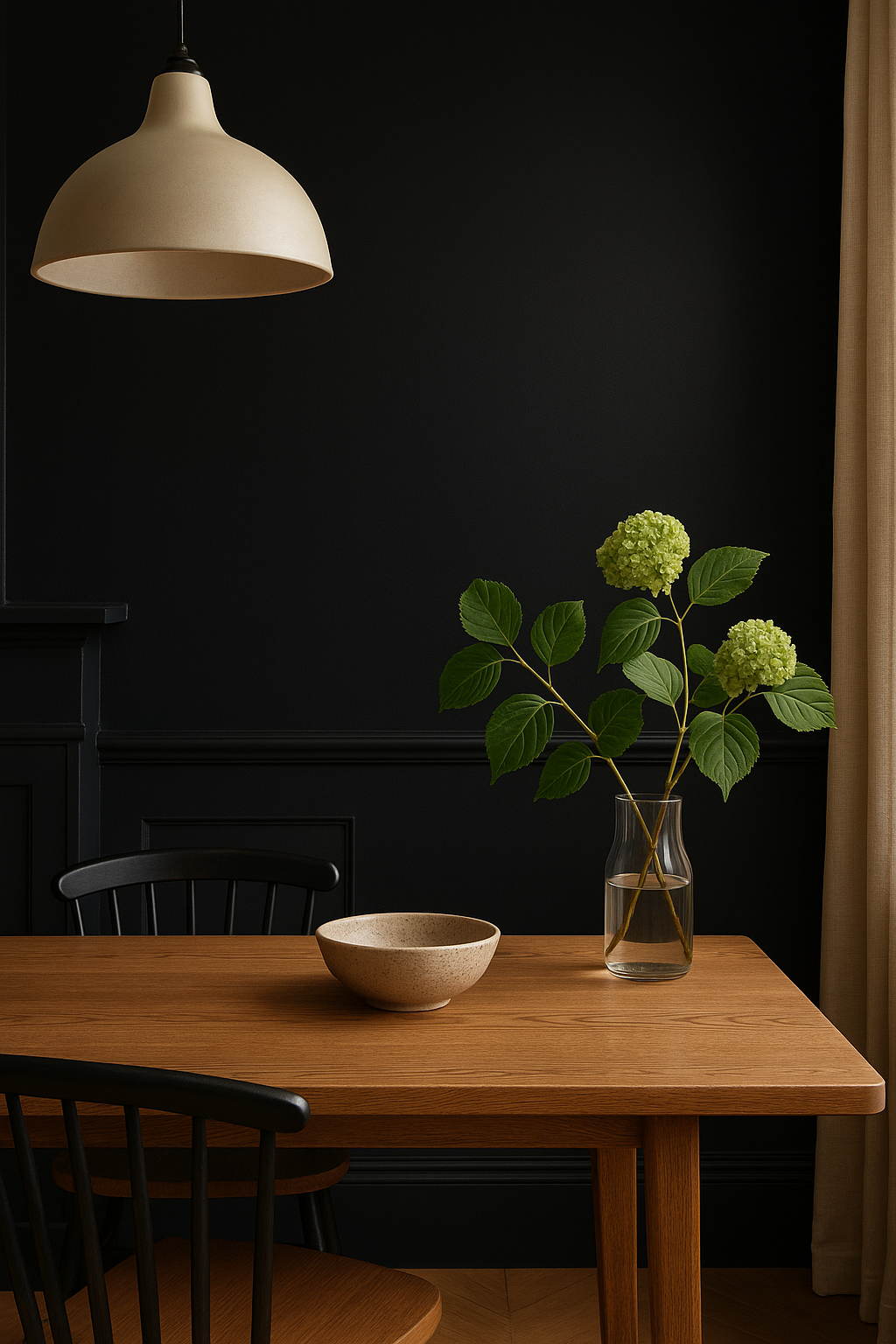
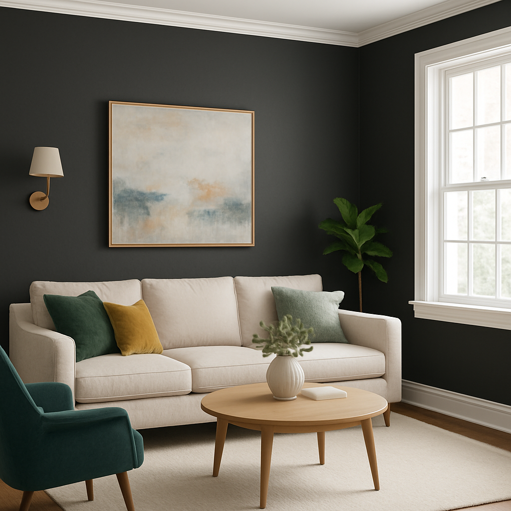
3. Black
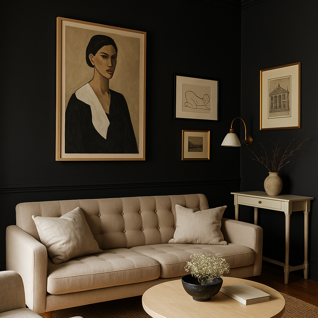
Bold and dramatic, black walls are no longer considered risky—they’re downright chic. Designers are embracing this powerful color to create statement spaces that feel sophisticated and modern.
Black works surprisingly well in small rooms, adding depth rather than making them feel cramped. The secret lies in good lighting and thoughtful styling with lighter furniture and accessories.
Consider using black in powder rooms, home offices, or as an accent wall in your living room. It makes artwork pop, highlights architectural details, and creates a gallery-like atmosphere that feels both elegant and edgy at the same time.
4. Gray-Green
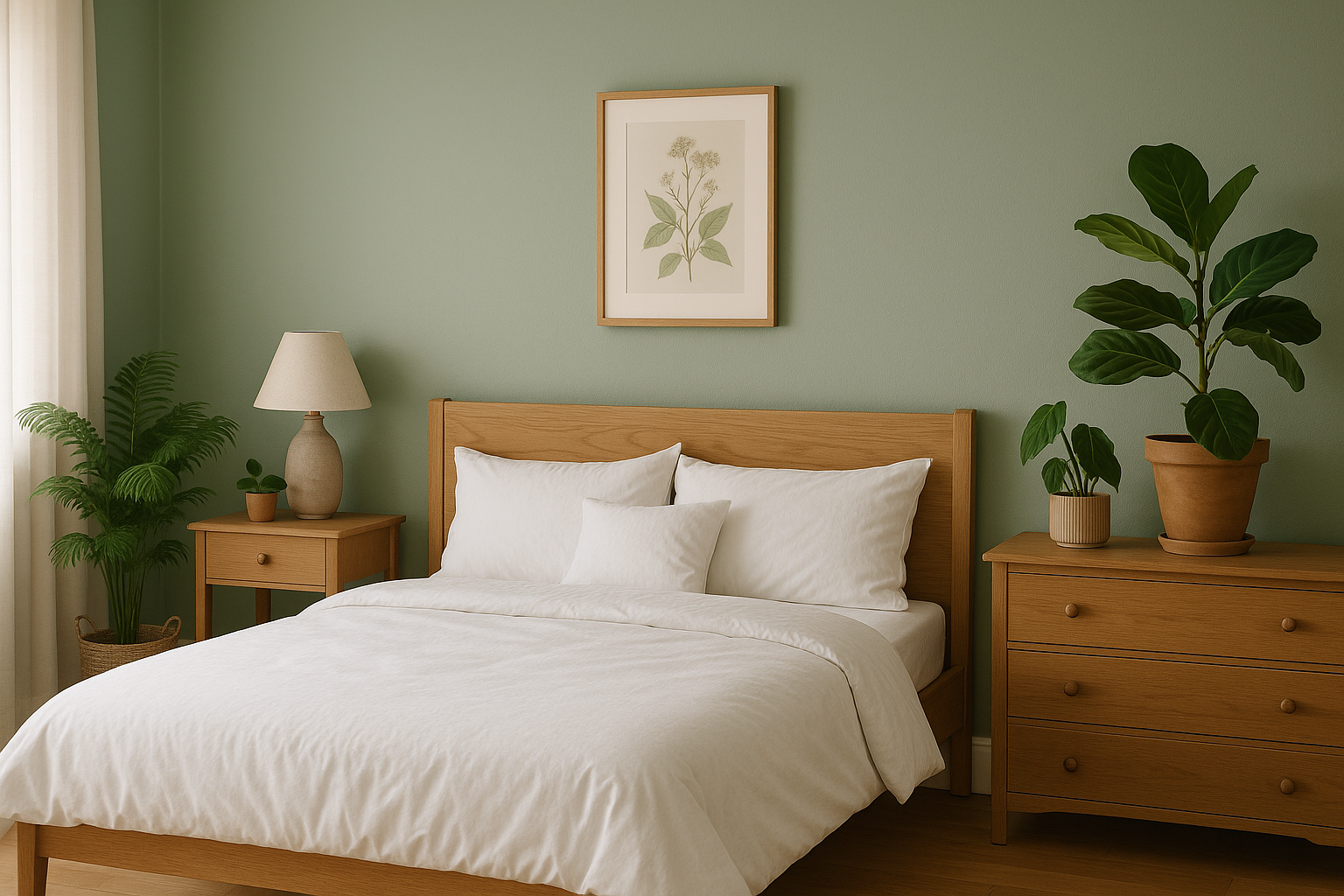
Nature-inspired colors continue to dominate, and gray-green sits at the perfect intersection of calming and stylish. This muted sage tone brings the outdoors inside without feeling too bold or overwhelming.
Bathrooms and bedrooms especially benefit from this soothing shade. It creates a spa-like feeling that helps you relax and unwind after long days.
Gray-green plays nicely with both warm and cool accent colors, making it incredibly versatile. Add brass fixtures for warmth, or stick with chrome and white for a crisp, clean aesthetic that never feels boring or outdated in any season.
5. Sherwin-Williams Anonymous
Sometimes the best color choice is one that quietly supports everything else in the room. Sherwin-Williams Anonymous delivers exactly that—a perfectly balanced gray that works everywhere.
Unlike some grays that lean too blue or too beige, Anonymous maintains true neutrality. It adapts to different lighting throughout the day, looking soft and inviting from morning to evening.
This shade has become a favorite among designers for open-concept homes where you need one color to flow seamlessly between spaces. It complements virtually any decorating style, from farmhouse to contemporary, making your design choices easy and stress-free.
6. Soft Butter Yellow
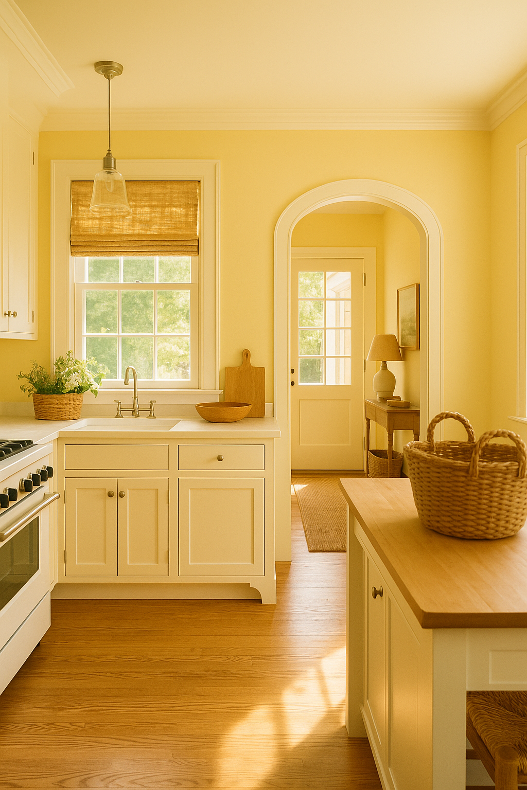
Sunshine in a can—that’s what soft butter yellow brings to your home. Unlike bright, bold yellows that can feel overwhelming, this gentle shade radiates warmth without shouting for attention.
Kitchens absolutely glow when painted in this happy hue. It makes mornings brighter and creates an inviting space where family and friends naturally gather together.
Butter yellow also works beautifully in entryways and hallways, greeting you with cheerfulness every time you come home. Pair it with white woodwork and natural textures for a fresh, cottage-inspired look that feels timeless rather than trendy or dated.
7. Smoky Blue Green
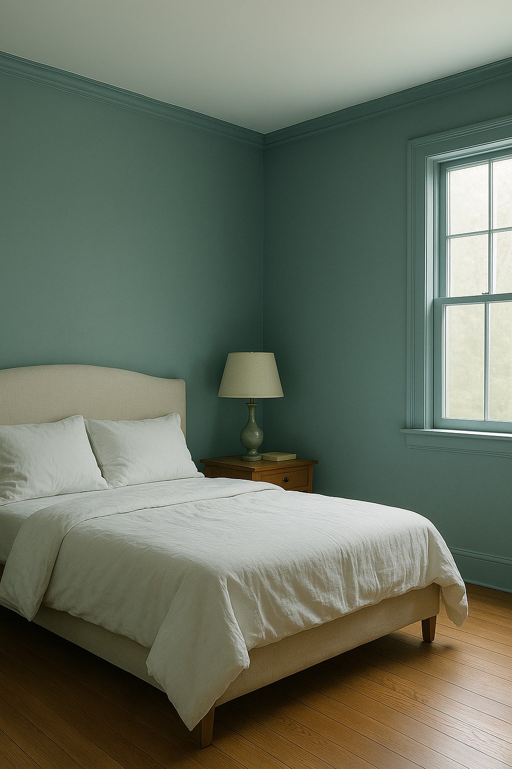
Imagine the color of ocean mist on a calm morning—that’s smoky blue green. This complex shade shifts between blue and green depending on the light, creating visual interest that keeps your eyes moving.
Bedrooms painted in this color become instant retreats. The cool undertones promote relaxation while the green hints keep it from feeling too cold or clinical.
Blue-green shades have been shown to reduce stress and improve focus. Whether you’re creating a home office or a meditation corner, smoky blue green provides the perfect peaceful backdrop for concentration and calm reflection.
8. Farrow & Ball Pitch Black
When regular black isn’t quite rich enough, Farrow & Ball’s Pitch Black steps in with unmatched depth and character. This isn’t just any black—it’s a carefully crafted shade with subtle undertones that add warmth.
High-end designers frequently choose this particular black for accent walls and cabinetry. It photographs beautifully and creates stunning contrast against lighter colors and natural materials.
The special pigments in Pitch Black give it a velvety quality that cheaper blacks can’t match. While it costs more, the luxurious finish and durability make it worth the investment for spaces where you want true sophistication and lasting impact.
9. Kendall Charcoal
Charcoal gray strikes the perfect balance between black’s drama and gray’s versatility. Kendall Charcoal specifically offers a deep, moody tone that feels current and sophisticated without being too intense.
This color excels as an accent wall, drawing the eye and creating focal points in living rooms and bedrooms. It makes white trim look crisp and bright by comparison.
Designers appreciate how Kendall Charcoal works with virtually any color scheme. Whether you love jewel tones, pastels, or neutrals, this dependable charcoal provides a strong foundation that lets your personality shine through in furniture and accessories you choose.
10. Sea Salt
Coastal vibes meet modern elegance in Sea Salt, a soft blue-green that brings tranquility to any room. This popular shade feels like a breath of fresh air, literally bringing the calming essence of the beach indoors.
What makes Sea Salt special is its chameleon quality. In bright light, it leans more green; in softer light, the blue tones come forward, creating different moods throughout the day.
Bathrooms and bedrooms benefit most from this peaceful color, though it works beautifully in open living spaces too. Combine it with white, cream, and natural wood for a relaxed, beachy feel that works year-round, not just summer.