 MomSkoop
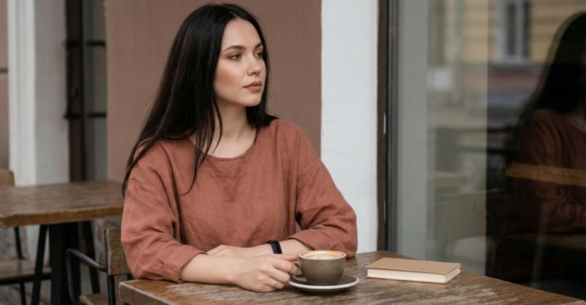
Fall does not always have to feel bold and dramatic. This season, softer, muted shades are taking center stage, making everything feel warmer and more relaxed.
From dusty pinks to smoky purples, these ten colors bring a gentler side to autumn that feels fresh, cozy, and totally wearable. Whether you are updating your wardrobe, redecorating your home, or just looking for some seasonal inspiration, these hues are worth getting to know.
1. Dusty Rose
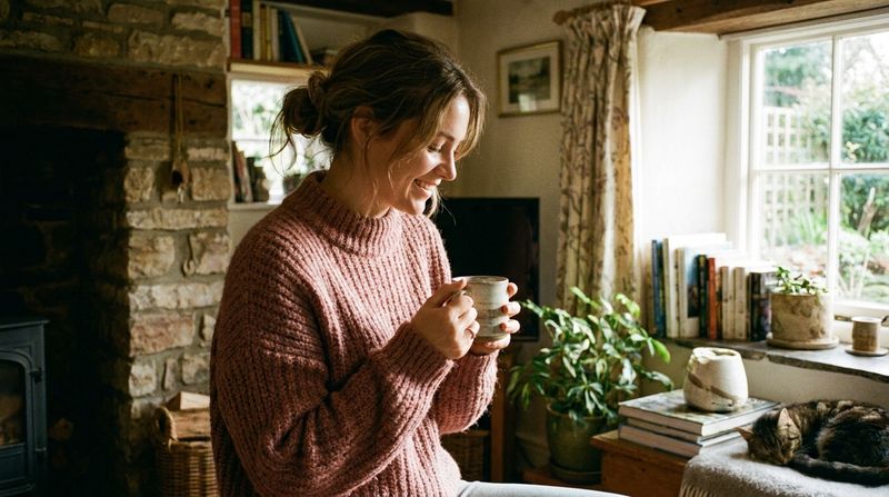
Dusty Rose has a quiet kind of beauty that feels like a warm hug on a cool fall morning.
This muted pink, with its subtle gray undertone, sits somewhere between blush and mauve, making it incredibly easy to style.
It works beautifully on all skin tones and pairs naturally with creams, soft browns, and even muted greens.
Try it in a chunky knit cardigan or a cozy scarf for an effortless autumn look.
Home decorators love it too, as a dusty rose throw pillow or accent wall can make any room feel instantly warmer.
The color carries a vintage charm that feels both nostalgic and surprisingly modern at the same time.
2. Muted Terracotta
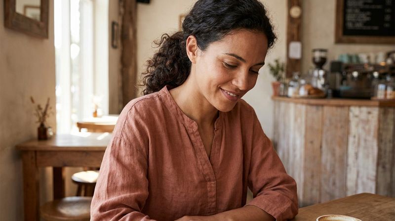
Somewhere between clay and sunset, muted terracotta has become one of the most beloved shades of the season.
Unlike its brighter, more saturated cousin, this version is toned down with a dusty finish that makes it feel relaxed and grounded.
It carries the warmth of the earth without screaming for attention.
Pair it with cream denim or soft olive trousers for a look that feels effortlessly put together.
In home decor, terracotta pots, vases, and textiles bring a cozy, earthy energy to any space.
This shade has roots in ancient pottery and Mediterranean architecture, giving it a rich cultural history that makes it feel timeless and deeply connected to the natural world.
3. Soft Rust
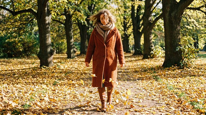
Soft rust is fall in a bottle.
It captures the exact shade of a maple leaf mid-turn, that warm reddish-brown that makes you think of apple orchards and campfire smoke.
What sets soft rust apart from a standard rust tone is its gentler, more faded quality, which makes it incredibly wearable without feeling too loud.
It looks stunning layered over a cream turtleneck or paired with dark olive green.
This color works especially well in structured pieces like blazers or trench coats, where its warmth can really shine.
Fun fact: rust tones have been a staple in Scandinavian design for decades, valued for their ability to bring coziness into minimalist spaces.
4. Warm Caramel
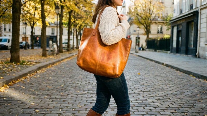
Warm caramel is like your favorite fall drink translated into a color.
Rich, golden-brown, and endlessly flattering, this shade has a sweetness to it that feels both luxurious and approachable.
It reads as a neutral but brings far more warmth and personality than beige ever could.
This tone is a dream for accessories.
Think leather boots, handbags, belts, and watch straps in warm caramel that anchor any outfit.
It also works beautifully as a clothing color, especially in flowy fabrics like satin or suede.
Pair it with soft white, dusty rose, or mushroom taupe for a palette that feels cohesive and quietly sophisticated.
Caramel is the kind of color that makes everything around it look better.
5. Buttery Ochre
Ochre has been around for thousands of years, literally.
It is one of the oldest pigments used by humans, found in ancient cave paintings dating back over 40,000 years.
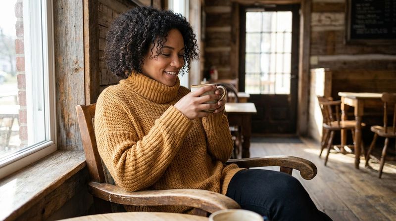
The buttery version of this golden yellow-brown feels warmer and softer than traditional ochre, making it much easier to wear in everyday outfits.
It catches light beautifully, giving skin a warm, sun-kissed glow even on the cloudiest fall days.
Style it with dusty olive or soft cocoa for an earthy, tonal look that feels very on-trend.
Buttery ochre also works wonderfully in home interiors, especially on walls or in velvet cushions that add texture and depth.
It is a color that simply radiates warmth.
6. Sage Green
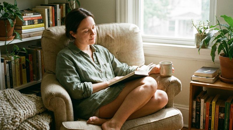
Sage green has a calming, almost meditative quality that feels perfectly suited to the slower pace of fall.
This muted, grayish-green is named after the herb, and much like the plant itself, it brings a sense of quiet and balance wherever it appears.
It is soft enough to feel relaxed but has enough depth to look refined.
Sage pairs beautifully with warm neutrals like caramel and mushroom taupe, as well as with dusty rose for a palette that feels both earthy and feminine.
In home decor, sage green walls or linens create a serene backdrop that makes a room feel like a retreat.
Wear it in linen, cotton, or knit for a look that is effortlessly understated and stylish.
7. Dusty Olive
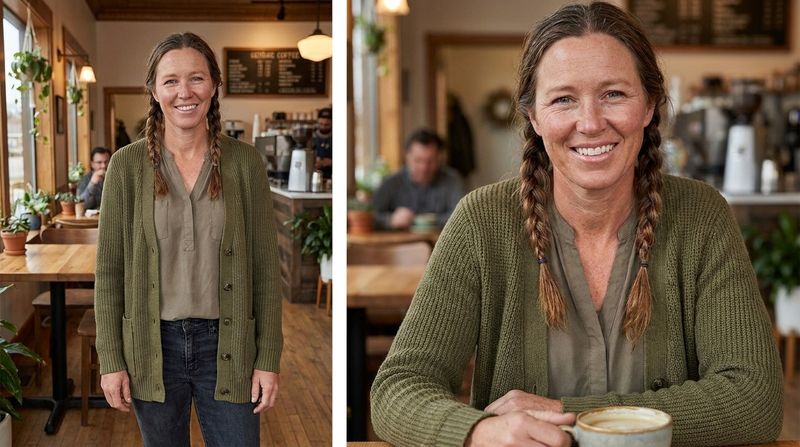
Dusty olive is the kind of color that makes you feel cool without even trying.
It walks the line between green and brown, with a faded, almost vintage quality that gives it serious style credentials.
Military and workwear fashion have long embraced olive tones, but the dusty version feels more relaxed and less structured.
It is one of the most versatile shades in a fall wardrobe because it works with almost everything.
Throw a dusty olive jacket over a buttery ochre sweater or pair it with soft rust for a look that feels rich and layered.
Even in home decor, this color adds a grounded, natural energy to spaces filled with wood tones and warm textiles.
8. Mushroom Taupe
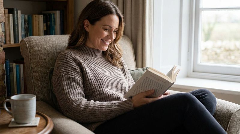
Mushroom taupe is what happens when beige grows up.
This sophisticated neutral carries warm gray and brown undertones that give it far more dimension than a standard tan.
Named after the earthy tones found in wild mushrooms, it has a quiet elegance that works in almost any setting.
As a clothing color, mushroom taupe shines in cozy fabrics like cashmere, fleece, and chunky knit.
It pairs seamlessly with nearly every other shade in this fall lineup, making it the perfect base color for building layered outfits.
In interior design, mushroom taupe walls or furniture create a calming, grounded atmosphere that feels luxurious without being overly formal.
It is understated in the best possible way.
9. Soft Cocoa
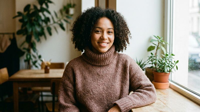
Rich but never overpowering, soft cocoa is the fall color that feels like comfort food for your wardrobe.
It is a warm, medium brown with just enough red in it to keep things interesting, sitting cozily between chocolate and chestnut.
The softness of this tone makes it feel wearable all day, from morning coffee runs to evening gatherings.
Soft cocoa is a natural anchor for any fall outfit.
Build around it with warm caramel accessories and a sage green scarf, or keep things tonal by layering different shades of brown together.
In home decor, this color works beautifully in upholstery, curtains, and rugs, adding warmth and intimacy to living spaces.
It is genuinely one of fall’s most satisfying shades.
10. Smoky Plum
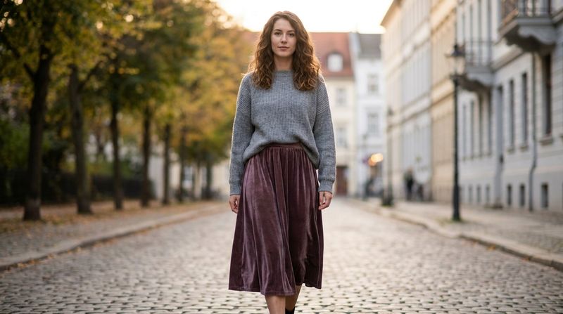
Smoky plum is fall’s most mysterious color, and that is exactly what makes it so appealing.
This deep, muted purple-brown sits far from the loud berry shades of winters past.
Instead, it carries a quiet depth that feels moody without being dark, romantic without being over the top.
Velvet is the ultimate fabric for smoky plum, bringing out its richness in a way that catches light beautifully.
Try it in a midi skirt, a structured blazer, or even a statement coat for a look that turns heads in the subtlest way.
It pairs surprisingly well with mushroom taupe and dusty rose for a palette that feels dreamy and cohesive.
Smoky plum is proof that fall can be both soft and dramatic at once.